Chapter 20:
The three monkeys
– A fluid category
This chapter examines how the see-no-evil, hear-no-evil, speak-no-evil monkeys are used in various communicative contexts and with quite different purposes. The historical background is outlined, but the key point is that the three monkeys do not have a specific form. They are a flexible conceptual idea that works as a highly fluid metaphor. Focusing on this material but simultaneously un-material imagery has caused me to suffer from collector’s syndrome. I ended up gathering so many examples of the three monkeys that I finally had to make a museum, albeit a small on-line one called, Museum: The three monkeys.
Your image or ours?
As a semiotic sign collector you look for meaning in the visible world and meaning is created when the two sides of the sign, the signifier and the signified, are combined in a qualified way. The form and the content are two sides of the same coin and can never be separated without becoming a non-sign.
Physically miming the form and content of a sign like the see-no-evil, hear-no-evil, speak-no-evil monkeys is a simple task; you can cover your ears, your mouth and your eyes with your hands based on an image inside your head of the three monkeys. What material formed the basis for creating your three monkeys? Was it paper, wood, alabaster or bronze? How big are your monkeys? Are they matchbox size? As big as the Statue of Liberty or as large as the Eiffel Tower? What do your monkeys look like? Are your monkeys three-dimensional or are they flat? Are they monochrome or do they have many colours?

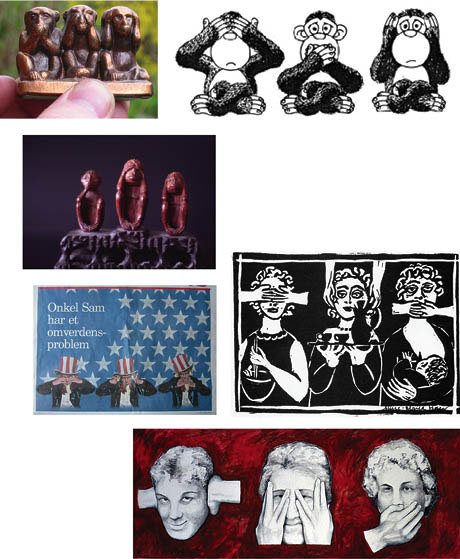
Ill. 20.1: Which one of these six variations matches your image?
1) Bronze 1990’s collector’s item.
2) Cover illustration of Nielsen & Rasmussen: Write, Speak and Be Heard: A Communication Handbook for Social Workers (Skriv, tal og blive hørt), Forlaget Børn og Unge, 1996.
3) A 1950’s Japanese figure in wood. Gift from Simon Heilesen.
4) Half-page picture in the culture section of the newspaper Politiken, 17 September 2002.
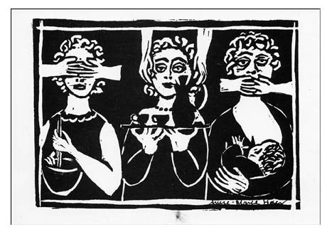
5) Postcards published by Woman Gallery, 1972; made by Anne-Marie Hoeg.
6) Painting by Lesser, around 2002.
The original image
When you look at illustration 20.1, which image of the three monkeys most resembles the inner picture you have of them? Does the style or what they are made of make a difference to you? Why is our need to have an ‘original’ image secondary?
When picturing Leonardo da Vinci’s Mona Lisa, imagining a detailed portrait of a young woman with an indecipherable smile sitting in front of a somewhat peculiar landscape is easy. Whether we have seen her on cups, postcards, scarves, t-shirts and posters or in the Louvre in Paris, our shared internal images of her do not differ dramatically.
There is a positioning between two categories of images. The ubiquitous image of the Mona Lisa, despite variations in material, shape, size and colour, is always of the same. Regardless of the form of expression, the woman is always the same, or at least the same one in Da Vinci’s painting. This indexical relationship is crucial to our ability to experience the same phenomenon, i.e. picturing a woman identical to the one Da Vinci painted in 1506. Even a minimal amount of changes to her image would obliterate its iconic nature, turning Da Vinci’s Mona Lisa into just any other woman. The image of the three monkeys however is of a different nature and belongs in another category, which I will touch upon later.
How to avoid being a collector of signs
In our society we are continually bombarded with pictures, many of them thrown at us intentionally. As potential users we have the option of actively filtering them out. Roland Barthes, when discussing the kinds of pictures that hit and wound him, found that they share a common feature or what he calls the punctum, which he defines as images not that he seeks out, but that seek him out. These are the kind of homing images one must beware of (Barthes 1981).
Being a sign collector can be an all-consuming task. In order to prevent it from dominating one’s existence, I realised two different strategies could be used to avoid becoming one. One involves accumulating images and the other comprises constructing images. The former is the model museum collections abide by, while the latter is the one creative production follows.
The three monkeys in use
Creating new images is a means for keeping down the collection of other signs in order to either stabilise them or totally eliminate them. From the outset I was uninterested in having anything to do with the symbolic content or traditional story behind the see-no-evil, hear-no-evil, speak-no-evil monkeys. In a good, creatively inspirational way I was demolishing part of a shared visual culture, but one day I began seeing the three monkeys as a metaphor for communication, where the three monkeys are in a dialogical relationship between protecting one’s self and self-censorship.
The three monkeys can be looked at from a position in which an attempt is made to see the world and the events that are occurring from a rosy, limited perspective. This self-imposed narrow perspective can be likened to a horse wearing blinders, i.e. there are things you do not want to see, hear or speak about.
The opposite is also true. From a production perspective, situations exist where an organisation has something it does not want to be seen or heard and which is therefore something that should not be talked about. This dynamic raises a number of specific issues often present in a communication situation.
The three monkeys in an article
The following excerpt is from a 1984 article I wrote for a popular Danish magazine called Samvirke:
See - hear - speak!
Daily, we are bombarded with images, words and sounds. All sorts of information come crashing down on us.
The three monkeys ensure that there is something we will never hear about.
We use the three monkeys to protect ourselves against intense media exposure.
We discover the see-no-evil, hear-no-evil, speak-no-evil monkeys when we produce videos, exhibitions, websites, radio programmes ... (Ingemann 1984)
I would also like to present the closing quote from this article as it illustrates a tone that was dominant in 1984 and which captures the focus given to the discourse on universal access to the media:
When you take the first step and begin producing knowledge and experiences in a specific media, you also simultaneously take two steps back, the distance giving you a better eye to see what you do not want to see, hear or talk about.
Taking the first step alone is difficult. If you are with others you can support each other. See. Hear. Speak!

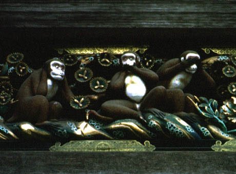
Ill. 20.2: Nikko, Japan. Photographed by Simon Heilesen ca. 1990.
The new collector strategy
Using this productive approach of stealing an idea and a picture to use it for my own purposes did not allow me to isolate the image of the three monkeys or to make it into just one concept. There were various connotations and narratives connected to the metaphor of the monkeys. I started looking for examples of how the three monkeys were used. People began giving me small figures, drawings and references to other texts with the see-no-evil, hear-no-evil, speak-no-evil monkeys [Ill 20.2].
In Japanese culture the three monkeys have a religious connotation. At the beginning of the late Muromchi period (1333-1568), it was customary to carve them into koshinto, stone pillars used during the observance of Koshin. According to the early 19th century Kiyo Shoran, the three monkeys are also associated with the religious complex of Sanno, where they play the role of divine messengers. The three monkeys represent the three truths of the Tendai sect in Buddhism. The founder of the Tendai sect, Saicho, is said to have carved a representation of the truths in the shape of monkeys. There is a famous carving of the three monkeys in the holy stable of Toshogu Shrine in Nikko, Japan. Cuts of the monkeys were believed to prevent disease in horses. A postcard from Nikko states:
The three monkeys are said to come from China and that they cover their eyes, ears and mouth to symbolise the old maxim, “See no evil, hear no evil, speak no evil”. It is believed that the Buddhist priest Dengyo (762-822) was the first to engrave the three monkeys on a Koshin tablet.
Initially used in a religious context and later associated with Buddhism, the three monkeys have been around for at least 500 years. The three monkeys espouse certain values. They do not merely encourage no seeing, hearing or speaking, but seeing, hearing and speaking no evil! What values are being communicated? What is the evil? In the 1857 Pre-Raphaelite composite photograph, Two Ways of Life, by Swedish photographer Oscar G. Rejlander, evil is equated with games, adultery, wine, excessive enjoyment of life, theft, murder and death. My collection of eighty sets of monkeys shows what is defined as evil. Four examples from my collection will be looked at more closely to demonstrate how the three monkeys are used and in what context.

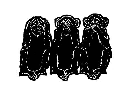
Ill. 20.3: Cover illustration of Sigrid Thomsen’s book, The Three Sad Monkeys (Tre triste aber), Gyldendal, 1980.
Artist: Eva Wulff.
The illustration is also used in the newspaper Politiken, 19 March 1995 with the headline “Interfere”.
Three sad monkeys
The three monkeys are on the cover of Sigrid Thomsen’s book, The Three Sad Monkeys (Tre triste aber), which is about weak readers. Thomsen uses them as a metaphor for weak readers [Ill: 20.3]:
Look, we - weak readers - are similar to the three little monkeys. We manage partly by being copycats. We imitate the clever ones that can read, hear absolutely correctly and convincingly repeat what we hear. We have to rely on and even believe in them. We try in good faith to say what they told us - as we have seen it.
The intellectual ‘top’ manages us. We must trust someone.
We do not hear. This means that we often find it difficult to perceive correctly. Our ears are hit. We are aurally impaired.
We do not see. This means that we have difficulty reading. Our eyes are hit. We are visually impaired.
We say nothing. This means that we have difficulty articulating what we want to say, what we feel and what we think. Our mouths are hit. We are verbally impaired.
The three monkeys – that’s us.
And us in today’s society: the three sad monkeys.
Evil
Thomsen uses the three monkeys quite concretely. They are not merely similar to weak readers, they are the weak readers. Being in a situation where you cannot see, hear or speak, as weak readers are, is clearly painful. The evil they experience is exclusion from a community, from society at large, both as recipients of experiences and information but perhaps also as participants in the democratic dialogue and development of society. Who exactly prevents the monkeys from seeing, hearing and speaking? They do. Thus what creates obstacles and limitations also has a visual focus.

Ill. 20.4: 10x13 postcard published by Woman Gallery, 1972. Made by Anne-Marie Hoeg.
The three women
The postcard pictured in illustration 20.4 leaves one guessing what year or decade it was made. The three sad monkeys, also a linocut made with simple strokes, solely depicted monkeys. In this case, the monkeys have been transformed into something entirely different, a woman, or rather, three women. In addition to having either their eyes, ears and mouths covered, they are occupied with another task. The first woman is stirring a bowl, an activity that apparently does not require her undivided attention; the second woman, with sparkling eyes, is bearing a tray, laden perhaps with coffee for her awaiting husband; and the third woman, weary, stares in the air while nursing her child. There are an extra set of hands keeping their eyes, ears and mouths shut, unlike the traditional image, where the monkeys do this themselves. What does the image communicate about the social standards that govern what the proper role of women is?
The evil here is a glimpse of what constitutes and constructs the limitations women face in life. It is not a specific woman who is depicted, but a woman of a certain class, most likely bourgeois if her clothes, hair and makeup are any indication. The postcard is agitating against the suppression of women, but the women presented also appear to have succumbed somewhat to this oppression.

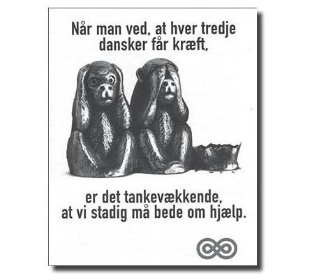
Ill. 20.5: Danish Cancer Society, 1998 postcard campaign proclaiming that every third Dane will get cancer.
Every third Dane
Early in 1998 the Danish Cancer Society ran a campaign prior to its annual door-to-door collection in the spring. The artwork and design shown in illustration 20.5 were used on posters, brochures and postcards. The drawing of the three small figures is perhaps a little harsh. Lined up from left to right starting with the no-hear and no-see monkeys, the no-speak monkey has obviously been annihilated with force, pieces of the monkey lying on the ground in front of it. The text that precedes the image, “When you know that every third Dane gets cancer”, is quite clear. The three monkeys, one damaged, represent the Danish population, one-third of whom will supposedly die of cancer. Or perhaps the last monkey represents the group that has gained new insights and a sense of awareness and is no longer willing to ignore the evil of cancer. Following the image is the statement, “... It’s amazing that we still have to ask for help”.
The rhetoric becomes a bit messy at this point. The three monkeys represent ignorance and the refusal to hear about evil, i.e. that one in three Danes will get cancer, but they also represent the general population and the third that will get cancer.
What makes the campaign thought provoking? Who is the campaign designed to jolt into action? The evil might not be cancer, but rather ignorance. The assumption is that readers are so ignorant they have not yet grasped the gravity of the situation, and yet, at the same time, the sender would like to recruit them to help with the door-to-door collection. Why did they choose to alter the no-speak monkey? What does this choice symbolise? Are you allowed to raise money but not speak out?

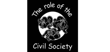
Ill. 20.6: Action Aid Denmark 2002. Being civically active.
Being civically active
The significance of the three monkeys can of course also be changed. In 2002 Action Aid did a workshop on being civically active and used a logo with the three monkeys, but they had big ears, wide eyes and a large mouth, none of which were covered [Ill. 20.6]. If anything, the hands were used to help amplify the sights and sounds. The message was that being civically active means seeing, hearing and speaking out to ensure democracy and development in society. These three monkeys perhaps loose a bit of their rhetorical force and become somewhat of a cartoon designed to promote what is good as opposed to fighting evil.
None of the other seventy-nine monkeys in my collection are altered in precisely this way. They are however used with different communication goals in mind, e.g. they are used to reveal, investigate, make claims, propagandise, lie, exaggerate, understate and create laughter. In general, the monkeys do not deal existentially with evil as Rejlander does, where games, adultery, wine, excessive enjoyment of life, theft, murder and death are seen as evil. The topics the three monkeys say volumes about without seeing, hearing or talking include:
Environmental destruction
Pesticides
Risk of drug addiction among e.g. doctors
Lack of telecommunications
Political torture
Official speech
Ignorance about health issues
The socioeconomically disadvantaged
Lack of transparency in municipal politics
Lack of attention to advertising
The political self-sufficiency of the US
Political distortion of reality

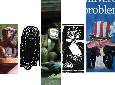
Ill. 20.7: Images – or something else? Examples of how varied the style of the monkeys is.
What do the monkeys express aesthetically?
The question still remains as to whether the three monkeys are an image or if they are something else. Some the three monkeys have a specific form, e.g. a bronze figure, a book cover of a woodcut, a painted wood relief, a linocut postcard and a colour drawing in a newspaper [Ill. 20.7]. The materials vary from bronze to paper to wood, but are the styles different?
The rather realistic bronze figure is quite small, produced in a typical tourist souvenir manner and easily recognisable as the three monkeys. The book cover woodcut is slightly flat, the white marks indicating the fur and face but not in a way that looks as natural as the little bronze figure. Both lack personality, perhaps indicating the limited amount of thought put into the design other than lining up the monkeys as expected.
Produced in the 1700s, the third example in Ill. 20.7 is filled with colour, life and humour. In contrast to the first two examples, the monkeys are especially lifelike and quite distinct from the other examples in that they are not posed close together facing forward in a straight row; for instance one of them is sitting sideways. Initially I came to the conclusion that the image had not yet become a stereotype in the 18th century, but later learned that their poses are common in the Japanese tradition.
A simple white linocut with a black background, the fourth example, while not a masterpiece, is in no way a stereotypical version of the three monkeys. Although facing forward and in a line, the monkeys have become women and the intent of the image is highly political, like much art at that time. The fifth example is a colour drawing of Uncle Sam, who symbolises the American government. The image is naturalistic and employs the same colours used in the image of Uncle Sam during World War I. Once a positive symbol of the American government, it has come to be considered propaganda and has taken on negative connotations. Turning Uncle Sam into the three monkeys is tantamount to saying America has become blind to other ways of seeing the world than its own.
Are they just pictures?
Picturing one particular image of the Mona Lisa is easy, but recalling exact details of the setting and how she holds her hands is more of a challenge. If you try to picture her right now, what position is she in, what is her facial expression? With the see-no-evil, hear-no-evil, speak-no-evil monkeys, coming up with an image is instantaneous, but the image is not a universal one, just the conceptual idea. To illustrate, consider American concept artist Joseph Koshut’s famous, One and Three Chairs, which comprises a sign hanging on the wall of an enlarged definition from a dictionary of the word ‘chair’; an actual chair in the foreground; and a life-size photograph of the chair, also hanging on the wall. When the piece is exhibited the actual chair, the photograph of the chair and the dictionary the definition comes from change, but the conceptual idea, the starting point, remains the same. As Hapkemeyer and Weismair explain, “The expression was in the idea, not in the form – the forms were only a device in the service of the idea” (1997:135).
The various renditions of the three monkeys in my collection are something different than art. They are pictures, but they are also more than pictures. They are objects that represent cultural waste or a residue, a hotchpotch. But along comes the reluctant collector with a trained eye. Disinclined to fill the world with more and more stuff, I take comfort in that fact that artefacts and physical objects fortunately can be digitised.
The three monkeys are signs, a conceptual structure and not physically bound pictures. The minute this mental concept even slightly enters the public sphere it cannot help but take on a material form, including words. Perhaps this is also why we have trouble seeing the image of the three monkeys, or any image. We see through the image and into the conceptual idea. |
