Chapter 15:
Provoked dialogue as reflection-in-action in designing an exhibition
This chapter focuses on the processes of developing the visual and symbolic design of a small poster exhibition by following the design-thinking processes in detail. The fundamental concept is an introverted analysis completed by giving one person two roles, that of designer and researcher. The result is a dialogue concerning the processual experience as a reflection-in-action. This is interspersed with a narrative analysis of this dialogue. This introspective analysis can be seen in the tradition of phenomenology, experimental psychology or semiotic sign theory like Ronald Barthes’ work, who, in his autobiography, Roland Barthes by Roland Barthes turned towards himself as a text to be studied.
Developing methods designed to allow extremely close examination of the actual practice can lead to an upgrade of the practice-learned insights to a level where the tacit knowledge is revealed (Polanyi 1967). Consequently, the design research becomes more vivid and more related to the actual practice, in addition to developing approaches for opening the black box of design processes.
Donald A. Schön is studying the processes of design and how those with more experience are using practices to develop experiences to educate the young, less experienced learner, i.e. the novice. His work can be seen as a phenomenological investigation of processes, which are often difficult or impossible to trace and to make explicit (Schön 1982, 1987). Design processes can also be seen as a variety of experiences, narratives and schemata as theorised by British psychologist F.C. Bartlett (1932/1995) and further developed into processual methods in creative reception (Gjedde & Ingemann 2008).
The practitioners fall within this spectrum. Reflection-in-action is the core of Schön’s theory. He believes that, “[a]s makers of artefacts, all practitioners are design professionals …” He stresses that his main case, architecture, demonstrates that we have access, “… to a prototype of the designer’s reflective conversation with his materials; and we can observe it in service both to functional and aesthetic values” (Schön 1987:43).
The concept of design is enveloped by the design process but also by the end product, which is an artefact. Design is much more than a given form that serves the function of an object. In his book, entitled How Designers Think, British psychologist and designer Bryan Lawson claims that his book, “… is not about science, art and technology …” and that “… the designer cannot escape the influences of these three very broad categories of intellectual endeavor” (1988:5). He follows this line of thinking when he cites graphic designer Paul Rand (1970), saying that the “… graphic designer’s central task is to find the essential meaning in his material and then to abstract and symbolize” (Lawson 1988:143).
Framework of the biotechnology case
The focus of this article is a case that involves the communication of rather complex content about biotechnology, or more precisely, it is about the development of the design process over the course of more than a year. The client was an organisation called the Technological Board, appointed by the Danish state to raise issues of a problematic or critical nature about society. In this context the purpose was to examine and define what the core issues in the debate on biotechnology are about. These expansive issues were then to be communicated via a small poster exhibition at public libraries. The end product comprised posters measuring 100 x 70 cm [Ill 15.1].
The process concluded in September 1990 and the subsequent dialogue was written during the following year [1]. As luck would have it, time and circumstances coalesced in such a manner that the researcher, who has nearly twenty-five years of practical experience, was at a crossroads that meant the possibility of combining his experience with graphic design practice and the writing of his dissertation at the same time as the making of the exhibition. The case in question was developed in this context, the uncertainty and openness of the situation providing fertile soil for coming up with the idea of gaining insight into the creative process of design.
Obviously quite happy with his prototypical case in which the professional architect, Quist, meets his young student, Petra, Arnold D. Schön believes that in the practice of dialogue, “… drawing and talking are parallel ways of designing, and together make up what I will call the language of designing” (Schön 1983:60). Schön studies video recordings of dialogue sequences and presents well-founded assumptions about the practical outcome of reflection-in-action as he sees it.
The research concept in this article is different. In this case, the designer and the researcher are the same person and the ‘interview’ is formatted so that it alternates between the role of the designer and the tacit knowledge he tries to reveal and the interviewer, who in the role as the researcher, questions the designer’s answers.
The researcher’s aim is to discover how visual ideas are created. How do creative processes occur? How are knowledge, insight and experiences facilitated beyond the rational logic mode? What effect does the craftsman process have on creativity?
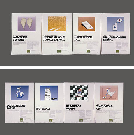
 Ill. 15.1: The final series of the poster exhibition. Produced to hang in public libraries, the original size of each poster is 100 x 70 cm. The content and headlines of the eight posters are: Ill. 15.1: The final series of the poster exhibition. Produced to hang in public libraries, the original size of each poster is 100 x 70 cm. The content and headlines of the eight posters are:
Genetically engineered sugar beets: CAN YOU SEE THE DIFFERENCE? Biorefinery: OIL, PAPER, AND PLASTIC ARE HARVESTED HERE...
Malaria vaccine: IF YOU HAVE MONEY, THEN...
Washing powder: THE EARLY BIRD CATCHES THE WORM...
Rabies vaccine: LABORATORY GOODBYE
Research: BIG, SMALL
International competition: THEY LOST, WE WON
Growth hormone: READY, STEADY, GO!]
The dialogue/interview
[Researcher] - How do you tackle your work? How do you get started?
[Designer] - The most important step a designer will take is the first one. The main issue is to choose a visual and textual style that can be sustained throughout the exhibition. In that phase you’re rather vague and tense. On one hand it’s important to make your choice quickly. But on the other hand it’s crucial that you choose accurately. That’s why I spend a lot of time making small postage stamp-size sketches to try out various ideas for layouts and for the content and nature of the illustrations, as well as for the type of title to go with them. In this early stage I’m not talking about typography, but about the style of the message expressed by the titles.
- That’s pretty vague; can you be more specific about the exhibition we are talking about?
Biotechnology is a rather difficult subject. There are no obvious images associated with it. Well, maybe there are. Various kinds of pictures pop into my head, but they are all scenes of horror. A cow with two heads. Genetically modified humans. Utter fear and loathing. The point of the communicative process is not to create fear, but to establish a basis for issues which are worth discussing, in other words, how we can use biotechnology to serve society and what effects we want it to have on society (Ill. 15.2).
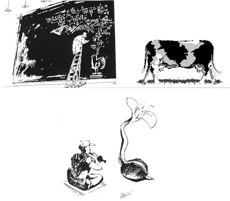
Ill. 15.2: The cliché images have to be formulated to get rid of their influence on the Designer.
- You say that the first images that sprang into your head were primarily images of horror, so how did you get around those clichés having an influence on you beforehand (Bartlett 1932/1995)?
It’s extremely important to free yourself quickly from such obvious and well-known images. I rapidly draw some sketches with those types of images. It’s like a stockpile of pictures that prevent you from thinking of new visual expressions. Those pictures prevent me from forming my own exciting, interesting pictures.
- But doesn’t a designer always have to use and re-use the repository of pictures? Both to be understood by the public, but also because the designer lives in the same visual culture as other observers? What you call new – isn’t it just a way of thinking through the same visual ideas and using them in a new and perhaps surprising manner?
You could say that there is a certain amount of recycling. What is new is perhaps the relationship between the picture and the title. When I free myself of the most cliché-ridden pictures, it starts to get hard. Time also plays a role. I need to get a lot of input. So I read all about the subject, but some time has to pass before any visual ideas begin to form. It is important for me to learn about the material I’m going to express. Obviously. After reading broadly in the literature, I found a number of topics that I felt were both interesting and important. In addition, they contained good stories with a potential for exciting visualisation. So right from the start we were thinking about both form and content.
The eight topics
[Researcher] – Why did you choose eight topics? Couldn’t many other topics also be of interest?
[Designer] – Because the exhibition was to hang in a library, there were both space and budgetary constraints preventing us from making more. So it was mostly practical issues that determined the number. We couldn’t just start up somewhere and work away until there was nothing more to say. We were mounting an exhibition and that meant we had to meet certain requirements regarding simplicity and visual quality.
- That means that from the beginning you were involved in the design of the entire exhibition. Both the text and the presentation? But you have no particular knowledge about biotechnology and in no way are you an expert in that field.
That’s true. We worked together with the people on the Technological Board; they were responsible for the scientific content and I was the communications expert. But it didn’t mean that the content was written first and then diluted and simplified. The manner of presentation was considered from the start. The content was actually not written before the presentation and titles were ready. Then we began to pour in the content. Being familiar with the stories and which points were to be made by each poster was actually a sufficient basis to create the exhibition in its entirety. The public is quite unprepared upon meeting the exhibition. Initially, the exhibition should function in the same way as a poster. The audience should be able to catch the message at a fleeting glance. The pictures and titles should clearly tell their stories and engage a potential reader.
- It sounds almost like what you would expect of a good poster: One word. One picture. But it’s not quite the same as a poster. There is more information at an exhibition and aren’t people supposed to read the entire text?
I was perhaps too glib in saying that the picture and title should be able to tell the whole story. In this case the messages to be presented are more complicated than the ones a normal poster would contain. The idea is also for the audience to read the text or part of it, which is why the layout of the finished exhibition has been specially designed.
Layout and reading – the overall picture is the controlling factor
[Researcher] – Is that something which has been thought through from the start? I mean the final layout that we, the public, see now.
[Designer] – No, it wasn’t. During the brainstorming period we worked with a very "boring" and rigid layout in order to put the illustrations, titles and content in place. But while we were doing that, everything became more defined. And when we were almost finished juggling all the elements into position, we could then concentrate on the final layout. It’s a matter of only focusing on certain issues at a time. You can’t have too many balls in the air at a time. As the work progresses, the issues that you focus on change.
- How do you read a poster? What I mean is, how do you picture the audience reading a poster?
I don’t think everyone "reads" a poster in the same way. What I try to do is offer different ways of reading. Some people are very text-oriented and others are better with images. So I try to provide several ways of reading. I choose the most extreme approach, which is image-oriented. During the entire work process, the visual aspect is what obviously catches the eye first.
I assume that the poster is read in the following way:
The first thing you see is its totality. You see all the posters at once and get an overview of the range and visual style of the layout, typography and images. Most people can’t articulate that this is what they are doing, but when you are a professional you become very aware of how you behave as observer and reader. A professional can also explain his actions in words. The sense of totality is extremely important. At this point the observer decides whether to spend time on the exhibition or not. If the totality comes across as confusing or hostile or has the wrong »style«, then reading will cease.
- It sounds like you mean that the layout is the most important part of an exhibition and that the content only begins to play a role if the total concept is accepted. But doesn’t this put too much importance on the form?
It’s really an historical process. About 100-150 years ago it was probably less important. Today it’s all about competition. The quantity of information is expanding explosively, and every single utterance is fighting to capture the interest of potential readers. This competition has grown even fiercer because the visual aspect of the media has changed dramatically. You have to send the right signal instantly.
- How can you be sure you are sending the right signal? That the actions you are taking are the right ones?
It’s not possible to say that a certain presentation is the only way to do it. Every poster, every exhibition can take many different forms and they can all be “right”. But here you have to trust the designer’s professionalism and extensive knowledge of what sort of layout and typography is popular just now. It’s a question of fashion. A certain type of typography looks modern. Ten years ago it was unusual to use all caps. But today it is very fashionable. Trends and fashions change. And you have to be sensitive to these changes.
- I think it is unsatisfactory that the total concept depends upon something so fleeting as fashion and professional opinion. It would be more reassuring to perform an analysis and systematically decide upon the basis for the total concept. If one accepts the word of the Designer, it is primarily issues and decisions about craftsmanship that need to be settled. If you want to achieve an understanding of the craftsmanship, you would have to examine examples and learn to analyse the »language« of the totality. I do, however, agree with the Designer that it is a question of style, fashion and function, but it must be possible to make a semiotic analysis. Every layout is an idiolect and has a content and an expression (Barthes 1977). It may perhaps be difficult to be very clear about the expression, but it must be possible to get beyond intuitive impressions. So in that sense there must be a similarity between the abstract painting and the total concept perceived as a single picture. But let’s get back to our discussion about the layout of a poster. How do you think a poster is read? (Ill. 15.3).
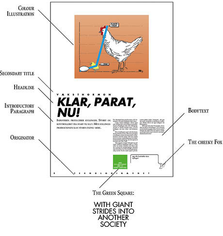
Ill. 15.3: These elements create the specific idiolect of the entire exhibition.
The title and picture are seen first. Closely related, the picture and title form a unity. They are also the most dominant visual elements and fill most of the surface. The secondary title which is the small text above the title, will be read at the same time. The eye can then glide down to the second element, which is visually an independent entity, namely the fox. There is a small drawing with a brief text that makes a snappy little comment on the content of the picture/title and the body of the text. The eye returns to the introductory paragraph, which is right under the title, and if enough interest has been generated in the content, you will read the text.
The text can be read in several ways. You can read the entire text, or just the end of the text, where there are some short questions dealing with the problems connected to the topic. The text begins with a description of the topic, followed by positive arguments and then negative or questioning arguments.
The Technological Board as sender of the message is important information that will surely be one of the first things read! Who actually says this? You can see/read parts of the poster and understand them without having to read the entire poster or all the posters.
- You seem to imagine a very easygoing form of reading. You apparently think of the readers as people who have to discover on their own what interests them.
I have no illusions that every utterance will be so immensely interesting for all potential viewers that they will read everything. You have to accept that the time a viewer is willing to spend on the posters varies greatly. Some will only "read" the pictures and headlines, some will read all the posters, but most people will do something in between. At least I hope so.
The first important poster – about the sugar beet
[Researcher] – Let’s return to the discussion about how each poster was conceived and try to understand how ideas develop. We can start with the first poster. It deals with genetically modified beets. How was this idea conceived?
[Designer] – This poster was important for several reasons. It was the first one I made, and therefore it was the most difficult. It was more than a question of finding an illustration. Rather, the challenge was to determine what relationship the picture and title should have to one another.
The written information explains that it is now possible to genetically modify beets so that when a certain herbicide is used to kill weeds the beets remain unharmed. Drawing a picture of a beet is obvious. But what then? There is no visual difference between beets that are modified and those that are normal. A beet is a beet is a beet. How can you show that the beets survive the herbicide and the weeds die? How do you show that the beets are genetically modified?
I drew some beets just to get started – there’s nothing worse than a blank sheet of white paper, so just putting down some doodles made the paper less fearsome and less virginal. Suddenly, there were many beets on the paper.
Words such as similarity/difference were what got the ideas moving. There were two beets beside each other on the paper, and that was exactly the idea: to show that they were identical. And then when you have two identical beets side by side, you have the picture, but also a whole stockpile of similar pictures: before-after, fat-thin, find-five-faults pictures etc. (Ill. 15.4).
So it was obvious what the title should be:
CAN YOU SEE THE DIFFERENCE?
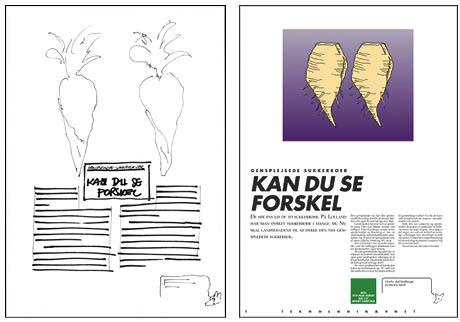
Ill. 15.4: Shows the rough draft for the poster on sugar beets first – and second: the final poster. With the text: The first of the eight posters in the series. As the first poster to be visualized by the designer, it set the standard or format for the entire series. The poster’s title reads: Can you see the difference?
This challenges the reader to take an extra look at the picture to compare the beets and to determine what the differences are between the two beets; they are of course identical. The text is interactive. It points toward the picture and encourages entering into a dialogue with the picture. In all actuality, the text does not have a clear message when it stands on its own, making it nearly devoid of meaning. It could be a title for just about anything and contains nothing that indicates what it is about. To guarantee that the title is understood, it was also given a secondary title: Genetically engineered sugar beets
It functions as a label that refers to a factual reality. There is no fancy wordplay or references to the picture. Even if we do not read the rest, this ensures that the reader will know what the poster is about.
Let me intersperse some elaboration, considering the dialogue from my perspective as a designer and researcher today. I am aware that the Designer is referring to similar illustrations that are typically found in ads for weight loss drugs, hair growth remedies etc. And when he believes that the title is self-explanatory, it is most certainly because he is working with it not only as an extension of the genre advertisements use, but also an ad style that directly takes advantage of the interplay between text and illustration, not to mention familiar wordplays that nearly have value in and of themselves. The title obviously does not refer to a thing or a situation in the real world, but solely to the illustration. The title is necessary to show what the viewer should be aware of in the illustration – namely the difference between the two beets.
The interaction between the text and the picture does not mean that the text is anchored to the picture but rather that it relays something (Barthes 1977:39-41). The picture supersedes parts of the text in the same way that it does in the cartoon. In this case, the picture explains a crucial aspect of the entire story while the text is of essential importance for providing the drawing with significance. This is an exceptionally successful way of briefly presenting the material. The picture carries the maximum amount of information possible, liberating the text from having to provide the entire message. Combining these two elements ensures fast, effective communication.
Thus, it is no coincidence that the cartoon and the ad apply substitution as the main technique. In this case, the message or joke must be delivered quickly. This also goes well with the Designer’s description of what he had in mind, namely that even a fleeting glance from the viewer would be enough to get the message across. People are sceptical and have irrational fears about genetic engineering. This is exactly why it would be a good idea to tap into these irrational fears if the objective is to quickly grab people’s attention.
[Designer] – If getting attention was the only factor that needed to be taken into consideration, then this would be a straightforward approach. It would, however, be the equivalent of putting half-naked women on the hood of a car. Attracting attention would be the most significant feature, but our purpose was greater than that; the aim was to gain attention using something that was central to the message.
If one can demand something from the pictures, then it is similar to what American designer Bob Gill once described. He believed that good visualisation and good ideas can be explained on the telephone. If this is not possible, then the idea is worthless. He does not devalue the aesthetic design, but rather simply points out that if the idea is not clear, then it cannot be saved by the aesthetic design (Gill 1981).
This is also the reason why it is possible to work at the rough draft level, where only the idea is given consideration and not the final design.
[Researcher] – Do you consciously take advantage of the aesthetic and a style that has features in common with ads?
[Designer] – I would say that it’s not surprising. This is not something that I have consciously thought about. Maybe this sounds a bit naive, but I’ve often seen this kind of spill over effect from other types of media. I know that it happens and I don’t think that it is problematic. I think that people get inspired and that subconsciously they respond to a variety of influences of this kind. Digging up all of the subconscious factors that are significant in the creative process is difficult.
At this point, time again plays a role. During the process when ideas begin to surface, it is impossible to respond analytically and consciously to each and every form of influence and borrowing that occurs. The chief concern is to concentrate on adequately expressing the subject as well as possible. In this regard, it is the interaction between the creative and analytical levels.
- Research on creativity has traditionally divided the creative process into four areas: the preparation phase, the incubation phase, the illumination phase and the verification phase (Kneller 1965, MacKinnon 1976, May 1975)). During the preparation phase one becomes aware of the existing problem and begins to identify it. During the incubation phase the problem is put aside and presumably forgotten. During the illumination phase a crucial idea suddenly comes to the surface: “A light bulb went off in my head”. During the verification phase the idea is tested, after which, if necessary, it is reformulated or revised. The designer frequently goes back to the issue of time and its role in the process. When he examines the pile of material on the subject, he quickly disregards what he calls cliché pictures, which means he is in the preparation phase.
- Can you recognise any of these steps in the creative process?
[Designer] – I know the feeling well of “a light bulb just went off in my head”. This is an aspect that I consciously work with. Over the years I have discovered that I often get good ideas when I ride the train late at night after a long day and am really tired. I also often wake up at night with a crystal clear idea in my head. This has led me to work consciously with subconscious processes. If I have a problem that I can’t solve, I sit down and focus my thoughts on it just before I go to bed. I frequently wake up with a new idea, but it doesn’t happen every time.
I don’t think that I forget the problem; on the contrary, I remind my subconscious of its existence. The tiredness I experience on the train, on the other hand, shows precisely how much I need to let the censorship and limitations of my conscious mind go. I believe that I can work consciously with the incubation phase and integrate it with the illumination phase.
This is where time plays a big role. If I have project to complete and the pressures of time are heavy, then I don’t have time to let this process take place. The result is that the solutions that I come up with are often repetitions of something I have done previously. This is permissible on a professional level. At any rate, it does not surprise me. Even though many people believe that they work best under time pressure, I believe that this is only partially correct.
Having to finish something quickly can be a challenge, but the greatest amount of time is spent on the actual idea phase. If I don’t have sufficient time, then I seldom come up with something that surprises me. It’s a luxury that I would like to give myself. This is where the challenges lie. This is why being in the middle of a variety of projects at the same time is a good idea. When I have a need for the problems to develop on their own, then I can work on something else.
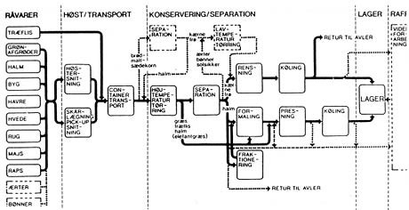
Ill. 15.5: This is only a section of the diagram showing the flow in a biorefinery. Difficult.
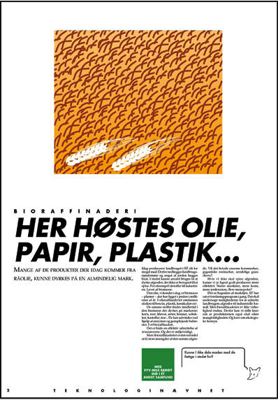
Illustration 6: The final poster about a biorefinery. With the text:
The title on the last biorefinery poster reads: Oil, paper and plastic are harvested here ...
The second poster: Difficult topics such as the complexity of a biorefinery
The title on the completed poster about the biorefinary reads: OIL, PAPER AND PLASTIC ARE HARVESTED HERE … The illustration shows a golden brown field of grain with two white shafts of wheat to the left in the foreground. Style-wise it closely matches the interactive aspect of the first poster with the sugar beet. Was that also one of the ones that was self-explanatory?
[Designer] – I thought that two out of eight of the posters were difficult to sort out. One of them was the poster about the biorefinery and the other one was about rabies. The problem with both of them was creating an interactive unit out of the title and the illustration. The first rough draft shows this. The title is Biorefinery. This title is perhaps puzzling enough in the first place.
In brief, it is a system for gathering, sorting and processing what biologists call young biomass: grain, beets, beans, sunflowers, potatoes, wood etc. They contain substances that can be extracted with the help of enzymes and genetically modified bacteria. This is what happens at a biorefinery. These substances can be used to make oil, paper, plastic etc.
The first idea I had to dismiss was a flow diagram of the entire process. Although it may have communicated the aspect of planning, it was incomprehensible unless accompanied by a several-page explanation. The issue of technology wasn’t actually what I was pursuing. Well, I didn’t really truly know what I was looking for (Ill. 15.5).
The next idea, which formed the basis of the first draft, was the “black box”. On the box it said Biorefinery. A multitude of different kinds of biomass, corn, beets, beans, sunflower seeds, wood etc. were being poured from the upper left corner of the poster into the black box and came out of the lower right corner of the black box in the form of food, paper, plastic, film etc.
This was perhaps a good illustration of what happens in a biorefinery without being too technical. It was an explanatory, instructional illustration, but the style established in the first poster of the sugar beets was certainly not being adhered to.
[Researcher] – What, then, was the best way to proceed? How did you progress from an understanding of why it didn’t work to what is now the final visualisation? Did it just pop up out of the blue?
[Designer] – My reply is pretty much of a yes to that question. I actually tried to analyse the sugar beet poster. It was a familiar product that took on new significance due to the title. In the case of biorefinery, what was new and what was familiar? The new aspect was the products that you can manufacture and the familiar aspect was the corn, beets etc. Although I had hit on the surprising aspect, no visual ideas came out of it.
When an idea succeeds and has been fully developed then it looks natural and obvious. Unfortunately, the same cannot be said about the process. In this case it is confusion, frustration, irritation and blockage that reign. You go about your daily family life, cook dinner, pick up the kids, talk with family members about their day, read the paper and watch TV, but a recording plays in your head about the confusion you are experiencing while you simultaneously continue to try to find a solution. This is a pain in the neck for everyone around you because you are physically present, but nonetheless absent.
At this stage in the process, time was getting short. Two new ideas had to be generated within the space of a few days. It is especially difficult because you have come up with an idea that you’ve written down. It’s nearly become like a child to you. Doing away with it and moving on is difficult. You become fond of the ideas that you get. Even the ones that aren’t very good. Consequently, you create blockage that actually makes it more difficult to move on (Ill. 15.6 & 15.7).
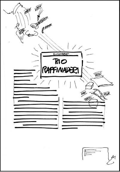
Ill. 15.7: The rough draft shows the thought process of the black-box metaphor.
Let me intervene once more, to clarify and expand from my point of view today: The Designer has to get rid of the clichéd illustration he has had from the beginning. Although it is a liberating process that sets the creative processes free, the opposite is true when he expresses his own ideas on paper.
He makes the comparison to having to do away with a child. It is falling in love and a birth. It can also be looked at as being lazy. Creating something new is terribly exciting, but it also means experiencing fear and pain. Apart from perhaps just being fun and exciting, it is also demanding, stressful and ambitious.
- Do you have ambivalent feelings? Would you like to do something that is good from both your point of view and the consumer’s on the one hand and yet also experience dread at the thought that you might not be able to do it on the other?
[Designer] – Well, I wouldn’t quite use a word like ’dread’. I would say that when I started doing this kind of work many years ago, I most likely had a feeling of dread associated with the notion that I wasn’t good enough or that I couldn’t manage. To a large degree, it was a feeling that was connected to other people’s appraisal. Today, it is more my own assessment and norms that I battle with. My ambitions are probably the issue. I know what I am capable of – but that is not always possible. I’ve become more humble and accepting. I’m not a world champion, but I’m good enough. Regardless, one solution blocks another. This is why the first solution has to be done away with for new ideas to arise. I have to forget what I have done and try to begin again.
- How can you actively forget? Is it possible to wipe the slate clean?
I wipe the slate clean and start over from the beginning with a fresh piece of paper. This gives me a very empty feeling, which is how it is supposed to be. It’s not pleasant and it requires overcoming any reluctance. I began with the text. This is the area where I had spent the least amount of energy until now. How could I create a text that would invite initiating a dialogue with an illustration that I had not yet come up with? This was the weakest point and the easiest place to start.
In retrospect, it is easy to see that I made the first rough draft in one sentence: Harvesting film, petrol and paper is possible … Just as it is possible to drill for oil. Using a shortcut where some processes are skipped, you end up with the product of biotechnical processes. This is typical for developing ideas: one comes up with something by grouping what is impossible and illogical. The entire biorefinery process ought to have read: You harvest grain, beets, beans, sunflowers, potatoes and wood ... which can be turned into oil, paper and plastic ... This is the one that I wrote and then combined in a new way:
Biorefinery
OIL, PAPER AND PLASTIC ARE HARVESTED HERE ...
The illustration was obvious. It should be an ordinary, easily identifiable field in Denmark planted with a familiar crop. In this case, I think that a field of grain was an obvious choice – what could be more Danish or more familiar?
To give some further details from my perspective today, the Designer (in me) at the time thought that it was difficult to wipe the slate clean, so he chose to concentrate on the weakest link, namely the title, and then to completely forget the illustration for a while. This is where he has invested the least amount of life blood and creative work. At the same time, it is clear that without the work that went into the first instructional illustration and the resulting understanding, it would have been impossible to come up with the final title. Even though he claims to have wiped the slate clean, he has not actually done so. To a great extent, he uses his previous experience in a highly active way.
Instead of wiping the slate clean, he pushes his experiences down into his subconscious and calls them forth again as if by magic. But it is a well-planned stroke of magic. This is evident from his statement about beginning with the weakest point. He is highly aware of what he has to do even though it occurs subconsciously. When he believes that the illustration was obvious, it is solely due to the fact that it was available as a possible option while work with creating a title was going on.
He had the picture in his head and was puzzled about the connection between ordinary fields and oil, paper, plastic etc. This puzzlement was tied up with focusing on explaining the tenets of a birorefinery in an instructional way. The Designer clearly shows a desire to be educational. This is an offshoot of his extensive experience with precisely this type of communication. He has fallen into a pit that he has dug himself.
He has thorough knowledge about instructional illustrations. This leads to the short circuiting that he finds so difficult to get away from and that he spends a long time describing. Believing that it happened is difficult. Surely his observations are correct on a more general level, but in the specific situation, his explanations are insufficient.
Ill. 15.8 & 9: A visual concept designed to be the main illustration of one poster ends up being a single cheeky fox that provides commentary on each of the eight posters.
Foxes – rabies – and the cheeky fox
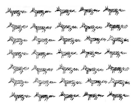
On the first rough draft you showed me, there was a title that read Death has a cause and then there were a bunch of animals that you said were foxes. Why didn’t this idea get used?
[Designer] – A part of that idea was used, but it was a by-product and not anything that was thought of from the start. The fox. When you write something that is controversial, you have to be very precise and factual. It is not possible to put your feelings and opinions directly into the text. The text of course contains opinions, but only indirectly. While doing the work, I felt there was a need for a breathing hole, a vent, a spot where it was possible to be cheeky.
The only item that survived this poster was the fox. The little fox can whisper in your ear with comments that cannot be incorporated in the actual text. I ended up using a fox head with a speech bubble that contains thoughts a viewer might have. This is not a new idea either; it was surely inspired by the angles and devils in an annual satirical magazine called The Octopus and by the child who exclaims “But he has nothing on” in The Emperor’s New Clothes (Ill. 15.8 & 15.9).
On the sugar beet poster the fox says: Why does agriculture need to produce more?
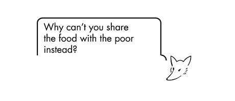
On the biorefinery poster the fox says: Why can’t you share the food with the poor instead?
The fox appeared during the process because it pushed its way in. It simply wanted to be included; it wanted to be on the posters. After it had become an idea, it was quite easy to convincingly explain the importance of its role. The reason it actually developed was because the first draft with multiple foxes didn’t work.
- The Designer talks with relief about a breathing hole, a vent, a place to be cheeky – and he also talks indirectly about a national organisation and communicates about a controversial topic. It has perhaps not been quite as free as he describes?
The next section will continue to reflect on these reflections-in-action enabled within the force-field of this dialogue between the designer and the researcher, which was created directly after the exhibition. By adding another, more analytical level of reflection some conclusions become possible that take us back to relating design research to actual practice.
Back to the practitioner
Familiar with the constraints and ‘value traps’, the Designer tries actively not only to overcome them but also to build upon and create constraints (Pirsig 1974:302). The Designer actively determines the constraints for his work as a tool to induce new ideas. He invents ‘points-of-attention’ and tries to identify where the ‘soft spots’ in the design process are. In addition, he works vigorously, nearly to the point of exhaustion, to find information and visual inspiration from the popular culture and the field of science to expand his repertoire of expression.
Interested in finding out how visual ideas are created, the Researcher poses the questions: How do creative processes occur? How are knowledge, insight and experiences facilitated beyond the rational logical mode? What effect does the craftsman process have on creativity? More than just the Researcher, however, has recognised that the design process contributes to the creation of knowledge through the production process of communication – so has the Designer.
When Schön analyses his superb prototypical example from the studio, he demonstrates his understanding of many interesting aspects of the case. When Schön notes, “... Quist reflects very little on his own reflection-in-action, and it would be easy for a student or observer to miss the fundamental structure of inquiry which underlies his virtuoso performance” (Schön 1983:104), he points out a serious problem, namely, who is it that performs the reflection-in-action, and who gains insight from this process.
The analytical, self-reflective move of putting one person into the roles of both designer and researcher was created without knowledge of Schön’s study at the time of the analysis. In this approach, the insight gained makes the tacit knowledge and the practical action visible and useful for the designer. It can also be viewed as an answer to the issue Schön brings up in the following, “We know very little about the ways in which individuals develop the feel for media, language, and repertoire which shapes their reflection-in-action. This is [an] intriguing and promising topic for future research” (Schön 1983:272).
Without actually undertaking an in-depth analysis, dialogic interviews obviously reveal some sort of design constraints. Bryan Lawson divides these constraints into internally and externally related domains such as the designer, the client, the user and the legislator. When describing the design generator model he created, he explains, “... this model is not intended to form part of a design method but rather as an aid to the understanding of the nature of design problems …” (Lawson 1988:79).
In order to follow the design process and reflectivity beyond the academic level, Schön’s observation about reflective research provides guidance: “Reflective research requires a partnership of the practitioner-researchers and the researcher- practitioners” (Schön 1983:323).
In another context, how users of a variety of cultural products create meaning and experiences has also been of interest. In this case, the aim has been to develop methodologies that are able to examine so-called person-in-situation experiences. Users and informants exhibit highly creative actions, but what occurs cannot be described as design processes. The methodologies used can easily be creatively addressed. Studying person-in-situation experiences requires the use of video technology, for instance, a video cap [2] or a ReflexivityLab. Simply creating mountains of data with the technology is not sufficient, which is why the methodology comprises three types of dialogue, e.g. during the design process: the process dialogue, the work dialogue and the reflection dialogue. This opens up additional avenues to the introspective dialogue presented here. One of the main advantages of using three types of dialogue is that the action-present is stopped and interrupted regularly, thus allowing the informant be part of and learning from the reflection-in-action (Gjedde & Ingemann 2008:173-176). The practitioner can be provoked to reflect on his or her own practices and the researcher can theorise about the uncertainties and chaotic or unique aspects of the situation in question.
Notes
[1]
The entire project and the final product were analysed in detail and published in an internal stencil as working papers. The Danish title is: Grafisk Design – om de creative processer, strategier og deres resultat, Papirer om faglig formidling, [Graphic Design: On Creative Processes, Strategies and Their Results] Communication Studies, Roskilde University, 1991.
[2] See for example the video-cap presented in Gjedde & Ingemann (2008) p. 76. And technological development in: http://akira.ruc.dk/~bruno/Processual/researchingexperiences_x.html
|