Chapter 5:
Mise-en-scène - One artist constructing himself retrospectively into the future
With art historian Ane Hejlskov Larsen as my companion I am visiting a retrospective exhibition on a famous Danish artist and plan to look at how the whole mise-en-scène constructs the artist and the visitor. Ane and I are open to finding the cues and leitmotifs that can help us expose unarticulated arguments that block the impact of the exhibition as a whole.
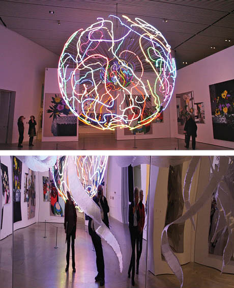
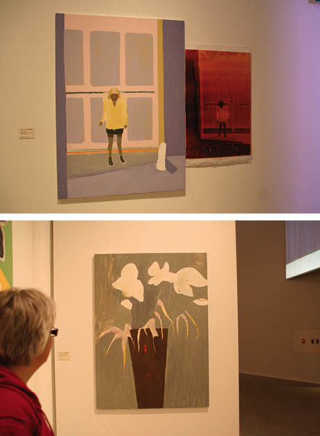
A key aspect of an exhibition is the amount of time visitors allocate to the exhibition. Spending a half hour on an exhibition allows time to quickly get an impression of the exhibition and the artist’s motifs as well as the materials brought into play, not to mention the museum’s agenda. This is also true for the retrospective exhibition of the Danish artist Erik A. Frandsen at ARoS Aarhus Museum of Modern Art, where Frandsen’s brilliant neon globe, huge flower pictures, peculiar steel plates with cut-out flowers and neon lights are on display. There are also various particle board pictures made with a fretsaw, half-empty charcoal drawings, pulsating red and orange neon shapes, photographs of a naked couple and the tracks they make set in LED lights, mock-ups of the artist's family home, colour negatives next to paintings with the same motif and large, heavy glass mosaics [Ill. 5.1]
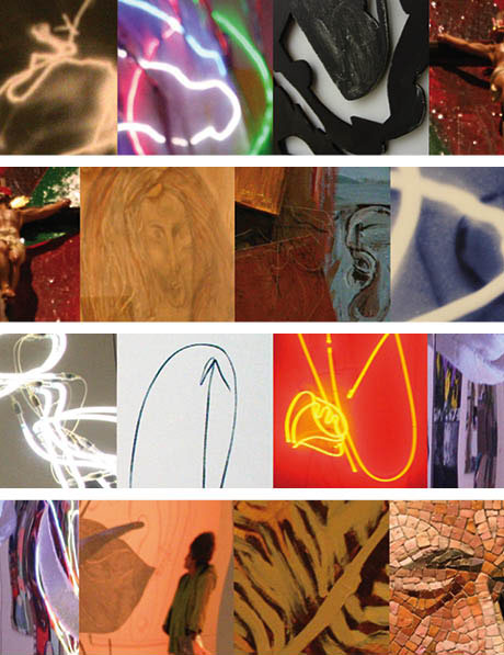
Ill. 5.1: Close-ups of artist Erik A. Frandsen’s many motifs and techniques.
Below is an example of one of the brief descriptions the museum provides to help viewers with the overwhelming visual experience they encounter:
Mud and blockades
After a riotous period Frandsen retrieves calming inspiration in Nordic art. This results in a number of monumental paintings, the so-called mud paintings, where Frandsen creates an anti-classical painting in which pictorial space disintegrates and the figure more or less blends in with the background.
Unless highly knowledgeable about art, viewers may immediately give up when confronted with the concept of e.g. Nordic art. Is it in fact a well-defined concept where Munch, Hammershøj, Krøjer, Billgren or whoever else automatically comes to mind? Will readers be familiar with what an anti-classical painting is? Some viewers will be enriched by the framework the texts provide for the pictures and by the challenge and invitation to dialogue with the artworks on display. Paramount to creating a dialogue however is not the texts, but how the mounting is structured and the spaces are laid out.
An exploration of these other cues reveals additional aspects of the exhibition not evident in the texts and points out the other phenomenological and communicative approaches taken by the museum. This exploration does not primarily focus on the artwork but rather the staging, arrangement and textual framings performed by the museum’s curators and how these design elements work as a whole to construct one or more narratives. The analysis will mirror the approach taken in Mieke Bal’s splendid book on reading exhibitions, Double Exposure, which explores “… three areas of exposition usually treated separately: museal exposition, the exposure of bodies in cultural artifacts, and exposition of arguments” (1996:5).
Bal also emphasises that the most obvious place these three areas of exposition are integrated into is in the actual, specific exhibition of artefacts in museums and galleries. She explains that the selection and ordering of items is, “…. made ‘readable’ on the basis of arguments which often remain unarticulated, but which tend to be related to a particular kind of use value. One such value is aesthetics; another one is knowledge, including historical knowledge” (1996:5).
Thus the aim of this analysis is to make what often remains unarticulated into transparent and visible traces related to the lifeworld of the visitor and the art history background of the curator.
Searching for indicators
Entering the revolving door at ARoS from City Hall Park, visitors check in, hang their coats in the wardrobe and gain an overview of the various exhibitions. A large curved staircase leads to the exhibition on Frandsen, who turned 50 in 2007. The museum's programme explains that it is a retrospective exhibition of works from the past 25 years and covers over 2,000 m2. The exhibition begins even before entering the building, where brightly coloured neon signs hang on outside walls and on the various floors by stairwells.
A retrospective exhibition is far more than the individual works of art. In this case it spans over 25 years, the rooms creating numerous sequences and narratives held together partly by the individual works of art, but also by clues put out or highlighted by the artist and the curators.
The ARoS exhibition, in principle, addresses anyone who comes to see it, the presentation of this major exhibition on Frandsen stresses that he is an artist of international calibre. Because of areas of expertise, art historian Ane Hejlskov Larsen and I, a communication theorist, are not just average visitors. Our visit will stretch well beyond a half an hour into an entire day and the aim is to enter into a dialogue about this exhibition from two different points of view.
The exhibition is called the ‘double space’, but the museum offers no explanation about the meaning of this term during the exhibition. Finding out what it means requires reading the little pamphlet available by the stairs or buying the exhibition catalogue in the museum shop. These two resources reveal that double space has two meanings. The pamphlet states that it specifically refers to the exhibition entrance room, while museum director Jens Erik Sørensen’s introductory article in the catalogue explains that the double space occurs with the tray-image series, characterising the double space as “… a stylistic sandwich of figurative expressionism and abstract minimalism” (2008:40). Unaware of these definitions, Ane and I see one aspect of the duality as referring to the relationship between the artist’s work and the role of dissemination. Our initial interpretation of double space before reading the pamphlet and the catalogue is the one we use as a central thread throughout the exhibition.
During our visit, in addition to examining how other indicators develop and merge together, we will discuss the everyday experiences we encounter that can both appeal and repel visitors.
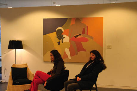
Ill. 5.2: Two girls sitting much like the Frandsen family in the picture in the background. Everyday life as sociological and psychological categories is stressed.
Visitors under 16 years of age
Our eight-hour non-stop stay in the museum ends in a special room for Juniors that includes three environments with chairs meant for one family perhaps comprised of a father, mother and two children. The main theme of the room is family. A pair of Frandsen's paintings hangs on the walls and by the door is a text entitled ‘erik a. frandsen JUNIOR’ followed by, “The family. How much do you know about your family? Who makes the decisions? Who is the greatest? Who makes the least noise? Who is most fair? How many people are there? What is the family structure and pattern like?”
Although the goal is apparently to talk about family, we focus on the dissemination approach [Ill. 5.2]. Dissemination generally means reducing the complex material that makes up life and art, but the text by the door is a bit strange. Small children and young people can of course talk about their own families on a sociological and psychological level as the questions posed propose, but how do the issues raised relate to Frandsen’s exhibition? Dramatically focusing on the family as an interpretative key to understanding Frandsen’s art perhaps focuses too heavily on its content. Focusing unilaterally on the content renders Frandsen’s experimental use of various materials invisible, leaving visitors less likely to address this aspect.
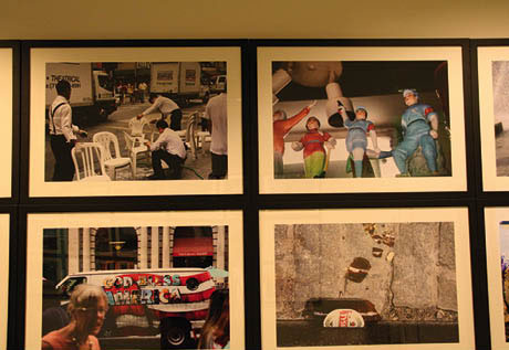
Ill. 5.3: Are these snapshots simply family snapshots or are they sketches for what will become large paintings?
The questions asked primarily focus on the visitor’s family, consequently narrowing the exhibition and making it rather one-dimensional instead of opening it up. Families can also choose to relax in the chairs and talk about what they saw in the exhibition, which is what we do. We also talk about the large, beautiful photographs taken by Frandsen that hang closely side-by-side in a long row outside the junior room. Ane and I read them as travel images, agreeing that they differ from the snapshots a normal family would take as tourists. Some photos are of family members, e.g. Frandsen’s wife and son, identifiable because we recall their faces from paintings earlier in the exhibition that have made them familiar to us. The family and its welfare play a supporting role in the photographs, just as they do in the paintings. The photographs chiefly reveal Frandsen’s visual fascination with other cultures, lifestyles, colours, clothing, landscapes, people and objects. Recognisable motifs from Frandsen’s paintings also appear in the photos, e.g. a close up of a tray of fruit balanced on a white wooden staircase on a hot summer day, two stuffed birds, a pale purple hotel with a woman, perhaps Frandsen’s wife, about to undress. His paintings take these motifs and make them even more static and eternal.
Hence the photographs outside the junior room work not only as photographs but also as models or preliminary sketches, but they are more than just momentary snapshots and were released prior to the exhibition as a separate book entitled, The Frozen Moment Desert – Scared Shit Restless To-tolerant, Reading Time (Killing Time), Acknowledged Memorabilia, Time Has Come-For Real Immigrant-Travelers, Photo Book. The decision to place the photographs beside the junior room and not in the main exhibition so visitors can easily discover the exciting connection between Frandsen’s paintings and his photographs is a bit odd as the photographs play an important role in understanding Frandsen’s image perception and image method.
The teaser and many indicators
The staircase leading down to the exhibition has a number of similar black and white portrait photographs mounted with white passepartouts in classic, light wooden frames, the curvature of the museum walls providing a panoramic effect. Although we move from one photo to the next, we remain aware of the images in front and behind us and zoom back and forth to see how the individual photographs differ. The pictures have the same recurring motif of a barely perceptible naked woman who becomes visible with the help of a light mounted on her body. When her position changes, the contours of her body are revealed.
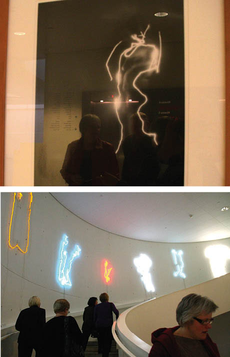
Ill. 5.4: A black and white photograph of a woman with light showing her body movements.
Ill. 5.5: Colourful neon light images hanging along the museum’s curved staircase transform and enlarge the movements of the woman in the black and white photographs.
We alternate between the photographs and discuss Frandsen’s technique before reading the first display text. We both remember the Danish COBRA painter Asger Jorn, who, similar to Picasso, made drawings with light. These drawings were photographed in photographer Poul Poulsen’s studio in the 1950s. The idea was to paint with a flashlight to create a work that only became visible when the negative was developed. Frandsen’s photographs are not drawn with light simply to deliberately create a drawing using light, but to represent movements. The woman – or the artist captures traces of an action on camera, e.g. the woman caressing her body or removing articles of clothing.
Curious about the technique used, Ane and I discuss whether the images are caused by the light strapped to the naked woman’s arms and legs or whether the traces of light are the result of the artist drawing around the model in a mirror or standing behind her? Text informs visitors that the woman in the photos is Frandsen’s wife, Annette, and that putting lights on her arms to create the images was Frandsen’s idea. Frandsen most certainly chose the specific photos on display, transforming them into the process of undressing, which in turn provides an indication that guides us as we move further into the exhibition.
Further down the steps there is a neon relief, which reproduces the trail of light from the photographs. The woman disappears completely now along with the black and white photos, but her motions, together with photographs, are echoed by the tracks of light. Her presence however would have been invisible in the neon lights without having seen the black and white photos first. The one medium builds upon on the other to create new meanings.
The neon items share the joint title Ghosts, causing us to associate them with Ghostbusters, an American film with impish ghosts, but the accompanying text on the wall states, “… Frandsen’s neon ghosts show a new interpretation of the woman’s portrait ...” We are much happier with the other more interesting associations we have come up with and that have been triggered by the works of art along the stairs. We do not invent the leitmotifs; we are getting a gift with various elements to use in our own construction of the leitmotifs.
In the next room, which is still close to the neon lights, we talk about how fascinating and fun they are, but that they might have been pretty boring and quite invisible out in the public domain, unless they were much larger. We recall a variety of famous neon lights in the commercial world with highly simplified, clear motifs designed to communicate in the dark of night. They are visually compelling, but they have no strong textual anchor.
The reflections, e.g. of other visitors in the glass on the black and white photos are annoying, but it remains to be seen whether these reflections will be revealed as a leitmotif.
 Ill. 5.6: The neon globe is fascinating because it mirrors the movements of a couple’s hands during intercourse. Intimacy is blown up in size in industrial neon light. Ill. 5.6: The neon globe is fascinating because it mirrors the movements of a couple’s hands during intercourse. Intimacy is blown up in size in industrial neon light.
Ill. 5.7: A cylinder and wall covered by milled steel show the reflections of visitors. The artwork is more than just the physical objects.
Artworks, structure, space – staging the beholder
The exhibition is free of the constraints of time – or it is merely in the present. The museum’s architecture helps strengthen the feeling that time has stopped for us as visitors. No disruptive phone calls, no city noises and no pressing duties to take care of. We are focused on being present in the exhibition. We meet other visitors with the same goal, walking two by two and talking together about what they see.
We walk through a black automatic sliding glass door, not because we are being lured by something, but because we always go in here. Many additional colours and lights beckon to the right of the sliding glass doors, but we ignore them and choose to go through the doors, because we believe the museum intends for us to start here. As we move toward the sliding glass doors, they open slowly with some resistance to reveal a large captivating light sculpture five meters tall hanging from the ceiling. Shaped like a ball and almost touching the floor, it entirely fills up the space in front of us. Brilliant in every sense of the word, it totally overwhelms us. This giant neon globe consisting of an organised jumble of neon-coloured threads woven in and out among each other is reflected in a small mirror. Later, after reading the booklet for the exhibition, we discover that the aforementioned leitmotifs are at play again, thus enhancing our experience of the neon globe, whose intricacies are the result of more than just play. The pattern evidently stems from the couple’s hand movements during intercourse. A pivotal aspect of this work is that the viewer is also reflected in it.
The teaser with the mirror at the entrance put us both on the trail of mirroring as a new guiding indicator. We discover that the entire room and anyone going into it enters into the works as reflections, covered and uncovered into infinity. The mirrors are not placed randomly, but staged with precision, the spatial mechanisms making viewers aware of space as a form that engages.
We talk about what the work really is. In isolation the actual neon globe could have hung anywhere, but certainly not over someone’s couch. The design makes it appear as though it were made for the room, where it is displayed, which is the case to an even greater degree in the second room to the right of entry room. In the second room, the globe is reflected in a cylinder of steel and walls with steel plates with fantastic flowers milled into them. The reflection from a moving rectangular red neon light in the third room is also reflected in the steel plates. Clearly integrated with each other, the globe, the cylinder and the rectangle in these three rooms combine to constitute a work of light and movement that rises far above the decorative to create an extraordinarily intense experience where the art work and its individual elements, in a sense, become invisible. The rooms themselves and their entirety as works of art in turn become visible via viewers’ movements. We are confronted by several rooms: the room with the images, the motifs and their relationship to each other, as in the first room, and our own specific activities and those of visitors, as in the second room. The images are reflected in each other and visitors are involved in this strong mirroring effect. We are convinced that visitors of all ages will easily become aware of this indicator. Nonetheless, we are doubtful whether the other indicators in the exhibition appeal to all age groups.
Ill. 5.8: Top row: some of Frandsen’s first paintings, which were done quickly with cheap industrial paint. Bottom row: black wooden reliefs made with a fretsaw.
The second structure: chronology
Around this core of light, movement, flowers and viewers is another story that is clearly chronological. The chronology begins as soon as we move to the left side of the entry room and continue from room to room, our comments interconnected to each other. Skipping some rooms is not an option, though some artworks are more entrancing than others.
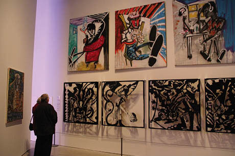
The story begins in 1982, where we meet a young man, Frandsen, who is trying to experiment with different materials. There are big black wooden reliefs measuring 122 x 122 cm. Packed with action, they are highly figurative. Above them, hang some of Frandsen’s first small oil paintings, which are splashed with acrylic and bicycle varnish. Ane remembers them from Eks-skolen, a highly experimental art school in Copenhagen, where the images were created in the space of a few hours. Highly expressive with a humoristic distance, they are supported by the casual pencil drawings on the other side of the wall that show drinking, women and penises. The drawings, based on proverbs and language games, are commented on in vulgarised, symbolic language. Any visitor over the age of 13, no matter their level of experience, would be able to understand what was going on.
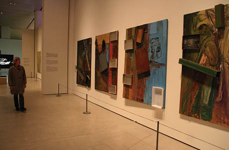
The first year covered by the exhibition is dealt with briefly, the art historian apparently having left out several earlier pictures not deemed relevant for the retrospective selection the exhibition is built upon. In the next room we jump directly into several collages. There are pieces of wood stapled to some of the paintings. On another wall, there are paintings of Christ crucified and red, green and silver boxes are attached to the paintings. The third wall contains large oil canvases, where outlined figures fight their way through a muddy ground of green shades. The museum appears to be showing how Frandsen was testing a little bit of everything at that stage at a rapid pace. The question however is whether the museum’s selection of items reduces Frandsen’s production to too few works, thus making it guilty of a historical misinterpretation of a young artist’s beginnings. Or does the museum strengthen the conviction that the talented painter quickly found his own identity? Answering these questions with surety is difficult, because we cannot remember all of his intermediate artistic endeavours.
Ill. 5.9: The abstract painting covered with many salvers. This is what the museum calls the blockade theme’ and is a central indicator in the exhibition.
According to the museum, Frandsen is in full swing after his initial four years of experimenting. The museum’s presentation of this part of Frandsen’s journey works as an indicator to help visitors understand his subsequent work cycle, namely what they call the blockade theme. This theme is presented in a room where trays and wires are nailed to the ground, which is filled with coloured figures gesticulating wildly with their arms, legs and heads. In another room pubescent girls in yellow paintings that are fitted with small rubber rings also take up the blockade theme, which is designed to be an interpretative key to the rest of the exhibition. A silent black and white film with naked girls dancing around in a crude storehouse is being shown in this room. While we are looking at the video, a group of pre-school children come over, stop and take a look. One of them exclaims, “Look bottoms!” The teacher quickly removes the children from this part of the exhibition and encourages them to move forward. We are surprised by the teacher’s reaction and perhaps also their motivation for bringing the kids to the museum. Can the children follow the indicators the museum provides or do they create completely different ones? Pursuing the answers to these questions might be interesting, but not possible in this context.
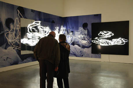
Ill. 5.10: A couple in the act of looking at a couple in the act of making love. The lonely woman at the beginning of the exhibition has now met her man in the lovemaking scene. Light as blockade.
The blockade theme extends into a large room that moves the chronology ten years forward in time. The museum has written, “The motif attracts our gaze, but the traces of light block further insight”. The motif is a bed with a naked man and woman touching each other, but who are both covered. The huge blue and black glossy photographs are covered by large mirrors that partially obstruct the view of the motif. Interwoven neon lights are placed on top of the mirrors. The photos provide evidence of how the movements and traces of the movements of their hands are transformed into traces on the photographs. The small lights fastened to the naked man and woman’s arms are clearly visible.
On one level, we understand why the museum chose the blockage theme, i.e. one thing blocking something else. The mirrors obstruct the photograph and reflect the neon tracks but also the room with the other trail of light. The visitors are mirrored in between everything else.
This cold room however moves us away from the blockade theme and away from the chronological narrative, back to the initial teaser by the stairs leading down to the exhibition. The numerous small black and white photographs of the woman with the trail of light from getting undressed and the fine small traces of light provide an indicator that is now being unfolded in the room we are standing in, which, oddly enough is called Untitled. Luminous moving tracks cast an explanatory light back on the stunning colours of the luminous neon globe that is the pivotal point of the exhibition.
The chronology on the perimeters of the rooms around the bright neon globe and the big mirroring cylinder switches character and provides an evolutionary tale: the couple - in love – the shared home – the family with children – and out into the world. The blockade theme, the whole idea of blocking the view of what lies behind, is fading from our view to be replaced by a great painter who paints everyday motifs of scenes recognisable to Danish families: the child with a saucepan on her head; the baby being dried after a bath; individual portraits or with family members. The paintings resemble and are family photographs, albeit not naturalistic reproductions. Clearly, what we see is a heavy magnification of the colour negatives next to the paintings, where only the colours from negatives are used as a starting point for the paintings. A striking feature of these paintings is their unique overwhelming colour scheme, which creates interest, opening visitors up to the wonder of familiar, stereotypical motifs, allowing them a chance to see their own families through Frandsen’s paintings.
Ill. 5.11: The girl in the painting is based on adjacent colour negative.
Ill. 5.12: The fantastically feminine, homey and familiar flower painting has a Japanese touch.
Another dominant motif in Frandsen’s pictures is flowers. It is as though we are really sitting in Frandsen’s room watching the changing floral arrangements, the displaced colours openly visible. Ane thinks that the paintings have a Japanese touch, caused perhaps by the surface, the brush strokes or the simplicity. The indicator we came up with was that of making traces. Physical traces are evident, but mainly it is the mental traces of the painter, who has transformed what is highly familiar to us into something that makes us look at both his paintings and daily life in a new way.
The chronology of the outside world ends with the present in the last room, which contains giant paintings and glass mosaics made after 2000 that are too large to fit anywhere but a public building. The museum’s final line of text states triumphantly, “... monumental works of art for eternity”. This last room is overwhelming because of the multitude of works it holds. Our impulse is to remove some of them to make it possible to see what the message really is.
The huge paintings (262 x 391 cm) are based on excellent photographs and are far better than what the museum calls “... snapshots of scenes from everyday life ...” The motifs from the artist’s home and those with flowers easily conjure viewers’ own stories about their families and lives. In this way the paintings’ motifs are far more ambiguous and open, leading us to look for stories and ask questions. Where was it taken? It has a southern feel? And those kitsch figurines – I wonder where he found those? Why does he think they are so interesting?
A new indicator emerges, one that is thing-like and museological. Frandsen collects things. Or he paints things from collections or things that become valuable when collected, like Chinese figures and figures of the girl with the goat. But there are also giant paintings of small stuffed birds on a cut branch and a huge cherry on a green surface.
Ill. 5.13: The huge glass mosaics look like photographs at a distance and become even more fascinating when seen close up.
Before seeing the exhibition we read about the large glass mosaics (300 x 220 cm) and had seen small photographs of them where they appear to be snapshots. They are most fascinating when you stand close to them and look rather nearsightedly at them, allowing you to study the many fine mosaic stones in various shades and shapes. At a distance they lose their power and become what they once started out as, namely photos. It is a paradox. Using photography as a starting point for something different and more is a common feature in Frandsen’s works. In this case, however it only becomes interesting in a bad way: imagine that a photograph can be reproduced in such a lifelike way. The exhibition has taught us something different about what Frandsen’s approach is. He usually works and displaces the motif and the colours. The displacement is what adds something new to recognisable motifs.
Chronology and the existential leitmotif
Chronology, central to the exhibition, is also made central to the viewer, the design of the exhibition expertly facilitating the opportunity to follow the existential indicators. This can be seen in the short form in Frandsen’s works and their presentation. We see the artist, born in 1957, as a young man, confused, alone and searching for ways to express himself (black wooden reliefs, barriers, lead frames with pubescent girls, the couple (with lights), in the family (child with a saucepan on her head), floral images and, finally, out into the world (with mosaics)).
The existential indicators provide both a look at the artist and his human development in what are perhaps autobiographical works. Viewers receive not only a new perspective on their own lives but gain knowledge about their peer’s lives. I remember well the turmoil of the early adult years and seeking to define my identity in many directions. Coming from a rural town I was in search of something or someone who could show me exotic new things not acknowledged in my unsophisticated hometown. It is a distinctive feature of the exhibition that its structure and content create a great deal of exceptionally personal stories and experiences for the viewer that involve issues that remain undiscussed for a long time, but that suddenly become topical in the exhibition, e.g. turning 25, the birth of one’s first child, turning 32, reaching 50 etc.
Gaining a biographical or psychological understanding of the artist is not the main goal, but paradoxically the small hints in the exhibition’s chronology turn into quest for parallels in one’s own life or circumstances. This dialogue about Frandsen and the periods of his life provide space for the articulation of our own lives without becoming a question of identification. This space is a consequence of the dissemination approach used, which has created a chronological cycle around a spectacular space without actually being supported or displayed in the accompanying texts in each room.
We discover our urge to talk about his and our own lives and are exploring the different ways to experience the exhibition and one of them is what we call the age leitmotiv. Is it an exhibition for people over the age of 50 who are able to recognise the different life stages? Is the personal story in the exhibition so strong that it appeals to mature adult viewers, creating in them a desire to talk about themselves in different life stages? Are the existential indicators most closely linked to people who have some experience and who have passed a certain stage in the cycle of life? What would the exhibition communicate to a 16-year-old?
At the end
This analysis of the Frandsen exhibition at ARoS is framed by phenomenology and dissemination. Our aim was to conduct an experiment that meant spending a day in one exhibition and allowing the artworks, the rooms, the displays and the whole ambience to present the possible leitmotifs to us that, as Bal provocatively explains, often remain unarticulated.
We were not ordinary museum visitors who commonly spend less than an hour on an entire exhibit and who perhaps later visit another temporary exhibition and the ordinary collection. Andreas Huyssen’s book, Twilight Memories, points out the acceleration that has affected the speed at which people pass in front of exhibition objects:
… just as in our metropolitan the flâneur … has been replaced by the marathon runner … the museum … is increasingly turned into an analogue of Fifth Avenue at rush hour … Perhaps we should expect the museum marathon as the cultural innovation of the impending fin-de siècle (1995:23).
Ane and I are also two people with different, but deep insights about art, communication and museology. Readers may wonder about the minimal amount of traditional academic writing in this chapter. By using phenomenology as the framework of our visit, our experiment and the exhibition analysis are combined with the narrativity to present the artworks, the rooms, the text and the ambience to the reader – and to push the narrative text into the foreground, thus leaving the theoretical foundation of our analysis less articulated.
The exhibition could have been analysed to explore who visitors are, what their competences are and how they perceive the actual exhibition – but the aim was to broaden the perspective by using our competences to identify a range of possible indicators that could have been actualised for the ordinary user in the presentation and framing of the exhibition.
This could-have perspective has been fruitful for our experience of the exhibition, allowing us to successfully pinpoint eight to ten leitmotivs not specifically articulated or clearly presented in the entries or textual displays designed and executed by the curator for the user. We unearthed a variety of coherent indicators, cues and leitmotifs that make the exhibition and Frandsen more meaningful and more provocative. Museologist Eilean Hooper-Greenhill believes that there is no one single way to interpret exhibitions, which thus requires having various entrances to the exhibit available:
The meanings of objects are constructed from the position from which they are viewed. The gaze of the knowing subject … focuses on those aspects of the object which s/he is able to recognize and thereby grasp both visually and conceptually (2000:103).
The dissemination is crucial in providing the visitor with a relevant framework. Unfamiliar with the Czech language, Bal noted that while visiting an ethnographical museum in Prague she was relegated to experiencing it only as art, because she had no other framework to refer to than the aesthetic aspect, “From ethnographic concerns, the exhibition, without moving an inch, became an art exhibition” (1996:81).
The Frandsen exhibition at ARoS left many indicators untouched and hidden, but the curator may perhaps have had another agenda. People who visit retrospective exhibition can reasonably expect to get a fair understanding of the progression of the artist’s work. The presentation of Frandsen’s first 15 years in the field of art is rather fragmented, failing to demonstrate how the fascinating fragments lead to who he is as a mature artist. Quantitatively most of the exhibition space is filled with artworks produced within the last ten years and especially the most recent years are overrepresented.
The ARoS agenda was perhaps to do more than just present the artist from a retrospect perspective. The museum conceivably wanted to adjust the exhibition according to Huyssen’s observation that spectators in large numbers seem to be looking for emphatic experiences, instant illuminations, and stellar events that have led to, “… the current museum scene which has buried the museum as a temple for the muses in order to resurrect it as a hybrid space somewhere between public fair and department store” (1995:15).
The ARoS agenda plausibly was to promote one of its artists and attempt to sell the commodities to the public. The whole design of the exhibition underlines this scenario because it focused on the spectacular aspects fast-paced shopper wants. Thus, maintaining an interest in how the potential of the “… museal exposition, the exposure of bodies in cultural artifacts, and exposition of arguments …” can be used to create exhibitions that are more relevant and provocative is perhaps old fashioned.
|