Chapter 6:
The forced gaze: Home, shop, museum and IKEA
In its most banal form our visual existence takes place in a most familiar way, namely in the family home, e.g. in the living room. This chapter is based on two different rooms. One a living room in a bungalow as represented in an exhibition at the National Museum of Denmark called Stories of Denmark 1660-2000. The other one is a contemporary living room as presented in an IKEA store display in June 2007 in Copenhagen. Photographs, though not a target of the analysis, are used to look at these two rooms in a different way. The idea is to challenge and explore the physical space to interpret what it says about our visual existence as presented in the two exhibitions. Photographs support the dual purpose of the analytical approach, which is to look at the retail store from a museological perspective and the museum exhibition from a business perspective. In the visual culture field, the focus moves from the image itself to choice of perspective, thereby providing the materiality something social and personal.
The museum exhibition can be seen as part of the broader field of visual culture, which is not primarily - or only - images or the analysis of images. It is not the solely the media that defines the field, but also and perhaps more accurately, the interaction between the viewer and the viewed, i.e. the visual event. The English-American visual culture researcher, Nicholas Mirzoeff, states, “... visual culture is a tactic with which to study the genealogy, definition and functions of postmodern everyday life from the point of view of the consumer, rather than the producer” (1999:3). Mirzoeff refines his view of visual culture further by explaining that it, “... explores the ambivalences, interstices and places of resistance in postmodern everyday life ...” (1999:9).
If we accept that visual culture is a tactic, it means that that-which-is-out-there in everyday life not only is and has an essence, but also that that-which-is-out-there can be something special. Perhaps it is a tactic because it involves ambivalence, interstices and places of resistance, presupposing an interaction between the viewer and the viewed. This activist concept means that what makes visual culture interesting lies not only in the visual material or in the actual authentic user situation, but in interactions between the viewed and the viewer. It also means that a key position for visual culture is the ‘gaze’ as an analytic strategy that forces places of resistance, prompting questions such as: How can this gaze create a new understanding of something familiar? And how can this way of thinking/seeing the world be communicated with changing intentions?
This chapter is based on an interaction. Not between the viewer and the viewed, but between three people who have agreed to visit a store, IKEA, with the aim of finding a visual culture angle on the store and its content [1].The visit led to a fusion between the items displayed at IKEA and the exhibition of objects at a museum. It is my contention that, by shifting the gaze from the museum to the store and vice versa, it is possible to say more about “the good life” in relation to the two places and about how thinking based on visual culture can contribute to a more open, richer experience and understanding of the often invisible and unnoticed in everyday life.
From space to analytical images
The National Museum of Denmark has an exhibition of recent times (1660-2000) called Stories of Denmark. One of the rooms to be analysed, a living room in a bungalow, is part of this exhibition. The second room is part of an IKEA in-store display designed as a home for a nuclear family with two children as it appeared in June 2007. Interestingly, both the annual IKEA catalogue and the National Museum’s website [2] are dominated by large colour photographs showing e.g. entire living rooms as if they were pictures taken in real houses with real furniture and where one can imagine real people living. Both rooms are as realistic as humanely possible, their authenticity loyally representing everyday life in a contemporary home and a 1970’s bungalow.
There is however a second and more important point that involves the phenomenology of perception, which emphasises the role of the body in human experience. Viewers are not intended to be content with looking at just a website or catalogue pictures. The aim is for them to move in and out of the room to view the objects, coming close enough to see the texture in the fabric, wood, glass and metal. The idea is to move around and see how the different objects are located in the rooms in relation to each another and also imagine one’s self sitting in the furniture, or even better, actually sit in the furniture and feel the fabric, wood etc.
The rooms lead to one embodiment, or at least one use of the body - moving around and changing positions - and therefore different perspectives. The room, depending on how it is laid out, communicates a sense of either airiness or compactness that is difficult to put into words. In this chapter the phenomenological approach is used as a starting point for exploring what and how spaces and objects bear values and culture.
The photograph as the first analytical feature
Although not untidy, the rooms are somewhat chaotic due to the multitude of objects begging for attention. The general viewer’s response is often to reject the room: “Is there really anything interesting here?” From a cognitive psychological angle the chaotic aspect can be seen as either a challenge or as something boring, depending on the level of familiarity and the internal contexts. Finding a cue is necessary to establish some sort of coherency. Initially I chose to see the room in the 1970s bungalow as a phenomenon that in a simple and recognisable way is part of a schema that can be described as ‘living room’.

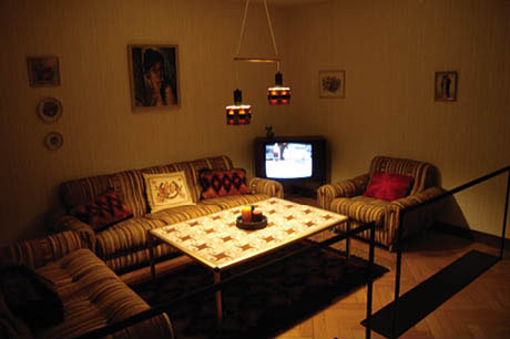
 Ill. 6.1: The room in the 1970’s bungalow is laden with heavy, comfortable furniture. The National Museum in Copenhagen, Denmark. Ill. 6.1: The room in the 1970’s bungalow is laden with heavy, comfortable furniture. The National Museum in Copenhagen, Denmark.
The first step in the analysis involved making the decision to photograph the room in a certain way to address the question ‘What is interesting here?’ To get behind the immediate schema of ‘living room’, the photos had to present the space, the living room and the objects as authentically and beautifully as possible, as though the aim were to sell the objects and the way of life presented. In general, anthropological photography is typically documentary in nature and employs the use of a tripod and flash to get as many well-lit details as possible. Even at this early stage, the choice of investigative photographic technique or strategy reflects how the analysis has already begun due to decisions made about which practices to select to do the analysis.
My photographic analytical approach is based on viewing the museum from a commodity-aesthetic perspective by:
• using only natural light to maintain the mood of the living room
• Shooting from a standing position
• Creating a panoramic photograph
• Hiding all signs of the outward context, e.g. signs, exhibition walls and exhibition spots
• Being honest to the objects
• Making the objects as beautiful as possible
• Creating the exhibition space as a living room
This approach is indicative of one of the overall aims of the rooms, which is to appear as though they were “real” living rooms by avoiding any outward traces of a larger exhibition space or display area.
The analytical photographic strategy arises from two approaches: one is the very spot, i.e. the rooms, the objects and their phenomenological potential; the second is the theoretical angle, resulting in the intersection between the phenomenological experiences of the National Museum’s 1970’s living room and the IKEA living room from 2007. The living room at the museum is looked at from a commodity aesthetic gaze perspective as something to be sold and that is part of the market economy. Later in the analysis, the IKEA room will be looked at from a museological and cultural history perspective as something that communicates about people’s values.
Analysis of photography
The task at hand is complicated because the print of the photograph to be used for analysis is also the room I photographed a few weeks ago that was built in 2000 but was designed to look like an authentic living room in a 1970’s house in Denmark. So what do I really see? I will keep these layers of complexity in mind as I analyse the photograph.
The 1970s room in the picture is dominated by large, heavy furniture comprising two sofas and an armchair. The central piece of furniture is a large tile-topped coffee table with steel legs reachable from all seating positions and not the television, which is relegated to the corner, an impractical spot making comfortable viewing for everyone seated almost impossible. Although functionality is important, the main purpose of the room is for people to have a good time together, which is clearly reflected in the decor, e.g. the solid brown, orange and red candles in the brown stoneware dish from Bornholm and the coarse, conspicuously striped brown and beige upholstery on the well-stuffed sofas and chairs. There is also a red and black shag rug under the coffee table and three shag pillows strewn on the furniture.
The home, in this case the living room, is an important reflection of the owner’s status and identity, much like a brand. It is also a stage upon which people present and promote themselves. The objects in the picture depict and represent what the good life is and who has the good life. Analysing the values displayed in the image of the room is quite difficult. The anthropological approach is to let these values appear through the people who buy the furniture and design the living room (see e.g. White Berg 1989). This approach also shows the potential that lies in the presentation of objects as signs open to interpretation and identification.
According to the photograph, the good life means gathering around a table lit by the only light in the room. Two copper lamps spread light onto the coffee table, some of it spilling into the room, thus creating a warm light and gentle ambience enhanced by a cushy sofa ensemble in muted brown and beige tones. With its deep chairs, the room invites you to sit with a cup of coffee to be together and talk, not play cards or other games. Six people can sit around the table, but what about guests? The number of seats, six, perhaps indicates that the family only has one child, hence leaving space for at least three guests.
The clunky furniture is also an expression of luxury, not because the furnishings are luxurious in themselves, but because having such large furniture is only possible if there is plenty of space. The furniture is placed tightly together around the shag rug and tile-topped table. The walls are decorated with various pictures, plates and a single photograph, all hung in a rather random manner. The photo, graced with a thin gold frame, is important and is perhaps the most important official photograph in a family’s life - namely, the wedding picture. A classic photo of the wedding couple, the bride in white on the left and the groom in black on the right, confirms who this interior is for: a family and not young people who recently moved away from home. The wedding photo, which is in no way highlighted by the room’s lighting, hangs noticeably alone, almost in darkness, which is in contrast to other decorative objects such as the pillows. On the couch, the two completely identical bright orange shag pillows with a strong diamond pattern have a primeval feel that blends well with the Viking-like pattern on the surface of the coffee table. These two pillows are in stark contrast to the light-coloured old-fashioned pillow finely embroidered with romantic flowers and birds that they flank.
The most significant visual element is the painting or lithograph of a half-naked gypsy girl placed predominantly over the middle of the sofa. As the main decorative element, its naturalistic style is powerful but in a different way than the shag pillows. The painting is almost transparent, offering a look straight into the reality or the dream of something wild, natural and exotic. This living room speaks of romance and romantic dreams coupled with a touch of something wild and different. The room contains elements that are familiar to many Danes, but it also has deficiencies.
The room is clearly being presented to someone who is alien to it. The wedding picture and pillows etc. are clearly personal items, but our familiarity with the genre helps us immediately identify that many of the objects are also impersonal: the candles are unused; there are no newspapers, magazines or books; no toys, used coffee cups or playing cards. There is not even a single plant. Other missing objects that come to mind are: a bookcase, a corner shelf for knickknacks and commemorative items. Thus with regard to visitors unfamiliar with a typical 1970s Danish living room, the creation of identity is weakened.
Finally, the fourth wall is missing. The photograph was taken where a wall might have been or where the living room continued, leaving room for a door or window. The missing fourth wall turns the living room into a naturalistic theatre where the actors are not permitted to look at the audience. There is a parquet floor with black markings indicating the edge of the room, the only specific sign that we are in a museum.
All of the objects in the living room can be bought in a store, which means they have a utility function and a commodity-aesthetic signal value linked to everyday life. Post-war thriftiness and restricted housing had transformed into a period of economic growth in which new, much larger dwellings with completely new standards for quality and comfort had sprung up. Being able to demonstrate one’s surplus of space and money and translating it into new furniture and familiar styles has symbolic value [3]. The photo of this exhibition showing a living room defines viewers as buyers who have to ask the dealer about what the objects cost or what the entire sofa ensemble runs as there are no price tags. The setup allows viewers to see themselves as a family with the economic wherewithal to develop themselves.
The commodity-aesthetic perspective is that, phenomenologically speaking, one can force the analytical gaze to be one-that-buys. Those who buy are directed towards creating something new and personal for themselves in the near future. A functional problem must be solved by creating a cosy place to converse that can be realised in a large variety of ways. One-that-buys imposes upon themselves an otherness, which can become almost unbearable. It is one thing to look at the choices others make and how they act and present their ideas about the good life, another thing is actually putting oneself in their situation and to seriously consider buying the three-piece furniture suite and other paraphernalia for one’s own living room. Would I really let this room represent what the good life is to me? How does what I see differ from my own values?
What creates ambivalences, interstices, places of resistance or opposing moods and emotions is what falls outside what is ‘normal’ or ‘accepted’. In this case, the phenomenological insistence on putting values in parentheses is vital, because detaching myself from any discomfort about what is not nice during my analysis is impossible, because the “… fashion aesthetic sits on the retina” (Skak-Nielsen 1989:67). Ingrained in our mind’s eye are the period from forty years ago and the period of the current analysis, both of which are multiplied by several layers of fashion, as looked at according to Bourdieu’s concept of taste, but also several counter-culture and anti commodity-aesthetic values. The premise for the moments of resistance and the ambivalent feelings is that it was possible to allocate this space and this photograph decisive attention (see Gjedde and Ingemann 2008).
The museum gaze: objects gain value through conservation
Attention is a prerequisite for an experience. But experience is not necessary for something to be assigned a value. One can only briefly wonder how objects gain enough value to slip into a museum for eternity. Quite pragmatically, identifying unique objects, where only the original exists is easy. Conversely, there are also items that are representative, e.g. a handmade sanded stone axe made of flint that exists in multiple examples. But how does a cola bottle get value? Or a black plastic garbage bag? (See Moore 1997). Or a room in IKEA? Before addressing these questions I will examine the consequences of the musealisation of objects. One of the first consequences of musealisation is that objects lose their natural setting and will subsequently be permanently included in a collection, frozen in time by future exhibitions. They are things of the past; they get value (Baxandall 1991).
Is the store display at IKEA looked at from a musealisation perspective? Does this perspective turn it into something we cannot buy, but that we can look at as a representation of a particular way of thinking about home and the good life? Outside the display there is a large photograph of a man, a woman and their two 8-10-year-old boys that openly and clearly presents an idea of a typical family that might actually live in these 122 m2. One aspect that is not entirely typical is that the father apparently has a different ethnic background than Danish. This visual representation makes assumptions about its audience, who will perhaps better be able to identify themselves as one-of-them or one-of-the-other because of this factor. This family constellation also expresses openness and tolerance for what is not commonly seen in Denmark (see Ill. 6.2).
Analytic photography with a distance
Musealisation comprises a built-in distance. We experience the impulse to identify with the picture, but we also wish to create a distance by putting a new layer on the experience itself and the pragmatic use of it by looking and searching for what makes these objects into something special in a non-everyday situation. Doing so requires dual actions: looking closely to find striking details that are meaningful and explanatory, and creating a large distance that puts all of the details into a whole. Progressing through the analysis may reveal that a different strategy is required.
Similar to previously, my analytical photographic approach, which is based on a musealisation way of looking at the objects as commodities, involves:
• Using a flash to get sharp, clear details
• Shooting from multiple positions
• Taking pictures at several distances: close, nearby and far away
• Making all signs of the outward context clearly visible, e.g. signs, display walls and display spots
• Constructing a situation
• Constructing a clinical gaze
• Creating a space - like the exhibition - as an expression of the overarching strategy to produce the constructed space as part of a larger exhibition.
There is a temporal aspect of any exhibit: the time between the production of the original object and its installation and then there is the temporally displaced moment when viewers see the exhibition. This analytical slant is provocative, because cultural history exhibitions generally use time to create distance. Exhibiting the 1950s is easier than exhibiting the present, because a natural selection of objects over time has taken place.
Analysis of the photographs
A widely used approach among museums that dates back to world exhibitions in the 1800s in London and Paris involves the interior principle, which means creating exhibitions in realistically depicted environments (Skougaard 2005:103-105). At IKEA, the time period is the present and the objects are new or recently manufactured. Applying the somewhat uncertain selection criteria that turn objects into museum objects is difficult. The criteria could be prioritising unique items over general ones; the representative over the divergent; or craftsmanship over industrial production. As an analytical approach however I can claim that this is selected and musealised, and look at what meaning is possible to extract out of the display.

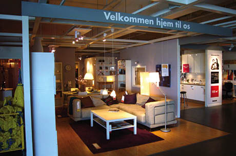
 Ill. 6.2: IKEA exhibition photographed on 13 June 2007 at 10:33 AM. Ill. 6.2: IKEA exhibition photographed on 13 June 2007 at 10:33 AM.
The display-cum-exhibition at IKEA has a number of different built-in forms of knowledge. The first room has a corner sofa that draws our attention away from the multitude of objects visible in the photograph. Then there is the linguistic anchoring of the entire exhibition. A beam stretching across the room invitingly states: Welcome to our home and anchors the entire exhibition linguistically. This supplemented by a marketing sign to the right showing a family picture with the same title, nearly leading the viewers’ attention from the home to its potential. Just under the family photograph is a floor plan of the visible part of the exhibition and what we can expect to see. Below this is a red square with white lettering that highlights how big the apartment is. The 122 m2 floor plan is clearly reflected in the life-size physical space and the clear demarcation between the light wood floor of the apartment and the store’s ordinary dark linoleum floor.
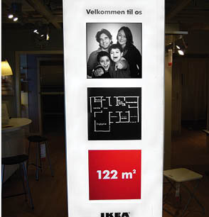
The four meta comments set the scene for what could become a narrative. A column of three boxes on a sign set the scene for the possible story and communicate through a sequence of iconic, indexical and symbolic visual elements. The next part of this chapter describes the different visualities of the three boxes from top to bottom.

Ill. 6.3: Sign column with sequence
of three boxes.
The first image in the sequence is a photograph of a family that is by no means an ordinary snapshot taken by another family member. The background is completely neutral while the photo is closely cropped and stripped of any unimportant elements and devoid of the blurriness, lack of cropping and spontaneity most often evident in casual pictures. The family portrait does not show neatly lined up family members radiating introspective kindness. The communication is aggressive and greatly aware of the beholder. The text says ”Welcome to our home” but the compositional energy of the photo rests in the boys’ pointing fingers, which echo the famous poster of Uncle Sam used to recruit soldiers for both World War I and II that states, “We want you” [4]. In this case however it is not the US government authoritatively ordering me to obey a command. The family comprises three males with open-mouthed smiles and a female who smiles less enthusiastically with a closed mouth.
Presumably in their mid-thirties and no longer studying, they have two children and an active life. The iconic elements of the photograph connect communicatively to similar images. The indexical features partly connect the image to our generalised understanding of the schema, which places two adults, one of each sex, with two children in the schema of a nuclear family, and partly to these specific unnamed people for whom we can easily construct a background, e.g. their occupations.
The second image in the sequence is a floor plan for the apartment, perhaps hastily drawn by an architect for the family but with each room clearly labelled. Cartoon researcher Scott McCloud explains that the space between two images in a sequence is the point at which something interesting arises and in this case it is the interaction between the photo and the floor plan (1993). There are two interactive processes that take place in the relationship between images and pictures and space and viewer. One process simply involves placing the four people where we think they fit in the rooms on display, a bedroom for each of the two boys, one for the parents and perhaps an office. The second process is to create a connection between the abstract sketch of the floor plan and the actual physical spaces (the kitchen and the office) located just beside the sign with the three pictures. There is an alternation between the predominantly indexical floor plan and the iconic physical space.
The third picture is a red square that functions as an exclamation point for the entire history and serves as an answer to the questions that arise when visitors look at the sequence of pictures. The answer to how big is this home is 122 m2.
The central point is that the meta comments at the IKEA display-cum-museum exhibition of a living room from 2007 creates not only the narrative elements but also the actual exhibit of the room, thus allowing for the production of a narrative and identification.
The people
The general story is about people and the importance of their home to them and that they have a home. Here, home is everything: the kitchen, bedroom, office and living room. The vision presented puts people as a starting point that is reflected in the musealisation criteria central to the collection of objects, where knowing the communicative significance the objects have for the user is important, i.e. what the user likes/dislikes and how the objects have pleased and preoccupied the user (Steen 1999). Most of all however it is perhaps the criterion of collecting and exhibiting the typical and common as entire cohesive environments that is important (Silver Garnert 1991).
The most common, typical aspect of the representation of the environment is how the musealisation perspective is frozen, deprived of a future and any kind of development. Another general feature is how white, light and smooth the objects in the exhibition are. The consistent use of shades of white makes everything highly coherent and uniform, punctuated only by a few dark pillows on the sofa decorated with a bit of dark green, gold, and subdued purple. A white bookcase contains a variety of books and numerous white cases and boxes with lids as well as wicker baskets, all designed to hold many, many things.
The white unifies everything, turning it into a large cohesive mass that creates a neutral, all-enveloping conglomeration of tables, bookcases, sofas and boxes, which in turn create a space and a background for human life and activity. There are some magazines about parents and children on the coffee table in front of the couch, evidence that the adults may have sat there and watched their flat screen TV. Picturing two active, outgoing boys sitting with muddied clothes from a football game on the light coloured couch eating chips, cola and chocolate is difficult.
The minimalism and whiteness of the room stand in opposition to the family portrayed by the display, because the room lacks the presence of memorable personal items. One item that breaks this pattern is an abstract print on the wall whose colour scheme matches the pillows on the couch. One can easily imagine that IKEA’s customers like the room, but the question is can it make them happy or worry them.
One fundamental value communicated by this room is the primacy of a democratic approach to the design in the sense that the use of white blurs social and cultural differences and causes neither joy nor worry. The room does not gain a personal identity until it is populated by people. Having a room like this is for everyone from all social strata and from all ethnic groups. The bright space is a multicultural meeting place.
Two forced perspectives
The point of this chapter is that forcing the eye makes it possible to force ambivalences, interstices and places of resistance. In the context of the living rooms, forcing the eye has two dimensions. First, there is the conscious choice to see the exhibition at the museum as a store display of objects that are part of a capitalist way of appreciating them - or to see the store display as a museum exhibition, where appreciation of the items involves a set of values that comprise cultural choices and exhibition practices (Floris & Vasström 1999:77). The second dimension is that the phenomenological experience and spatial understanding are expanded due to the analytical photographic strategy used that forms a central part of the analysis of two selected sites. This approach can easily be seen as a Brechtian alienation strategy because it makes known the less known and obvious, but also because it takes the photographic practice seriously based on a number of photographic choices.
Our visual existence becomes visible in the analysis of the photographs of the two rooms, the rather obvious comparison of the two rooms also revealing something about the person doing the analyses in a concrete, direct way. Hiding behind the proverbial fig leaf is not possible, because the photographic practice inherently contains an openness to the values the researcher brings with him. The visual event is the interaction between the viewer and the viewed, producing an encounter that is both naturalistic and analytical. The visual event is the analytical encounter.
Notes:
[1] The three professors were Helen Illeris, curator Stine Høholt and Bruno Ingemann. At the time we were all part of a visual culture network.
[2] http://www.natmus.dk/sw19052.asp
[3] One’s individual knowledge and competences can add more context to the analysis to anchor the implied connotations. The two people in the wedding photo are Elni [b. 1952) and Tage (b. 1945), who moved into a new detached house built by a local builder in the little town of Benløse. Married in 1973, they bought their new striped sofa ensemble in a shop in Ringsted the same year. Tage made the shag rug and pillows himself. An exhibition sign describes the living room as: “Parcel houses and the nuclear family: from 1960-1979 915,000 new homes were built and 450,000 of them were detached. Higher incomes, often earned by both the man and the woman, mortgage tax breaks and inflation made it possible for many people to buy their own homes”.
[4] The British recruiting poster from 1914 with Lord Kitchener pointing his finger reads: Your Country Needs You.
|

