Chapter 18:
Drifting sand
– The poetic interpretation and the process of construction. Preparation for unexpected gifts
This chapter is about sand. It is about the story of drifting sand over the course of three hundred years – but it is also about the creative process of sand, drifting sand and the creation of a multi-screen slideshow for a new exhibition. The aim of this chapter is to take stock of the creative process and find innovative ways to address the unexpected gifts arising from meeting resistance to this part of the exhibition’s form and content. Crises arose and led to despair, which in turn led to a new framework, creative answers and renewed energy.
The context for this multi-screen show about drifting sand over the course of 300 years is now a nature centre in Han Herred in northern Denmark. The exhibition text that describes the goal for the centre states:
The Han Herred Nature Centre is the central starting point for experiencing Han Herred’s natural and cultural landscapes. Here you get an introduction to this part of the country and an overview of what things you can see and do in the area. The target group is the holiday visitor and residents of all ages, but especially those who want to do something together with their children (Sorgenfrei 1998).
The centre presents a walk through the various types of nature using representations, videos, sound and experiments that greatly focus on children and on activities. After walking through the 500 m2 of exhibition space, visitors end in a renovated room that used to be a bank vault. This chapter centres on this room.
The head of the Sorgenfrei Exhibition Studio wrote the entire script for the exhibition and on 10 March 1998 she describes the vault as follows:
Drifting sand
Multi-screen show: In the middle of the dune plantation there is an opening into a dark room, where sound and changing pictures come towards the audience. The floor is soft, dark and indefinable. Alongside one wall is a faintly visible raised platform where visitors sit. Straight ahead, pictures and light flicker across several screens and across the walls, some close, some further away. Some sharp, some diffuse. The soundtrack is filled with pictures of, e.g. the wind, the sea, faint shouts, church bells, the sound of crunching sand, horse wagons and cows bellowing, to create a certain mood. Suddenly a male voice begins explaining how drifting sand caused havoc in the area. English and German translations appear in the corner of a picture. Nearly wordless, the show covers the space of a year. The audience is familiar with the story of drifting sand and the conditions people have faced, good and bad, from the 17th century until today. The show is 7-8 minutes long and runs in a loop so visitors can hop in at any time (Sorgenfrei 1998).
This short text turns out to be the most important point of reference for the creative process behind making the multi-screen show. How was this text written? The designer was contacted and invited to participate in the graphic design of the exhibition’s typography, layout, production of maps etc. He was introduced to two possible audiovisual productions, where the ideas for the content and form were quite loose and open. One option was doing a multi-screen show about drifting sand.
In the designer’s archive I found two yellow boxes with sketches, research materiel, budgets and a little blue book containing the chronology of the production process. On several CDs I found various versions of the scripts for the show, the original soundtrack and the digitally manipulated pictures used in the final production [1].
The research material reveals the concrete difficulties involved in telling a story that would be understood by ordinary visitors. The story would be about drifting sand caused by a local natural disaster, which was produced mainly by man’s overuse of the soil, intensive ploughing, peat cutting and the felling of trees. The transformation of fertile land into sand and tall dunes was accelerated because the dune area was used to put cattle to pasture. Increased cultural pressure on these areas was the root of a growing ecological crisis in the 17th century.
The royal family was interested in the area not because of environmental worries but because of taxes. Legislation threatening arrest and imprisonment was enacted to thwart farmers from affecting and destroying the various plants that prevent erosion. The crown’s financial interest led to scientific experiments at the end of the 1700s on how to control the drifting sand and restore it to its original state of fertility. Government legislation and financing backed up these measures (Viborg 1788). Plants such as beachgrass, lyme grass and many others were used to prevent drifting and were later supplemented with the planting of Mountain Pine. Drifting is no longer a problem today. One area, Råbjerg Mile, a migrating coastal dune that moves up to 15 meters a year, is maintained for recreational purposes and to preserve a variety of natural habitats.
This is a short version of what the research material contains. The designer’s task involved two issues: how to tell the story of a local environmental catastrophe and its influence over the course of more than 300 hundred years and finding pictures to tell the story? The designer’s first script for the show states, “There aren’t many pictures in the research material. Finding ways to visualise what happened will really be a challenge (Ingemann 1998a).
The first conflict
A commonly held position in photo theory is that a photograph is of something ‘that has been’, which is what the French semiotician Roland Barthes sees as the essence of photography:
I call ‘photographic referent’ not the optionally real thing to which an image or sign refers but the necessarily real thing which has been placed before the lens, without which there would be no photograph. […] In photography, I can never deny that the thing has been there. There is a superimposition here: of reality and of the past (1981:76).
Barthes is so focused on the indexicality of the photograph that he excludes the many other ways a photograph can be an image of something. In the context of drifting sand the designer faced a problem. His main tool is the analogue slide and whatever can be transformed into an image. As a result his research involved finding drawings, copperplate engravings, church paintings and frescos and perhaps old photographs. These various images hold some kind of indexicality and aura based on their time and provenience.
The designer expands how Barthes defines the photograph as a picture of something that has been to something that could be. This means that what the designer was trying to create was pictures that could be photographed today but that could represent events, scenes or nature that could have existed more than one, two or three hundred years ago.
The designer’s first script shows his eagerness to solve the issue of having a lack of pictures. He develops a simple solution to this unpleasant situation by inventing what he calls word pictures and spot pictures. The word pictures would be presented on a huge 2x6 m cyclorama and the script would describe the content of the pictures: shadows on a church wall, trickling water, light, sun, cow eyes, sand, the roar of the sea, lyme grass, the moon, night, heather, planting, fighting, dead trees, Mountain Pine, morning ambiance etc. [Ill. 18.1].
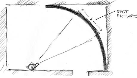
Ill. 18.1: The first cyclorama sketch shows the huge mood-creating, widescreen word pictures and the cyclorama’s small screen for showing the informative spot pictures.
The word pictures are supplemented in the script with a description of the sound meant to accompany them. The descriptions of the sound greatly reveal the dramaturgical idea of the script: from vigour and fertility to storms, gloomy desolation and struggles, to energy and victory, climaxing in a sense of openness and easiness.
The spot pictures are described only briefly as projections into the middle of the huge cyclorama. Factual and more documentary in nature, they will comprise historical pictures like church frescos and copperplate engravings of Lyme grass. The designer is also thinking of using spot pictures to show quotations from laws and articles, but the ideas is not yet clearly developed at this stage. One week later this area has been explored further and expanded. The second script for the show indicates that his feet are more solidly planted on the ground and venturing further now seems possible. In one week the designer will travel to northern Denmark to shoot what will become word pictures and to search for factual pictures for the spot pictures. This is the point at which the first crisis erupts.
The head of the Sorgenfrei Exhibition Studio hired the designer because of his competences, imagination and sensitivity. She told him that his task was to make a “… poetic and evocative interpretation of the cultural history of the drifting sand over the course of more than 300 years”. She and her firm had been hired by the Han Herred Nature Centre, which was going to build a totally new exhibition. The head of this new centre was surprisingly uninterested in following along in what was happening in the individual parts of the exhibition during the development process. He refused to spend any time reviewing or commenting on any script, picture or sound drafts. He was solely interested in seeing the overall script for the exhibition.
The crisis that arose, however, did not involve him, but rather the head of Sorgenfrei Exhibition Studio. She felt that the cyclorama did not live up to the multi-screen room promised in which, “…pictures and light flicker across several screens and across the walls, some close and some further away” (Sorgenfrei 1998). She was also apparently of the opinion that the artist had set the bar too low and had become too lazy and self-satisfied. She thought that a kick in the pants would make him perform more ambitiously.
Devastated and with only five days before his three-day trip to northern Denmark, the artist felt the whole project had been ripped to pieces. While at the Sorgenfrei Exhibition Studio meeting, he realised that some of the architects had already developed ideas about how to have many screens and they had chosen a solution with three screens. Upon returning to his own studio, he wrote a note to himself:
I’m angry now. I’ve lost my energy for the project … I’m caught in the coherent narration we have developed and I can’t see how to kill that idea and create something totally new … I feel that something has been imposed on me.
The artist does not like to be rejected, which he feels is not really what happened, but he does have to find a way to incorporate or reformulate the idea or the work pictures and the spot pictures. On one level he felt aggravated by the fact the architects had given the cyclorama idea just a three-screen solution. Close to giving up entirely, the designer stubbornly begins to draw. Not three screens, but five and six to fill the room. If they want screens, then let there be screens. Suddenly there are four two-meter high quadratic screens and the designer is once again enthusiastic, which is evident in a note he wrote to himself stating, “Unexpectedly there is a meaning with it all; the number of screens provides a comic strip effect and a natural sequence for fitting in oppositions and recurrences”. The designer is proud. Despite a day filled with crises, he had succeeded in killing his old idea and had managed to create a new one that still comprised the best features of the old one. At a meeting later the same day with Sorgenfrei Exhibition Studio, the three people he met with were excited, commenting, “… and we developed the idea so the screens could be positioned 5 degrees obliquely as well as moved forward and backward in the room and placed up and down”.
In the creative process the designer was coming up with ideas but he had also been preparing himself to receive a gift. Working alone for long periods, the artist often did not get feedback except from informal encounters with technical experts. It was an unexpected gift that started with a rejection of his creative work and then a wakeup call that started by walking into a monkey trap [2]. Clinging to the first idea and afraid to let go, he was able to set himself free and open up to new ideas.
His rather childish idea of dropping the whole project can be seen as his way out of the monkey trap and into a new field of creative development. At first like poison, the gift ended up giving him new energy.
Audience interaction
The final idea for the room and placement of the multiple screens was developed with an audience in mind that would observe like spectators at a tennis match. After entering the 6x9 m darkly lit room, spectators are to sit along a long wall. From this position four 2x2 m screens four meters away are visible but not simultaneously. To be more precise some of the screens only fill the spectator’s peripheral vision because it is simply impossible to focus on more than one or two screens at a time. This is where the tennis metaphor comes in because spectators need to move their heads back and forth between the multiple screens to change their field of focus accordingly [Ill. 18.2].
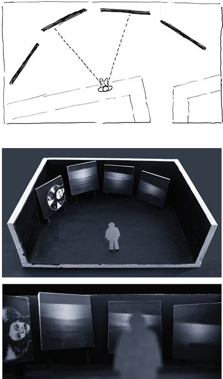
Ill. 18.2: Although unable to see the four screens simultaneously, spectators can orient themselves by using their peripheral vision. Similar to tennis match spectators, observers have to move their heads and eyes to see the different screens as focussing on more than one or two at a time is impossible.
Looking at how the physical interaction would have to take place had a huge influence on how the multi-screen show developed. The designer’s notes show that the word ‘cartoon’ came up quite early in the process, indicating that the four squares resemble a comic strip, where the storyline follows a fixed format with a beginning in the first frame, further development of the story in the next one or two frames and then an ending that gives closure (McCloud 1993). The viewer looks at the cartoon in a fixed way, reading from left to right as is the norm when reading. Another element that characterises most comic strips is that they have speech balloons.
But the media artist is not making comic strips! His multi-screen show has no speech balloons; the pictures are accompanied, contrasted and expanded by a soundtrack. Inspired, the designer/media artist breaks the ordinary reading direction because he is not following a strict storyline. His goal is to make a poetic, evocative and interpretive show. The idea of spectators interacting with the show and talking enthuses him.
A comic strip is solely four frames, but the multi-screen show is spread out over time and changes continuously. There are still photos, but they dissolve and fade between pictures, creating a so-called third picture. The way each photo dissolves into the next also means there are elements similar to that of a video.
The media artist felt free to invent a special idiolect to examine and express the poetic complexity of the drifting sand. Developing the actual show began with making sketches of the movements between the four frames and also between the sequences that follow each other in the narrative structure. [Ill. 18.3].
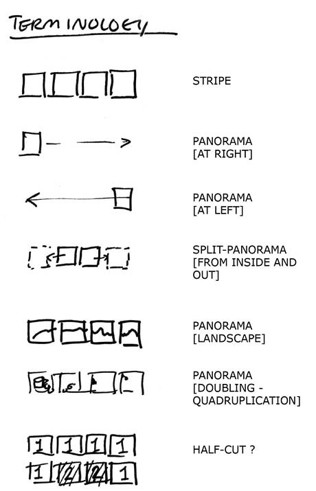
Ill. 18.3 – The designer developed terminology to capture the richness of the idiolect. A panorama of e.g. the landscape could be four pictures turned on successively one by one in a movement from left to right or also right to left.
Similar to the thumbnail sketches designers usually use for print or web design, these structural sketches were like creative openings for the potential form of the final multi-screen show [3]. He was thinking of the content of the photographs because the structural sketches were to be used as containers for the content. Next he began thinking about the dimensions of the objects. He would include huge landscapes but also small objects such as a herring or a prisoner foot chain. Figuring out how to include small objects as a panoramic picture was a challenge.
300 years of photography
The next step was to take slides to cover 300 hundred years of history in the space of three days in the early spring when the sun rises at about 6:45 a.m. and goes down around 7:45 p.m. Prior to his trip up north, the designer had been in touch with a half a dozen people he wanted to visit and had to photograph objects, landscapes, plants and other visual content. Most importantly he needed to work closely with the specialist consultant who was his main source for research material.
The considerations and decisions about the physical room, the interaction, the use of the comic-strip concept, the metaphor of the tennis spectator and the terminology of the movements in the four frames influenced how the photographs should be taken. For example landscape pictures would need to be split into four individual pictures.
The rather weak light in northern Denmark in the spring led to the decision to use high speed film that produced a slide with rather large, visible grains much like the structure of ordinary sand [4]. The standard 24x36 mm format made it necessary to digitize the slides to turn them into 24x24 mm pictures. This process was chosen not only because it met the goal of having poetic, evocative and interpretive pictures better than ordinary documentary pictures, but also because it solved the problem of constructing pictures of “… something that has been … a search after what could be”. Jointly with digitization, only one part of the process, the digital manipulation or image editing, was considered to be an important aspect of the multi-screen show.
The final multi-screen show
In a letter summing up his photo session results one week later to the head of the Sorgenfrei Exhibition Studio, the media artist wrote, “I have mounted a sequence of pictures and I have made the final script. In a couple of days I will begin scanning the pictures and manipulating them so they can be part of the sequences as sketched in the script” (letter of 10 April 1998).
Familiar with the individual pictures, their content and aesthetics, the artist decided not to send his script because his thumbnail sketches would only make sense to him. Instead he lets her know that everything is under control, explaining in detail what he has done and what the production plan is for the coming three weeks, “The musician has got the script and he’s seen all the pictures. We’ve talked the whole show through and he’s begun working with the sound. I’m in regular contact with him”. The show will last eight minutes and show about 170 pictures built up from 70 strips, each with four frames. He has also been working with five sequences that he has given the following working titles:
Abundance – 1 minute, 30 seconds
White as a sheet – 2 minutes, 45 seconds
To gain inwardly – 1 minute, 30 seconds
Organise the battle – 1 minute, 10 seconds
The balance – 1 minute
Example of an ‘Abundance’ strip
The artist travelled to northern Denmark with an open mind and in addition to photographs of nature he was very aware of other sources for pictures. He was prepared for visual gifts. One of them came from the researcher he met on the second day of his trip. She had found a wonderful pen drawing from the 1850s by Danish artist Vilhelm Pedersen [5] of four men herding cattle to market. The idea for behind the Abundance sequence was to visualise the concept of the wealth and richness of nature, whose plenty provided a living for peasant and traders without too much struggle.
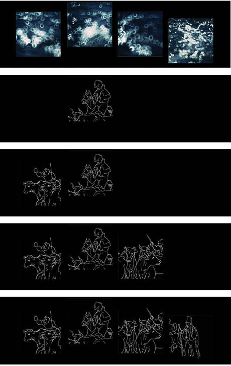
 Ill. 18.4: An ‘Abundance’ sequence excerpt visualising the richness of nature using flashing lights in the life-giving water and the emergence of the cattle being herded. There was one, three, seven etc. Ill. 18.4: An ‘Abundance’ sequence excerpt visualising the richness of nature using flashing lights in the life-giving water and the emergence of the cattle being herded. There was one, three, seven etc.
Accompanying the spectator’s view of the four huge screens with the pictures of sparkling water and reflections from the sun is the slow, meditative sound of a simple flute and the natural beat of a drum. Suddenly the music changes to a striking bell and the first part of Pedersen’s pen drawing appears in the middle of the screens and all the other screens turn black. Then, one by one from the left the screens light up. In order to carry the spectators away from the documentary mode and enhance their feeling of life and calmness, the designer took close photographs of light flashing in the water, adding a dreamlike quality by making the water out of focus.
In another context one spectator responded by explaining that the meaning could go beyond what is cultural and archetypical and capture what she called a hunch, feelings that are difficult to verbalise, i.e. “… moods and something that is more airy than moods” (Ingemann 2005:177). This layer of meaning is not mediated but is one’s own experiences in life that are not signs. The designer had this knowledge, not clearly stated but subconsciously as a feeling that he could formulate in his photographic practice and in his selection of pictures.
From early on in the design process the designer worked with what he called word pictures. The row or strip of glittering, unfocused water is one of the word pictures, which often have motives from nature and primarily present a particular mood or ambiance. The drawing of the cows being herded belongs to the spot pictures category. The pictures are meant to be a symbol of richness and abundance closely related to the cows being herded to market. The designers aim is to do more than just show the drawing by Pedersen, who is famous for illustrating Hans Christian Andersen’s fairy tales. The designer uses parts of the drawing to make a visual argument (Kjørup 1978). He split up Pedersen’s drawing into four frames to create a brief narrative.
Example of a ‘White as a sheet’ strip
After a period of wealth, an ecological catastrophe transformed what was formerly a bountiful landscape into an infertile, deserted landscape covered with sand and hit by sandstorms and drifting sand. The cultivated land that once fed many people had now turned its back them, offering nothing but hard conditions to live under. The designer wanted to find an existing, deserted landscape to illustrate how the area looked at that time. As a result he went to Råbjerg Mile, where he found just what he was looking for: sand, sand and more sand.
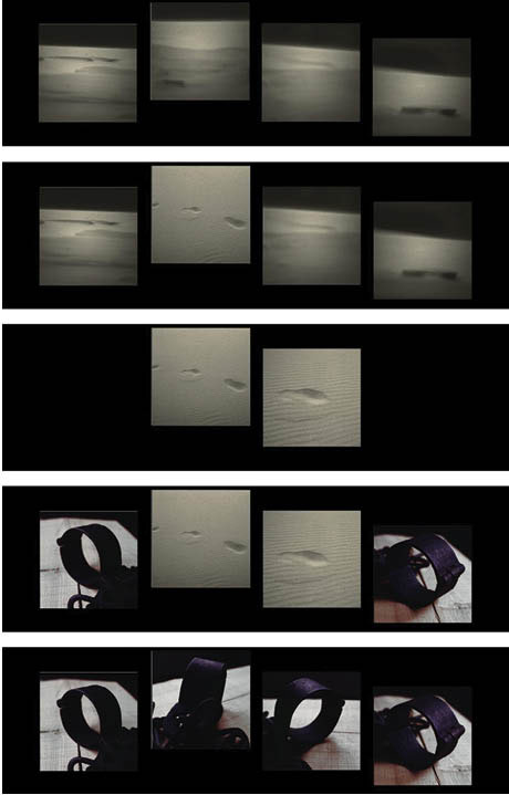
Ill. 18.5: The panorama of drifting sand dissolves into a close-up of footprints in the sand, indicating the presence of humans, flanked by pictures of heavy, old foot chains. The loss of fertile land led to the moral impoverishment of society, arrests and punishment.
In the transition from the ‘Abundance’ sequence to the ‘White as a sheet sequence’, the soundtrack changes from the quiet sound of the sea, waves and a lonely flute to swirling sand. As I write I am tempted to use descriptive words to cause the reader imagine the nature of the sound, but it is far from naturalistic. To further avoid the documentary mode, the designer chose a musician who used unconventional instruments like beans in a plastic bag or a thin bamboo stick with a string to produce sounds [6].
The problem of size is also an issue in this sequence. There is a panoramic view of drifting sand followed by close ups of human footsteps flanked by photos of heavy foot chains to evoke the sand of a 300-year past [Ill. 18.5]. While taking photographs, the designer developed his ideas about how to depict the objects, e.g. he placed the foot chains on an old table and took pictures from four different angles. Highly pleased with the creative ideas he was coming up with, he wrote a letter to the head of the Sorgenfrei Exhibition Studio describing how creatively satisfying the project was, but also how hectic his days were because he had to take pictures and then develop them.
Looking at the scanned pictures for the ‘White as a sheet’ sequence however he felt troubled. He was wondering what to do with all these pictures of sand, when he realised that sand also has various colours and shades. He tried to adjust the colours using Photoshop, but it was tremendously time consuming and he was not satisfied with the result. Time was running out. Tired and frustrated, he was facing the second serious crisis in the project. What to do?
Driving home after a long workday, exhausted and unable to think of anything, he was struck by the idea of removing all of the colours! There were too many colours and he could not adjust them to look like a death shroud. To achieve the ‘White as a sheet’ look, he made all of the pictures black and white, also the foot chain pictures. He felt happy but was disappointed because of the lack of colour. Compared to the other parts of the show this sequence was too detached due to its lack of colour. As a result the designer added a light sand colour to the black and white pictures, thus making them duotone.
Example of a ‘To gain inwardly’ strip
In the course of only one generation people managed to control the drifting sand by successfully preventing erosion by planting lyme grass. Pressure was put on Denmark to cultivate as much land as possible when political problems with Germany resulted in the size of the Kingdom of Denmark being reduced. As one famous Dane claimed, ‘what is lost outwardly must be gained inwardly’. The designer took this famous saying seriously, which is illustrated by the manner in which the sequence builds up to the conclusion. The nearness to the sea makes him think in terms of – not sand – but fish [Ill. 18.6].
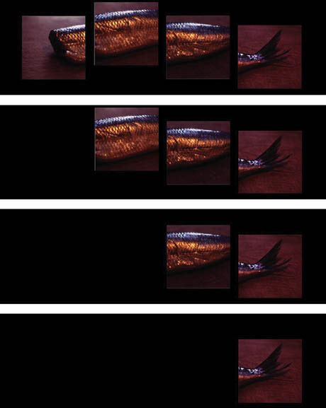
Ill. 18.6: The smoked herring lies on a glistening wood table. The herring itself is not important but rather symbolises what has been lost, i.e. the loss of wealth.
‘What is lost outwardly …’ is transformed by the media artist into a rather heavy-handed symbol. First the spectator has to understand that the smoked herring is a symbol of wealth and prosperity. Then the frames show the decline in prosperity as this rather huge fish disappears frame by frame until only the tail is left. And then it disappears. The next strip shows a heather plantation and then the introduction of sheep as the new creator of wealth in the area. Stopping the drifting sand was not enough. Land had to be cultivated and made more useful for farmers.
To paraphrase Gertrude Stein – a fish is a fish is a fish – but the herring pictures can be perceived literally as food to be consumed; as a symbol of the loss of the Danish territory; or a rather confusing object for the spectator, who may wonder why there was a herring in this multi-screen show about sand and drifting sand or wonder about why the fish disappears one frame at a time?
The artist felt a sense of release in making a personal interpretation of the history of drifting sand and by inserting a visual idea that went beyond a concrete depiction of sand and vegetation. He felt liberated by his task of making a poetic multi-screen show because it allowed him to take on more of a role as an artist as opposed to a designer performing a specified task. This feeling of freedom was stimulating, leading him down a path of detours, albeit ones related to sand. In the Japanese movie, The Woman in the Dunes (1964), a young entomologist ends up in a house at the bottom of a sandpit, where a young widow lives alone digging sand to be sold to the cities. He ends up imprisoned by the villagers to help the widow with her endless task of digging sand. He initially tries to escape but resigns himself to his fate, just as the designer, who embraces the philosophy that life is where you are.
With this highly existentialist approach guiding his moves, the media artist follows his impulse to turn a loudspeaker upwards and let sand fall on it, altering the sound and finally deadening the sound. His personal life also becomes involved because he has only recently discovered that his now deceased father once lived in the area not far from the drifting sand. Upon visiting the small village where his father lived he feels a sense of empathy for the difficult life his father led at the end of World War II. This experience turned making the multi-screen show into a personal matter and is an underlying influence on the decisions made during the artistic process.
Example of an ‘Organize the battle’ strip
The constant struggle against the drifting sand was too large a task for the local farmers to have sole responsibility for. As a result, when Mountain Pines were introduced to prevent erosion a garden centre was established as a reliable and steady partner. Experiments were also conducted to determine which threes could survive the best. Although aware of these historical events the designer still felt at a loss as to where to begin. As a result he felt that it was necessary to have the support of another set of eyes so he met with plantation owner Ib Nord Nielsen, who knew the history of the area and of his plantation, where the designer photographed Mountain Pines as seedlings; fresh, strong trees; and dead and decayed trees. Receiving help from others was also an important gift the designer was open to receiving [Ill. 18.7].
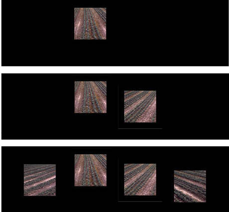
Ill. 18.7: The rows of small Mountain Pines symbolise extreme order and regularity.
The insights the artist gained from the plantation owner were immediately transformed into action as they drove around the plantation’s forests. The planter pointed out the Mountain Pines and told the story of how they were experimented with, the vestiges of the trials conducted still visible on the plantation. The designer took the photographs to be used in the four-screen strips.
The ‘Organise the battle’ strip is the sequence that is most like a documentary, but the artist added his own interpretation in two ways. First, he augmented the drama of the story about the production of saplings, the planting of the trees into the woods and then the dead and decaying trees being replaced by better, more refined versions of Mountain Pines. Second, he added a strong graphic line by enhancing the rows of small trees to stress the diagonal and vertical power in some of the pictures. Consequently the focus of the pictures became the rows rather than the individual saplings.
The plantation owner was kind and friendly but he was partially showing the designer around as a favour to the researcher who had arranged their meeting. Sensing that he was under pressure to get done rapidly, the designer worked swiftly to understand the story as well as to quickly focus, take a picture on the spot and then immediately continue to the next.
For the audience the whole story is really not clear, which is not necessarily an issue because the aim of the multi-screen show from beginning was to be poetic and interpretive. As spectators, the audience has the responsibility to take the aesthetic and narrative elements of the show and relate them to the nature right outside the Nature Centre. Their task is to add value and new ways of looking at the story of the drifting sand.
This part of the multi-screen show is of interest in relation to one certain spectator, the head and organiser of the whole exhibition and the multi-screen show. Refusing from the start to follow the development and production of the show, the only the description he had was the brief one given at the start of this chapter (Sorgenfrei 1998). The opening day was the first time anyone had seen the show with its four huge 2x2 m screens. Granted the designer had seen the show when it was being programmed and when the original soundtrack was synchronised with the pictures, but this was in the studio on a small 70x70 cm screen. In the darkness of the vault with powerful speakers the huge screens had an overwhelming impact. The designer’s notes indicate that he was nearly moved to tears and enveloped by a feeling of soaring high. He had written, “I feel light!”
One hour before the official opening the designer met the head of the centre and they ended up, nearly by accident, alone in the vault, where this new spectator would see the multi-screen show for the first time. Affected by how coincidental it was that they were alone, the designer wanted to let the head of the centre experience the show undisturbed, but was simultaneously consumed by an urge to enthusiastically explain the whole idea behind the show and his goals for the show.
Confused, the head of the centre was disappointed and not proud or enthusiastic. The confusion likely stemmed from the fact that he had neither a clear idea of what he was getting or that he had an exact idea of what it was going to be like, i.e. a factual documentary story; so he was disappointed and not pleased and excited. The media artist should have followed his hunch about explaining his intentions and the story to the head of the centre.
The media artist was pleased that he had at least had a close working relationship with the head of Sorgenfrei Exhibition Studio. Having tracked the process, she could easily follow the many decisions that had been made and the worries that had arisen. She was excited about the artistic expression and claimed that the designer had fulfilled her wishes about doing a poetic interpretation. Even though she did not have a clear, preconceived idea of what the show should be like, it lived up to her expectations. The head of the centre’s reaction abruptly put an end to this apparently happy progress. Nearly as close to a genuine spectator/user as possible, having his understanding and getting a positive response were important for the exhibition and the multi-screen show.
As a result of a conversation between the media artist and the head of the centre a useful improvement was made in the first month after the official opening. A poem written by the designer was added to introduce the show and provide a framework for the story:
Drifting sand
The sand came 300 years ago
And ruined the fertile soil
The peasants complained
The clergy complained
The king lost his taxes
The struggle against nature began
Lyme grass was planted
The heather came - and finally, the Mountain Pine
What is lost must be replaced
Battles were won - and lost
Until we found the right balance
?
Example of a ‘The balance’ strip
In the end, it is all about balance. The land is no longer used for producing farm products and the most important product is the landscape: the sand, the drifting sand, the lyme grass, the heather and the Mountain Pine. The landscape no longer needs to be held under such strict control, but maintaining a balance in the fight between man and nature is still necessary [Ill. 18.8].
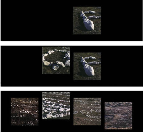
Ill. 18.8: Human interaction with the landscape is especially evident at the bottom of the sand dune, where people make words with stones in the heather.
Most Han Herred Nature Centre visitors are tourists who also visit the nearby huge sand dunes. The landscape has become visually and physically part of the experience economy for tourists.
The media artist is in familiar territory: words and letters. On the spot he takes pictures from the top of the sand dune and downhill to provide an overview of the letters and words tourists have made over time, mostly of their own or their beloved’s name. The media artist walks downhill and in between the letters and names, some more than a meter tall. Making beautiful, well-formed letters with stones is difficult, especially at a close distance. The media artist feels he is making more than pictures; he spends many hours walking each day to allow his understanding of and closeness to the plants, landscape and climate to be absorbed by his body and to be appreciated.
The spectator, in this case the media artist, notices many clues about the new, changing experiences of nature, culture and the landscape seen in the light of cultural history. The clues are not general, but personal, highly visual and phonetic, i.e. they involve words and letters. The spectator has also experienced something uncommon, namely the whole multi-screen show with the invention of an idiolect with four screens like a comic strip. The show is a unique experience, guiding the direction of the spectator’s gaze like an audience watching a tennis match, their heads and eyes following – not the ball – but the movement of changing pictures as they appear, disappear and create movement.
And the end …
Intensely interested in this project, the media artist saved much of the research material, including video recordings at the vault when the show was officially presented; drafts of various scripts; some of the correspondence with the people involved; his blue notebook with addresses and ideas for the visualisation of the multi-screen show; not to mention the architect’s various drawings. The extensive amount of material available was broad.
He must have saved so much because there was something of interest besides just the project. He had been wondering about the creative process and the project when he ran across a book by the Mexican poet Octavio Paz that reflects upon how the language of the poem is everyday language, and yet everyday language says things quite out of the ordinary:
The relationship of poetry to language ... in the poem - a verbal crystallization - language deviates from its natural end, communication. (Paz 1995:4).
Words do not say the same things as they do in prose; the poem no longer aspires to say, only to be. Poetry places communication in brackets ... (Paz 1995:5).
Later, when we have overcome our amazement ... we discover that the poem presents us with another sort of communication, one governed by laws different from those that rule exchange of news and information (Paz 1995:5).
The media artist was struck by the thought of placing communication in brackets – and the powerful saying that the poem no longer aspires to say – only to be. He thought about the exceedingly strong semiotic bond between the photograph and indexicality that had been so strongly underlined because of thinking about communication in these terms.
In the production process the media artist faced a few severe crises, but the material in his archives shows that thinking about placing communication in brackets and more seriously looking at the multi-screen show in terms of being and thereby in the category of a work of art does not seem especially central. His day-to-day practices show that he seemed rather convinced he was on the right track and that his unarticulated concept of a lyrical interpretation was sufficient for him to act adequately.
His anchor in this fairly ambiguous situation was his trust in his own resources – but more specifically, he understood the necessity of reducing the amount of information he met in the written research material and in the physical meeting with the landscape and other people. His most important anchor was making frameworks, obstacles and limitations that restricted and narrowed down what he could practice. A highly familiar aspect of creativity is that the ideas, concepts and new innovations develop more powerfully when there is some degree of limitations and frames.
Framing … is a result of our desire to organize our experiences into meaningful activities. Following the ancient Greek saying that the man who sees everything is blind, it can be claimed that frames, by directing our focus, make us notice what is important, therefore ensuring that frames, by directing our focus, make us notice what is important, therefore ensuring clarity and simplicity in the definition of the situation (Misztal 2003:82).
The first earth-shattering crisis in the creative process initiated a shift away from a non-focused or badly framed situation caused by the uncertainty of the situation, but mostly by the rather sloppy and unambitious attitude of the media artist. He was pushed into being part of rigid development process and frame that in the end helped him create innovative and surprising ideas and concepts. The four main frames were: space, metaphor, time and production technique.
The first framing was the physical space. In collaboration with the architects, four 2x2 m screens were installed along one side of the former bank vault. This frame served as a productive catapult for developing visual ideas and constructing the narrative of various picture resources and developing the soundtrack. This framing immediately placed viewers on bleacher-like seats along the other side of the room four meters from the multi-screens. This distance meant that they would have to watch the pictures similar to a spectator at a tennis match.
The second framing was the metaphor of the comic strip. This frame was a way of anchoring the development of the visuality in what the media artist called the ‘single strip’ and the relationship between the approximately seventy strips in the show. This framing was extremely stimulating, making the media artist feel as though he was inventing something quite new in this field of projection and narration. He took the metaphor of the comic strip, twisted it and transformed it into pristine fields.
The third framing was time. With the spectator in mind, the length of the multi-screen show was set at just under eight minutes. That was one sort of framing. But the brief two-month time frame for the project was also decisive in the production process, which comprised strict research deadlines, writing the script, taking photographs on the spot, researching pictures, scanning slides, digital manipulation, writing a new script, the sound production and shooting digital images for slides.
The fourth framing was the production technique. This process was time consuming and included choosing grainy film for the slides, selecting which slides to scan into digital images to be Photoshopped and then regenerating them as slides for the eight Kodak carrousels. The pictures had to be controlled by dissolve control units. There was also the process of digitally recording, manipulating and mixing the soundscape created from the sounds of various objects.
The four framings were initially obstacles for the media artist, but they proved to yield unexpected detours and gifts in the production process. In the end, the multi-screen no longer aspired to say, only to be.
Notes
[1]
The multi-screen show for Han Herred Nature Centre was produced by Bruno Ingemann / Communication. Script, photography and photoshopping by Bruno Ingemann. Hanne Mathiessen was an expert consultant. Music by Christian Glahn. Sound studio with Henrik Øhlers. Programming by Nicolai Vestergaard-Hansen. Digital pictures shot as analogue slides by Colorgruppen.
[2] A cage containing a banana with a hole large enough for a monkey's hand to fit in it, but not large enough for a monkey's fist (clutching a banana) to poke through the other side. Used to "catch" monkeys that lack the intellect to let go of the banana and run away. (http://en.wiktionary.org/wiki/monkey_trap)
[3] Art directors and graphic designers use the term ‘thumbnail sketch’ to describe a small drawing on paper (usually part of a group) used to explore multiple ideas quickly. (http://en.wikipedia.org/wiki/Thumbnail)
[4] Kodak 5040EPH, 1600 ISO was the film used to produce 900 slides.
[5] Danish artist Vilhelm Pedersen (1820-1859). |