Chapter 16:
The Journey
– Design between creativity and organisation
This chapter looks at the creation of the overall graphic design and the poster for the 1992 opening exhibition, THE JOURNEY, at the National Museum of Denmark from the perspective of the organisation and the designer. On a superficial level the production and approval of the exhibition poster appears to be a simple task, but upon closer scrutiny the process reveals a significant amount about the organisation, the underlying conflicts and the decision-making process. How do things end up going wrong? How can the creative process be so productive?
There are six weeks and counting before the opening of the newly renovated National Museum. The old buildings that housed the museum for decades have been closed for more than three years to carry out a seventy million dollar renovation project. Formerly open courtyards are now covered with glass and the museum’s square footage has increased by 6000 m2. The new area for special exhibitions will be put in use for the first time, the initial exhibition setting the standard for all subsequent exhibitions.
After two years of preparation, THE JOURNEY is finally going to open. Numerous problematic discussions and proposals concerning the museum’s ambitions surfaced during this time that the designer only became familiar with , but which he was not involved in, when his work on the poster commenced only slightly more than two months prior to the opening.
At one point, a crucial meeting takes place between the designer and the head of the communications department. The poster is ready for presentation for a final round of decisions and minor corrections one week before going to print. In the designer’s notebook (my notebook), there is a letter drafted to the head of the department in an aggressive blue ballpoint pen that states:
I’m furious. Never in my 25 years professional life have I encountered something like this. You call for a meeting – and then leave! I think this is insolent.
I arrive expecting to present my ideas and goals and to subsequently receive specific critique from you at which point we reach a conclusion together.
But you left.
I had hoped that you would describe the problem, but instead I’m left with a feeling of uncertainty and have to interpret your vague response and try to resolve it …
The designer has also added the following comment, “She walked all over me. Walked. I’m ready to pitch it all”. The designer’s notebook indicates that four days later a new meeting was set up with more people attending. The issue has become a conflict between two proposals: The designer’s proposed poster, which has been fully supported by the entire team actually working on the exhibition, and a new one presented by the head of the communications department that was made by a leading Danish artist.
One day later the designer notes, “… Only one poster is left and it’s mine. This one poster represents the immense potential for change, carrying with it the new elements that are to come”. The designer does not feel especially good about pressuring the head of the department because, “It’s a fait accompli. You have to approve the poster or there won’t be one, but this is a situation that I’m not responsible for. The work should have been started months ago”.
The designer discovers two important issues. One, the poster has become a metonym for all the new and necessary initiatives related to the field of museology and visitors. It also involves how the image of the ‘new’ National Museum is going to be constructed and presented to the public and to museum donors. The second issue is related to the decision structure, hierarchy and use of power within the organisation. A strong hierarchical structure means everyone focuses on the person above them and has to play it safe to avoid problems and unpopularity. One common power play is using time constraints to force decisions in an environment of mistrust.
Briefly, the first issue involves the organisational power that governs and influences the creative process. The second issue is creativity as supported by restraints, solicitude and trust.
THE JOURNEY exhibition
Three months prior to the exhibition the head architect of the exhibition contacted the designer (me). The head architect’s firm specialises in designing exhibitions and generally hires subcontractors expert in lightning, sound, showcases, signs, slideshows and graphic design. Less than three months prior to the grand opening, I was hired as an expert in graphic design and slideshows. My primary task was to create the overall graphic style for the pamphlets, school materials, tickets and signs as well as the banners and posters for presenting the new museum to the public. My second task, in conjunction with an external ethnographer, was to produce a slideshow about how Eskimo shamans travel into the realm of the spirits.
Although I had known the architect for many years, we had never worked together on a project. In 1991, however she came across a quite technical, practical review I had written of Photoshop in 1990 in the Danish version of Macworld. In the article I thoroughly explained how to make images by combining elements from different pictures and how to adjust the colour and mood by modifying the visuals. The five pictures in the review, though far from naturalistic, were highly expressive and put together like a montage. These pictures are what inspired her to contact me about the National Museum exhibition.
When the architect and I met to discuss the project, we discovered that we were on the same wavelength and hit it off immediately. Our meeting took place at the small flat used for preparing the opening exhibition which contained a white cardboard model of the opening exhibition and the room where it would take place. The architect filled all this whiteness with words, describing the light, darkness, shadows and special mood they intended to communicate revolving around the idea of paradise. I received a printed presentation of their approach to the exhibition, which stated:
Human beings have always travelled, if not physically then mentally through legends and myths. Throughout history traces are found of travellers, their routes, actions and stories. To depict this widespread concept that covers many aspects of human existence, the exhibition crosses traditional chronological and geographical boundaries. The concept of a journey is interpreted so widely that the exhibition deals with both the concrete, physical journey (by land, sea and air) and the more intangible, metaphorical journey through time, our imaginations and dreams.
… To journey is to move, experience and sense, and in keeping with this the exhibition, stress is put on the creation of moods and images that can frame the individual themes in the exhibition.
… The exhibition makes a departure from the original museum objects and involves all of the collections in the museum. It will contain a huge amount of multi-faceted objects from the National Museum.
The architects’ oral presentation focused on one issue: the poster that was going to present the whole exhibition to the public. Their heavy emphasis on the visual aspects of the poster piqued my curiosity. There was some playfulness in their talk. They had just ordered a dozen tropical trees, 20-meter palms and flowers for the Garden of Paradise section of the exhibition that were on their way from Amsterdam to be put on display in a few weeks. This was one of the core elements: placing living trees in a cultural history exhibition, a step that was quite provoking for the archaeologists, the ethnographic experts and the conservators, who were anxious about how to deal with the humidity and the organisms that would be imported with the trees and that might possibly harm the museum objects. I could hear their imaginations whirling in their presentation, which also contained strong religious connotations, touching on light and shadow, calmness and rest.
The second core element involved a discussion about the wall at the end of the room, where a variety of boats would, as opposed to resting on the floor, hang floating in the air to symbolise “the last journey”. A key person in this respect was the lighting man, a specialist who normally works at theatres. His task was to create flickering light on the walls and ceiling of the room. He used small spots to project light down on the floor, where he had placed numerous small salvers filled with water and small mirrors. Equipped with electric motors, the salvers moved, creating a delightful sparkling pattern of light. Our conversation closed sprinkled with phrases and words such as: trickling water, fertility, rest, harmony, looking through something, surprises, the emergence of light and shadow, sound and reflections in the water.
Now, time to make a poster!
The open-minded co-creator
These impressions and indications about what mood to create made the designer feel somewhat lost and insecure but also terribly inspired and provoked into find new ways of working. Two weeks later he met with both the architectural practice and the project head of the National Museum’s exhibition for the first time.
The designer was to present the two areas he had been working on. One involved the overall design of the catalogue, signs and tickets as well as the logotype for branding the whole exhibition. The solution the designer came up with is the one the exhibition used. The second area was the poster. Instead of relying on a traditional visual sketch or detailed draft of a poster, he presented – more inspiring words. He explained that he would like to produce a variety of backdrop images representing four or five exhibition themes that could be integrated into the background as minor images.
His idea was to collect images at the University of Copenhagen Botanical Garden, which has beautiful round greenhouses filled with various huge palms and assorted tropical trees. His plan was to take ten rolls of film in unusual ways with his Nikon camera. For example, he would swing his camera over his head by its strap and shoot a photo using the self-timer.
Another idea was to accompany the curators into the museum’s basement, which housed an endless number of storage rooms filled with thousands upon thousands of objects and ask them to pick out what they saw as some of the most outstanding objects, after which he would take photos from his point of view to capture useful visuals and objects with a powerful attraction.
He had no poster to present at this meeting. No visual sketches. No concrete visual content, just a work in progress that amounted to no more than the title of the exhibition, THE JOURNEY, in the logotype used for the catalogue, signs and tickets (Ill. 16.1).
A mood of openness, appreciation and eagerness reigned at the meeting. Everyone was interested in developing and expanding the designer’s proposals, bringing up suggestions about which storage rooms to visit and who should get to point out what might be of value from a communication perspective and not just a museal perspective.
Ill. 16.1: The first visual representation of the poster comprised only one word, the title of the exhibition in official font. The one Danish expression for THE JOURNEY is REJSEN.
Working in the dark
Exploring the treasure trove of objects in the basement was a semiotic act performed much in the spirit of Sherlock Holmes. The designer was on a hunt for significant clues not defined beforehand or selected based on clearly formulated goals, but ones that were to reveal themselves through observation, for example by photographing an object of interest on a stand or with extra lighting. Working like this, i.e. being open and staying open for as long as possible, is the ideal creative process.
With ever-present time constraints, remaining continually open is not possible in the real world. The scheduling meant only ten days were available before a semi-final version of the poster had to be presented. Ten days to photograph, get the colour film developed, mounted in slide frames, selected, scanned and transformed into digital images and then imported into Photoshop, adjusted, sized, manipulated, diffused, rotated and placed in many layers on a digital canvas. In between all of this, there had to be time for the creative development of the ideas. Combined with the various other logistical issues and plans, this meant working in a less open, more defined search process in which the level of openness was ruled to some degree by decisions that had to be made.
The museum also had a multitude of ideas to fit under the umbrella concept of the THE JOURNEY, including: departure, arrival, the Garden of Eden, the landscape of the journey, the equipment for the Journey, the means of transportation, the result of the journey, the spiritual journey and the last journey. In the creative process it is necessary to reduce and synthesise, so the designer reluctantly chose some of these frameworks when he began exploring the treasures in the museum’s basement.
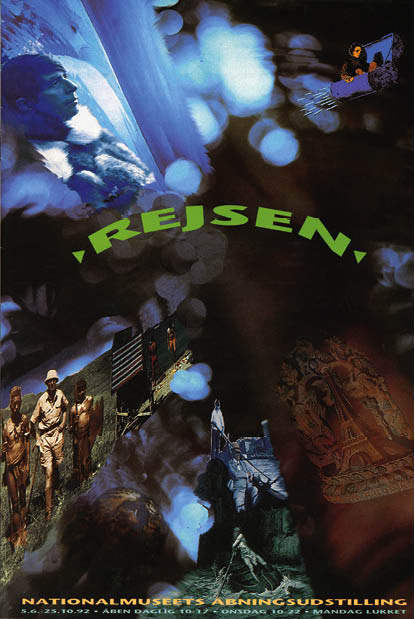
 Ill. 16.2: The final poster for THE JOURNEY (REJSEN) exhibition. Ill. 16.2: The final poster for THE JOURNEY (REJSEN) exhibition.
The final version of the poster clearly shows that the designer chose to work with the concept of oppositions [Ill. 16.2]. The images contrasted on the poster are:
An old Indian souvenir vs. a modern French souvenir of the Eiffel Tower.
A 1930’s white explorer wearing a topee standing between scantily clad native Africans with spears vs. a modern-day white male tourist on the beach at Ibiza.
A photograph of Danish author George Brandes sailing in a gondola in Venice vs. Gustave Doré’s 1867 illustration of Dante’s Inferno showing the Arrival of Charon on the River Styx, where newly departed souls are carried to the other side.
A photograph of Danish polar explorer Knud Rasmussen vs. a well-known drawing from H. C. Andersen’s 1850’s story The Flying Trunk.
In the preliminary critique session of the designer’s oral presentation, the designer stressed the importance of going into all of the storage rooms to seek inspiration, but the final poster only contains three objects, four old photographs and drawings and some other pictures, such as one of his own tourist snapshots and a Doré xylography. His sampling technique develops small narratives by placing paired, oppositional visuals close to each other to make them work dialogically. In the overall composition of the poster these paired narratives had to blend in while still existing as clear, coherent units.
For the background of the poster he has chosen a slide from among the more than three hundred taken randomly at the Botanical Gardens by e.g. swinging his Nikon camera around his head. He sees this slide as the final picture, but when he chose it, he did not know exactly which pictures he was going to insert and blend together.
The composition of the Botanical Garden slide has diagonal lines leading from the bottom corners upwards [Ill 16.3], guiding the eye until it is stopped by an explosion of light moving in different directions like fireworks. The dominant element in the composition is the light, which is enhanced by a dark blur of green and light brown in the lower right corner. Somewhat abstract, the picture condenses the concept of light and trees by capturing what the play of light looks like from the ground when the wind ruffles the leaves and branches of a tree.
The designer has succeeded with his concept of randomness. He has deliberately chosen to use film with a slow ASA, a small aperture (B:16) and hence a long exposure time. The entire effect was then enhanced by setting the lens on one meter and swinging the camera around.
Ostensibly a picture of a palm tree in the Botanic Garden, the true motif is the light and the mood and images brought up at the first meeting with the architects: trickling water, fertility, rest, harmony, looking through something, surprises, the emergence of light and shadow, sound and reflections in the water.
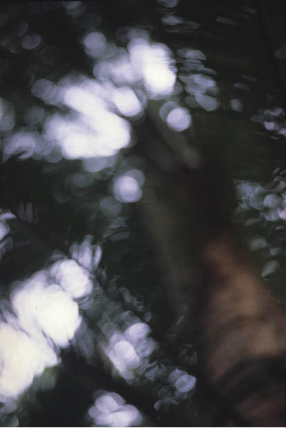
Ill. 16.3: The backdrop picture selected from among more than three hundred slides taken at the University of Copenhagen Botanic Garden.
To be seen
In this creative ambiance everyone is supportive and interested in getting the best result from the process. Nobody really knows where it all will end, but trust is a necessary condition for the process to succeed. After ten days of making slides, selecting them, digitising them and drafting them into a coherent image, he and the initiator of the whole project, the architect, both have a shared need to meet and jointly look at the physical product to see if the visual presentation successfully matched the architects’ enthusiastic oral presentation a month earlier.
The architects came to the designer’s small studio, where they initially discussed the various logistical problems with the exhibition and then the creative process of making the poster, not so much as just a poster but as a symbol for the general expression of the exhibition’s entire concept. Some of the archaeologists and ethnographic experts made critical comments about the idea that the designer found annoying.
Due to a lack of time, the poster was presented on a computer screen and not as a colour print [1].The head architect was shown an image in process and the title of the exhibition was not on the poster. Only a draft of some of the various small narratives was on the backdrop, while the others were still unaltered pictures, some of them still unscanned. The main idea however was clear and the designer could easily orally describe what remained to be done.
The architect was exited! This was exactly what she had hoped for! When she presented the exhibition and the poster five years later at a conference at Roskilde University, Denmark, in March 1997 on creativity in research and dissemination, she was overwhelmingly enthusiastic about the whole process in which the poster, in her opinion, represented the concept that had governed the production of the entire exhibition. She believed that the designer’s highly creative understanding made it possible to capture the mood and atmosphere of the exhibition so precisely and in such a well-founded manner.
If the whole creative process was so innovative and successful and the final poster so precisely expressed the concept of the exhibition, then why did it go terribly wrong in the final decision-making process?
Together in the organisation
This chapter started with a description of how a meeting ended in chaos. Although aware of clues about the hierarchy and organisational challenges at the museum, the designer was too busily immersed in the actual work process to take much notice of that part of the process. He was also protected from it in many ways. His close collaborators were the architects and especially the head of the architectural practice but also the museum’s appointed project manager, who was responsible for coordinating the content of the exhibition and handling the objects in cooperation with the museum’s curators. This worked well on a day-to-day basis, but the designer met with some resistance from the archaeologists and the ethnographic experts.
After three years of rebuilding, the museum expected the reopening to focus on the visitors’ experience and on giving them something unexpected, something different from daily life. This approach is reflected in the words of an eight-page article in a large Danish newspaper in which the Danish National Museum states, “Welcome to a new, quite active cultural centre”, where expectations are met and individuals can independently manage their museum visit at the level of their choice” [2]. This article is actually breaking news because the existing paradigm of the museum’s organisational culture previously focused on objects and the research on their provenience and chronology and not on dissemination and communication. The paradigm has shifted from the objects to the experience of the visitors.
This kind of change in an organisation will inevitably influence daily work, and when the decision has been made to undergo such an extreme transformation, members of the organisation may experience uncertainty and unresolved anxiety. One of the most well known organisational culture theorists, Edgar H. Schein, defines organisational culture as:
A pattern of shared basic assumptions that the group learned as it solved its problems of external adaptation and internal integration that has worked well enough to be considered valid and, therefore, to be taught to new members as the correct way to perceive, think, and feel in relation to those problems (1992:17).
Schein writes that culture formation is always, by definition, a striving towards patterning and integration, even though in many groups their actual history prevents them from ever achieving a clear-cut, unambiguous paradigm. Schein believes that culture can be analysed on several different levels, where the term ‘level’ means the degree to which the cultural phenomenon is visible to the observer. He proposes three layers: artefacts, espoused values and assumptions.
At the surface artefacts comprise any phenomena that one sees, hears and feels when one encounters a new group with an unfamiliar culture (1998:25). Artefacts can be recognised by people who are not part of the culture, some examples of which are dress codes, furniture, art, work climate, stories, work processes and organisational structures. The outsider might easily see these artefacts, but might not be able to fully understand why these artefacts have been established. To understand this, outsiders can look at the espoused values in the culture.
Espoused values are the ones normally promoted by the most prominent figures of a culture. Espoused values could be represented by e.g. the philosophies, strategies and goals that for instance managers seek to realise. However, the values leaders seek to realise must be supported by some general, shared assumptions about how e.g. a museum should be run or how employees should be managed. If the espoused values are not in line with the general assumptions of the culture, this might signal trouble.
Assumptions reflect the shared values within the specific culture. These values are frequently ill-defined and will oftentimes not be especially visible to the members of the culture. Assumptions and espoused values are possibly not correlated and the espoused values may not be at all rooted in the actual values of the culture. The differences between espoused and actual values may create frustrations, a lack of morale and inefficiency in an organisation. Schein writes:
Basic assumptions, like theories-in-use, tend to be nonconfrontable and nondebatable, and hence are extremely difficult to change. To learn something new in this realm requires us to resurrect, reexamine and possible change some of the more stable portions of our cognitive structure … Such learning is intrinsically difficult because the reexamination of basic assumptions temporarily destabilizes our cognitive and interpersonal world, releasing large quantities of basic anxiety (1998:31).
Thus according to Schein there are two keys to successful cultural change: (1) the management of large amounts of anxiety that accompany any relearning at this level; and (2) the assessment of whether the genetic potential for the new learning is present (1998:32).
Keeping Schein’s theories in mind makes it possible to comprehend why the meeting was so chaotic, bringing about an understanding of what happened and why, as well as an understanding of who benefited from the intervention of the designer with his poster. The poster became the prototype of the exhibition and the new trends to be exposed, valued and approved. The museum’s marketing states that visitors should have, “… an experience – something unexpected, something different from daily life”.
From the beginning one of the striking aspects of this exhibition was to make the experience of the objects, ambiance and moods open to interpretation by leaving out the traditional textual anchorage. Seen from a semiotic perspective, the visual (and physical objects) can either be anchored by the accompanying text so that the linguistic elements serve to anchor (or constrain) the preferred analysis. Or the image/text relationships can be complementary in a way that Roland Barthes calls relay, which focuses on the importance of intertextuality (1977, 38ff). Intertextuality is more than the relationship between image and text; it is also the relationship and the narrative constructed by placing one object in relation to another. It is broader than the actual sequence of objects in the design.
From a semiotic theory standpoint, the producers of the exhibition decided to use a select few keywords to anchor a cluster of objects and design into one rather open, stimulating experience inviting visitors to enter into a new area and to use their own knowledge and own experiences during their visit. The idea was for visitors to construct their own journey. As a result, the amount of textual content in the entire exhibition was minimal.
What was the outcome? From the moment the exhibition was installed the curators recognised what was happening. And they were furious. In their minds every single object had to have an accompanying text explaining what the visitor was looking at. A struggle commenced almost immediately, the conflict producing many losers. The curators won, which meant that the silkscreen printers had to work overtime to print text after text on the numerous glass showcases in the entire exhibition. The argument from the curator’s changed when the exhibition opened from their need for more text to what they believed was the traditional visitor’s need for more text.
From an organisational culture perspective the espoused values expressed by the leaders did not appear to be in line with the general assumptions about the culture by the staff, who consequently ended up feeling overlooked and under supported. The uncompromising response of the curators to the paradigm shift taking place meant they maintained their insistence on focusing on the artefact level. Their response to the poster exemplifies this stance. Unable to deal directly with the feelings of anxiety that arose they hid behind following the standard operating procedures by telling the correct, authoritative story of the objects using a linguistic message.
The severe reaction of the head of the communications department at our meeting was in response to more than just the design of the poster. It was also a response to the whole concept of the exhibition which just happened to come to a head when he saw the poster. For the first time the concept behind the exhibition had moved from white cardboard models, sketches and words into a concrete image. At the level of artefact the organisational culture becomes visible but at the same time some of the espoused values and basic assumptions, as outlined by Schein, also become visible, thus making it possible to react to them.
No explanation was ever given to the designer about what happened in the four days between the two meetings where the famous artist produced a new poster. The designer felt he was caught between two or more conflicting partners and that he was being used as a buffer because of his position as an innocent bystander not caught up in old conflicts. The designer responded to this exceedingly unpleasant and aggressive atmosphere by playing his most valuable card. He was willing to give up the whole project, which would mean breaking the contract and not being paid, but most precious of all, it would mean giving up the whole creative exploration and development of the concept for the poster.
His position is strong. He will take not only his poster with him, but also the whole graphic design, thus leaving the project in a position where a great deal of the catalogue, the educational material, the tickets and the book were under production and would have to be stopped and redesigned. The designer was not trying to be calculating and cunning, he was responding emotionally to the aggressiveness of the head of communications. He will always remember the duality of the project. On the one hand there were organisational challenges that were dramatically exposed, while on the other there was an open, highly collaborative creative work process with the architect firm and especially with the head of the architect practice.
Evidently, creativity and organisational culture can collide.
Notes
[1]
Small studios did not commonly have colour printers in 1992, which meant there were logistical and time constraints not experienced today after the advent of the Internet.
[2] The ad was published on 5 June 1992, the same day THE JOURNEY opened.
|