Chapter 4:
The hidden exhibition - The new prehistory exhibition at the National Museum in Denmark
This chapter deals with the same exhibition as the one in Chapter 3, which looks closely at a single showcase as a prototypical example of the presentation of objects and narratives that successfully engages visitors. The old exhibition has been taken down and rebuilt from scratch, opening up the opportunity to present Danish prehistory in new and unique ways. In analysing the whole exhibition space, I have chosen three areas of impact that show the approach the curators and designers chose to pursue talking to visitors. The focus on scenography and narrativity reveals an exhibition that is rather problematic from the perspective of the user.
In order to understand why the exhibition initially seems so old-fashioned and out-of-date, the intended narrative of the exhibition is studied in detail. The focus of the additional material in the museum is on “… early life in Denmark …”, and this point of view is promising, but also ends in disappointment. There is so little life in the exhibition, which also only has limited potential for young visitors to explore anything surprising. This is thought-provoking, considering that this exhibition may well be a permanent fixture for the next thirty years.
Any exhibition constructs its visitors, who have certain circumstances and knowledge and who are familiar with certain categories in addition to being filled with curiosity. The exhibition creates the lexis, which has the ability to exclude or include the visitor. In this chapter I look at the new installation of Danish antiquities at the National Museum of Denmark in Copenhagen. For several years, many of the objects had been in storage but were now being used in the new exhibition, which officially opened in 2008 [1].
My analysis will explore three main issues: the story the new exhibition tells, who the story is told to and what visitors can get out of the exhibition.

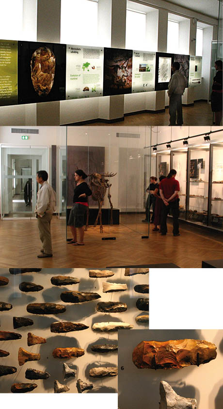
 Ill. 4.1: To the left an illuminated wall stretches through the exhibition and is filled with texts, photographs and drawings as well as a timeline. To the right of the exhibition rooms is a row of showcases with well-lit objects organised according to strict Ill. 4.1: To the left an illuminated wall stretches through the exhibition and is filled with texts, photographs and drawings as well as a timeline. To the right of the exhibition rooms is a row of showcases with well-lit objects organised according to strict  aesthetic principles. Seeing the objects up close is possible here. aesthetic principles. Seeing the objects up close is possible here.
Antiquity is objects – 12.000 of them
This section begins by presenting the new exhibition through a specific user's experience as well as a review of the exhibition while also providing a description of the exhibition and language of display, objects and space.
The specific user is my good friend Hans, who is excited about the new prehistory exhibition at the National Museum, a place he visited with his father in the 1940s and whose permanent collection he has seen multiple times since. Now 67 years of age, he is pleased and happy to see the objects again, especially in good lighting, after they had been hidden away while the rebuilding took place. He does not stop to read a single text as he is uninterested in doing so, because he already has all the knowledge he needs. Well-educated and deeply interested in history, Hans is in every way the ideal visitor for an exhibition on Denmark's prehistory.
Fully satisfied with the objects alone, he has all the categories he needs. Familiar with almost every single object, he knows the chronology, the archaeological division and the material. Being able to see twice as many objects, namely 12,000, is shear pleasure for him.
He does not concentrate on the curatorial aspects or the design approach at all. For example, he hardly sees that on the left side of each room is an exceedingly long frieze of square sheets of glass measuring 1.5 x 1.5 m placed in strongly lit boxes. Different colours represent the three main periods in ancient times and there is a timeline, introductory texts, photographs, drawings and detailed explanations. Hans also ignores the right side of the room with its newly designed, well-lit display case, which clearly illuminates the large quantities of objects beautifully positioned based on aesthetic and design criteria. Hans is impervious, as long as the objects, the many objects, are there.
Construction of the visitor
Hans is somewhat of an unusual visitor as he approaches the exhibition differently than the average visitor. First-time visitors normally spend time trying to make sense of the ordered chaos, doing so in an unconscious, Sherlock Holmes manner to find signs and symbols. The visitor is on the lookout for the signs and traces curators, exhibition designers, producers, writers and stage directors more or less present consciously. As a result the form and content of an exhibition work to construct the audience. Not necessarily through intentional statements, but through the whole physical and material organisation of objects in relation to each other in a space with the use of design in mind. Model Users are both a theoretical and an analytical construction that reflects the strategies the producer of the exhibition has directed at the user.
If an exhibition is to create a narrative understanding, then the exhibition must meet the user in a forthcoming manner. So how does the exhibition start? When meeting something new, people experience a sense of urgency and have the idea that they have a short amount of time find out what the exhibition is about; which particular approach or strategies the exhibition establishes; what one can expect to happen in the next hour; and what one can do at the exhibition. Perhaps there are good chairs to rest on and opportunities to connect one’s existing knowledge with any new knowledge encountered. Finally, there is an overwhelming curiosity about how one is going to look at what one sees.
Upon entering the new antiquities exhibition visitors find a small pamphlet called, “Denmark’s prehistory in 60 minutes’, which provides guidance on how the exhibition should be read:
This guide focuses on some of the highlights of the recently reopened new prehistory exhibition. Each exhibit opens the door to a different aspect of early life in Denmark, from the emergence of the first hunters on the tundra to the construction of the unique Viking monument in Jelling, which marked the transition from paganism to Christianity. We very much hope you will enjoy your visit.
Early life in Denmark
‘Life’ refers to birth, growing up, working, dating, having children, creating social networks, growing old and dying. Questions are raised about the people of antiquity concerning how old they were when they died; how tall they were; whether they had many children; how many of them lived in what was to become Denmark; and what their diet was like. Did they move far from home? What did they believe in? The phrase ‘... early life in Denmark’ raises a variety of expectations in the optimistic visitor. But does the exhibition indeed begin by meeting some of these expectations?

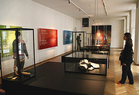
Ill. 4.2: This is the exhibition’s teaser, where we are exposed to the exhibition lexis and the categories we have to use to think.
The teaser is very simple; we are going to be taught. First, the special lexis in this exhibition, in this case the colour, is introduced. Three large boxes illuminated in three different bright colours hang on the walls: green represents the Stone Age; red-orange the Bronze Age and blue the Iron Age [Ill. 4.2].
The idea is to learn not only when the historic time distribution is an abstract temporal category, but also the reason why the subdivision is contingent upon the use of materials. Examples of the materials are provided in two showcases in front of each time period, e.g. for the Stone Age one showcase contains a large pile of flint and the other one has various objects carved in flint. The two main categories of weapons and tools generally define the three periods, while the Iron Age also includes jewellery and specialised kitchen utensils. Devoid of text or any explanations, the materials/objects in the showcases are not numbered. The only exception is a quote from Christian Jürgensen Thomsen’s 1836 book, Clues in Scandinavian Antiquity (Ledetraade i Nordisk Oldkyndighed):
Stone Age until 1700 BC. The Stone Age is the period when weapons and tools were made of stone, wood, bone and the like. There is no doubt that this was the earliest period in which humans lived in our regions. Metal was little known or completely unknown. In this period the large burial chambers of stone were built.
Normally, it is crucial that a good story or film begins in a precise manner, but this is not the case here. The text is highly timid and cautious. Surely the research conducted in the 172 years subsequent to 1836 has been able to provide more precise dating. The text also indicates that the aim of the exhibition is to convince or demonstrate to visitors that weapons and tools essentially constitute “... life in Denmark”. The heading causes disappointment as what is presented is incongruous with the expectations the heading builds up to. The initial approach is also condescending in that the names of the periods, Stone, Bronze and Iron Age, quite simply and obviously indicate what materials distinguish them from one another.
Perhaps it is symptomatic that the first room is called Room 0 on the layout in the pamphlet because it is outside the actual exhibition. Many visitors exclaim with relief, “This is where it starts!” when they see a sign at the end of Room 0 that states, “Entrance to the exhibitions”.

Ill. 4.3: It is significant that there is no illuminated wall and timeline in the last room. And what happened to Norse mythology and Christianity?
The exhibition fizzles out
After visiting the exhibition’s twenty-four (+ zero) rooms, visitors have passed the 12,000 objects available for viewing. Visitors expect the final room, entitled King and Christianity [Ill. 4.3], to be exciting after such a long odyssey, but the room, dominated by two, no three, objects is peculiar. Tiny, the room contains a large model landscape made solely out of cardboard of a small town called Jelling and its church. Upon entering, the model is to the left and has list of black lowercase letters running from a-e. The adjacent explanations are sparse and not especially enlightening. One of them states, for example, “The northern hill with the burial chamber built in 958-59 and opened in 965-66”.
Up until the final room the idea was to follow the traces of the three materials that define the different eras. Instead of stone, bronze and iron, the final room is approached from a new angle and cardboard is used. There is also a rather esoteric text about King Gorm the Old, his burial place in Jelling and graves and churches, thus causing visitors to wonder where it all leads, but the exhibition is over. Exiting, visitors must be content with a cardboard model and a brief text that ends antiquity with the statement that “we” became Christianised. There is no explanation of the transition that took place and the Iron Age is presented as ending abruptly in 1050 AD.
There must obviously be some other indecipherable criteria at stake that involves Christianity as a spiritual and secular power. Unfortunately, the crucial conflict between belief in Norse mythology and the belief in Christ is not unfolded. On the right side of the room, there is the usual showcase with some small objects, among them jewellery, including a silver pendant of Thor’s hammer [Ill. 4.4]. The text in the showcase states:

Ill. 4.4: The tiny pieces of silver jewellery show evidence of Norse mythology and Christianity.
From Norse mythology to Christianity - The transition from faith in Norse mythology to Christianity took place slowly. In the 9th century part of the population was Christian. In 965 when King Harald proclaimed the introduction of Christianity, the two religions had already lived side by side for a long time.
The closing room is both highly different from the rest of the exhibition and yet also quite characteristic of it. Much is required of visitors, but too little information means viewers can hardly create a connection between what they know and what is new.
Faith is exciting. If a link can be established between the academic content and all the other kinds of communication happening in society, then it is quite obvious that unfolding Norse mythology requires more than just with a few scattered comments. This is also true regarding the introduction of Christianity, which happens with a rather tame cardboard model. The sparseness of the information hardly allows viewers to create a coherent narrative from the fragments presented. The presentation of what is otherwise an enthralling topic, Norse mythology and Christianity, also fails to live up to the promise of the initial teaser, “... early life in Denmark”.

Ill. 4.5: The few generalised statements on the illuminated wall must be read, but they do not provide understanding and insight and leave vast amounts of knowledge hidden.
First impact: Flint in the Bronze Age
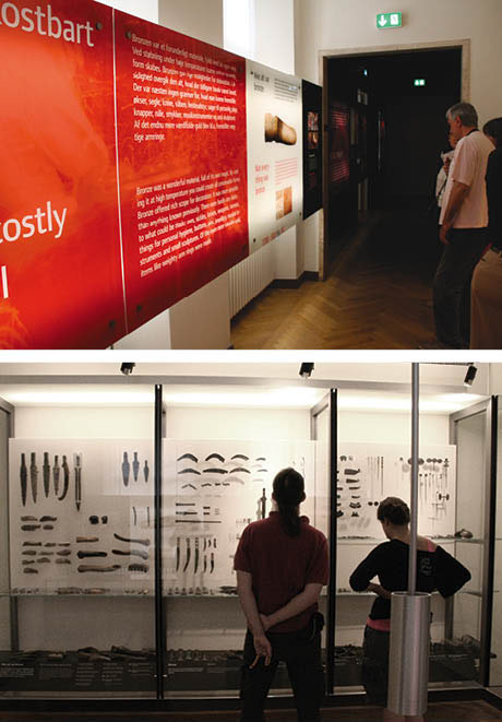
The numerous objects and extensive amount of text in the exhibition battle for attention. Visitors are expected to look at every inch of the contiguous, infinitely long illuminated wall and to read each text and study each picture. This puts visitors in a dilemma, forcing them to choose between reading the massive illuminated wall and throwing an odd glance at the objects, or abandoning the illuminated wall altogether and being content to look at the infinitely many objects [Ill. 4.5].
Doing both is not especially sensible, because the correlation between the illuminated wall and the showcases presenting a large accumulation of objects is weak. This inconsistency creates a large mental space that allows for the completely private interpretation of objects and their relationship to one another. Located half way through the exhibition, the room entitled “Bronze - a precious raw material” illustrates how visitors are abandoned to make their own interpretations.

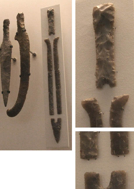
Ill.4.6: What is the story behind the broken sword?
Although it says Bronze Age, the showcases on the right wall are filled with flint swords. A brief text explains that even in the Bronze Age people still used flint extensively. One of the swords, broken in eight places, is hung on a special plate protruding slightly from the wall [Ill. 4.6]. Obviously, brittle material like flint cannot withstand being cut into a piece thin enough to make a sword for very long. Visitors, using their general knowledge, may perhaps conclude that the sword was destroyed either because it had been buried for so long or during excavation.
Other, more massive flint swords remain unbroken, perhaps due to their size. Despite being beautifully shaped and unique, the swords are familiar and recognisable. After ten rooms with some of the same kinds of objects similarly displayed, the viewer may experience a sense of boredom. The illuminated wall fails to provide clues to inspire new interpretations, leaving visitors to use their everyday knowledge, but at the lowest possible level. Exploration of the objects does not go beyond evaluating whether they are beautiful or ugly or good or bad workmanship.

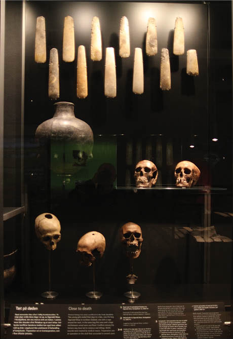
Ill. 4.7: The 12 axes hang threateningly over the skulls.
The second impact: Trepanation - a loss of information and experience
Room 4 has objects selected and placed in a decisive manner and texts that appear to make up a story. One showcase has twelve superb examples of axes arranged on an invisible grid of vertical and horizontal lines to create a narrative in which they appear to be on the verge of crushing a group of severed skulls. Although it looks violent, the display is also highly aesthetic, static and controlled [Ill. 4.7].
The skulls, punctured with precise holes, are one of the most conspicuous objects. The most immediate questions that arise are: Were the holes caused by an arrow or a spear? Did the people die from their injuries? Were the holes the result of torture? Were they the result of a medical procedure? A brief text below the three skulls states:
Close to death
People were also sacrificed in the early Stone Age. Two young girls ended their days in a lake, now Sigersdal Moor in North Zealand, one with a rope around her neck. Flint axes and a large clay vessel were also sacrificed in the same moor. Conflicts between peasants may also have triggered violence and killings. Medical procedures were used to treat combat injuries. Trepanation was a cranial surgery that sometimes succeeded.
In addition to being non-emotional, the text is incredibly dense and covers female sacrifices, the sacrifice of flint axes and pottery, violent conflicts and medical practices. The nature and tone of the text appeal mainly to well-informed visitors.
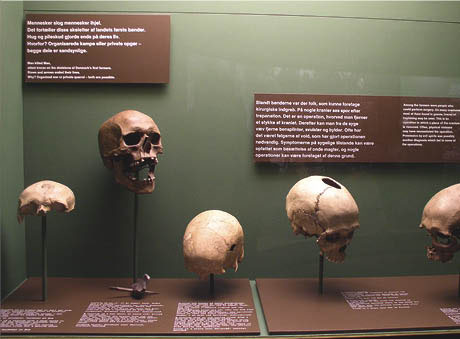
On its website, the National Museum, writes that the texts were written, “... so older children can read them”, but should this be the overarching goal of the texts? The absence of underlying content and assumptions makes understanding the texts difficult. When this type of skull was originally used to create a narrative in the old antiquities exhibition of 1972, much more detail was provided [Ill. 4.8]:

Ill. 4.8: Trepanation is described in more detail in the 1972 exhibition, which is more investigative. The visitor is invited to think side by side with the expert researcher. Photo: Carsten Tage Nielsen, 2006.
People killed people
The skeletons of the country’s first farmers bear witness to that.
Slings and arrows put an end to their lives.
Why? Organised fights or private encounters - both are probable.
There were people among the peasants who could perform surgery, some skulls showing signs of trepanation, a surgical procedure in which a piece of skull is removed to allow the removal of bone fragments, tumours or abscesses from diseased tissue. Violent acts often led to the need for surgery, the pathological evidence indicating the presence of malignancies.
The difference between the two texts (2008 and 1972) is not so much the length, but the richness of detail and the depth of explanation. The 1972 text was written by a knowledgeable but not omniscient person writing specifically about a topic of passionate interest. There are questions and a degree of uncertainty and conjecture concerning the explanations for the findings. The 2008 text is full of general postulations and devoid of an underlying story behind the facts. The link between the flint axes, pots, skulls and trepanation is only implied by virtue of the very broad theme “near death”.
An exhibition is not text, but text represents an easy shortcut for visitors to understand the objects on display. Text provides explanations, thus bolstering visitor understanding of the objects and the exhibition. When the National Museum enthusiastically writes that it took 18 hours to read all of the texts in the 1972 exhibition and it only takes one and a half hours in the new exhibition, they have missed the point. Namely that the key is to 1) create a fundamental framework through which visitors must see the exhibition and 2) define significant issues in the exhibition. The point is also that the composition of objects (and not text) must also provide a common thread.
The hidden exhibition
Creating a fundamental framework, defining significant issues and providing a common thread are what allow visitors, who are confronted with a variety of choices, to get something out of the exhibition. The 2008 exhibition lacks these key elements and comes across as strange and disappointing; its secrets remain hidden or disappear. The multitude of features is disruptive. The well-lit showcases make the copious number of objects visible, but the objects compete with each other to be seen, continuing to render the knowledge hidden [2]. The profuse number of objects is like a wall that does not allow visitor interest to be met with new knowledge.
Another aspect that also maintains the opacity of the exhibition is the giant illuminated wall filled with demanding text. As the above analysis attempts to demonstrate, the text on the wall is very literal and makes penetrating its surface to reach the knowledge it intends to reveal difficult. Visitors must act as archaeologists, not only in relation to the visible findings and objects, but also in relation to the signs, characters and texts whose level of abstraction prevents them from being accessible and welcoming.

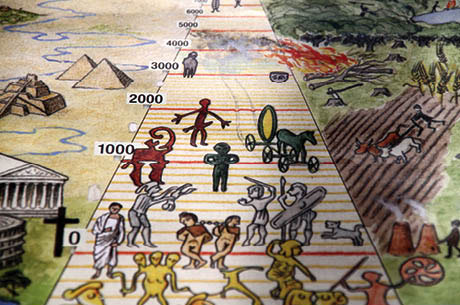
Ill. 4.9: Chronological table from Skalk, a popular science magazine for archaeology, history and culture. The popularisation of these topics has created a special understanding of different eras and outward perspectives.
The third impact: The illuminated wall and outlook on the world
Most Danes have encountered the chronological table found in the popular science history magazine Skalk. This chronological table is embedded in the new exhibition on the illuminated wall and is clearly its best design element. A chronological table reflects a fundamental need to relate what is known with something else, which is probably known, but from a variety of contexts. Take, for example, the Viking room, where the first to unexpectantly confront the visitor is a colour photo of the beautiful Blue Mosque in Istanbul, previously Constantinople.
Paradoxically, the curatorial approach does not become obvious until almost the end of the exhibition. The approach however is not as real as Skalk’s old chronology, where there is a clear depiction contrasting e.g. what was happening during the Bronze Age at home in Denmark ( fields, plows and mud huts) with what was happening out there e.g. in Greece (impressive temples and pillars). The inability to identify the curatorial approach is closely linked to the new prehistory teaser, which apart from being dull and obscure, fails to open the door to the exciting aspects of the exhibition. Room 1 provides an outward perspective by showing the Palaeolithic cave paintings in Lascaux, France, but this is the last attempt to contextualise anything in the exhibition until Room XX, when a comparison to the Romans is suddenly presented.
Employing the outward comparative perspective raises the critical issue of whether visitors need to know anything about other European cultures. Why are there no comparisons to the Middle East, South America, Asia or Africa? Is the aim to provide perspective using the Skalk approach or is the goal to explain what and how cultural influences came to Denmark? An outward perspective is wonderfully useful, but what is it that visitors must look at?
Unfortunately, visitors are not met with any clear indication of what the outward perspective is to be used for. The exhibition leaves the impression that the common knowledge of visitors is being strenuously rejected. Have the curators adequately identified the assumptions and knowledge visitors have of antiquity? If the curators have a general commonsense view of antiquity, then they realise that one’s consciousness of history is filled with fragments and that, at least for Scandinavian visitors, the Vikings and Norse mythology are dominant elements.
Visitor would be well-rewarded for diligently seeking out details associated with these areas. For example, there is a dark blue, well-lit display case with tiny reproductions of amazing ornaments depicting animals. They do not come across as overwhelmingly authentic despite what the abundant amount of flint Stone and Bronze Age objects gave promise to. It is disheartening that the exhibition does do not begin by communicating with visitors by meeting them where they are. The exhibition sorely lacks stories that allow visitors to connect what they see to the stories they already know from other media and contexts.
Were there 12 highlights?
My good friend Hans, who I mentioned at the beginning of this chapter, strolls through the National Museum with his four-year-old grandson, Forde, who pulls on his grandfather’s hand, asking repeatedly, “Where are the golden horns?” For Frode, his very own personal highlight is the golden horns. He knows what he is after and he does not want to see anything else. He is focused and knowledgeable.
The brief pamphlet distributed in the foyer of the museum presents 12 highlights that can supposedly be seen in 60 minutes, including the Egtved girl, the Sun Chariot, the Gundestrup Cauldron, the Golden Horns and eight other articles. These familiar items are characterised by an object-value derived from the material they are made of and the history told about them over the years, where they have taken on a significantly luminous, larger-than-life quality. The pamphlet presents the highlights as opening “… the door to different aspects of early life in Denmark”.
This obviously good idea of highlighting certain artefacts is so poorly executed that the only item to be given true prominence is the Gundestrup Cauldron, where the scenography makes taking in its grandeur possible. Room 12, which houses the Sun Chariot, spectacularly fails to highlight the most noteworthy object by making the highly unfortunate move of overfilling the room with other bright objects. Altogether, the exhibition design unsuccessfully focuses on 7 or 8 of the highlights, leaving them relatively unnoticed and invisible. They are not given the specific substantive value the special term ‘highlight’ implies in the pamphlet.
Narrative - a quest for meaning
When discussing the use of an exhibition, an analysis should rightly cover creating, being created and using the exhibition to explore three different narratives: the room’s narrative, the body’s narrative and the emotional narrative.
The analysis presented in this chapter explores how it is possible to create meaning in the objects, spaces and texts provided by an exhibition, in other words, to create the room's narrative. The exhibition analysed nearly makes itself invisible and, as the National Museum writes on its website about the highlights, it is a studio collection [3]. The museum also notes that it has “… a number of very beautiful ancient treasures known and loved by most Danes ...” This implies that the new prehistory exhibition is for people already familiar with the content and not for those for whom the secrets of antiquity are new.
The way visitors walk, stand and read texts or use their bodies while exploring an exhibition is the body's narrative. The new prehistory exhibition only engages the body minimally, making visitors somewhat tired after they are only halfway through it. The only activities that are encouraged are walking, standing, looking and reading texts, for example the texts and pictures on the illuminated wall. Visitors can of course also speak to those accompanying them or sit down en route, but, strikingly, there is nothing else to do. There are no digital media, buttons to press, screens to activate or sounds to trigger. The conspicuous absence of modern technology means that the exhibition could just as well been developed in the 1930s and not in the mid-2000s.
An exhibition must challenge visitors emotionally, allowing them to create an emotional narrative [4]. The museum apparently did not focus on young people as a specific target group, and although writing readable texts for older children is admirable, young people today expect more before an exhibition becomes relevant to them and they are able to create an emotional narrative. The new prehistory exhibition limits itself by focusing on archaeology professionals, the infinite number of objects, knowledge and perhaps older, highly enthusiastic visitors like my friend Hans.
The exhibition’s inability to set in motion the room’s narrative, the body’s narrative and an emotional narrative is somewhat catastrophic considering that the new exhibition may be around for the next 30 years or more. One can only hope that for the sake of future visitors the exhibit will be modified, adjusted or even completely changed, especially when it comes to appealing to younger visitors. Until then, audiences will have to live with the new prehistory exhibit as it is.
Notes
[1] The A.P. Møller and Chastine McKinney Møller Foundation for General Purposes gave USD 36 million to help establish the exhibition.
The National Museum of Denmark’s curator, Lars Jørgensen, describes the exhibition as being divided into three sections, “The first division is a backlit timeline, where the main text and most of the graphics are located. The exhibition is still chronological, so that the process is progressive. Several points are nevertheless more thematic, where the scenography of the rooms is in focus, breaking the temporal course ... (2008)”.
The rooms’ central axis is freestanding showcases containing highlights from ancient times. There are also a number of seats where the audience can rest or look at selected objects. The 12 items listed as highlights are of course mentioned in the timeline and are often at the entrance of the associated room.
Finally, opposite the timeline is a wall of objects designed to give an impression of the diversity of items in the exhibition. The texts here primarily accompany the objects and are supplemented by individual graphic elements (Jørgensen 2008: 182-184).
[2] Reflections from the illuminated wall and the strong light can be disturbing in rooms that are dark, perhaps causing interesting objects to be less visible.
[3] http://www.natmus.dk/sw34914.asp
[4] The room’s narrative, the body's narrative and the emotional narrative are inspired by The Attention Model (see Chapter 7).
|

