Chapter 2:
The safe harbour - How an exhibition constructs the user
This chapter, which focuses on a temporary exhibition at the city museum in Odense, Denmark, on the history of the local harbour [1], looks at the exhibition in question as a prototype for similar history museum exhibitions. The aim of this chapter is to uncover the exhibition’s secrets and expose hidden codes and stories in an attempt to present a more generalised idea about how to talk about and analyse the relationships between the user of an exhibition and the actual exhibition. The relationship between the realm of possibilities in the exhibition and the framework of possibilities for the user is apparently exceedingly strong and stimulating.
Through a combination of objects, pictures and text an exhibition creates a unifying design with broad and narrow opportunities for the objects to tell stories. An exhibition creates an identity based on its theme, while the objects, people and institutions involved are actors in the exhibition’s narrative.
Exhibitions also create an image of exhibition users based on the competences an exhibition expects visitors to have or to acquire through its representations. Thus the Model User is both a theoretical and an analytical construction that reflects the strategies an exhibition designer intends the user to apply. Hopefully the strategies are intended to help the user create a coherent narrative from the many components in the exhibit. The pragmatic reception analysis subsequently becomes a tool for creating a framework for analysing two key elements: users and exhibitions.
Users are presented with a variety of story options that are not only interesting, but that allow the viewer, in an informal learning space, to enter into or construct a narrative.
Encountering the harbour
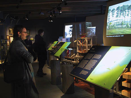
Five 12-year-old boys come running noisily along the mock gangway and stop up at the end of the room; they see something that fascinates them and exclaim, “Look, the soft drink cans are completely pressed together into a square” – only to run off through the rooms until they reach a room with photographs and models of a residential area where one boy calls out, “I’ve lived there. It was absolutely dreadful. I could never find our house because they all looked the same!”
An old man walks slowly and cautiously along the gangway right past most items until stopping at the end of the exhibition to look at the numerous paintings in gilded frames hanging on the wall, after which he exits the exhibition.
Did the boys and the old man actually see the same exhibition? What do viewers actually do with an exhibition? The old man passes all of the objects, photographs and maps before stopping at the rather topological paintings. He stands there, obviously touched by what he sees. His views them from an aesthetic perspective, perhaps searching for a surprise element, but the shear conventional nature of the amateur paintings fails to astonish, so he has to be satisfied with a more pragmatic approach and be content with recognising the local areas the paintings portray, perhaps giving him a feeling of nostalgia by bringing back the good old days. He knows something about the present and he knows something about the past and he can combine both time and space into an appraisal of what matters to him.
It is enough. He did not experience anything surprising, but what he did experience was authentic and personal.
Totally indifferent to the old paintings the five boys look for something they can identify with. They bypass all that old stuff to find the newest and the coolest items, namely the beer and soft drink cans crushed unmercifully into a solid metal cube measuring about a half a meter tall. The metal has been forcefully mutilated and transformed.
They boys also feel a sense of recognition. Photographs of worker homes in the part of town called Skibshuskvarteret have houses one boy recognises, but his familiarity with them brings out a strong reaction of discomfort. His response transforms the experience and attitudes of the other four boys. He becomes an obstacle to having a shared experience. He takes on the role of personal guide, showing them into the special universe the objects and images in the exhibition reflect. He can help his peers identify with his response because they can relate to him as one of them. Moreover he is conferred authority and the force of interpretation because he has personal insight into the content of this part of the exhibition because he used to live in one of the areas pictured. The boy is also a good communicator because he speaks their language, intuitively recognising what is good for them to know and experience.

Ill. 2.1: The encounter between the objects in the room and the user’s response create the exhibition.
How is it possible to really knowing what the exhibition can do and what one as the user can do with an exhibition? As the two introductory stories suggest, users create their own exhibition and - I will argue – do so in a way that is more individual and creative than what occurs when watching a movie or reading a book. This flexibility comprises both the strength and weakness of an exhibition. The exhibition is an encounter between the exhibition’s possibilities and what the framework of possibilities is for each user.
The following section looks intersubjectively more closely at the exhibition, the safe harbour, in an attempt to read which signs help constitute the social space the exhibition encompasses. The exhibition sets a framework for creating meaning; it encircles something and it omits something. The exhibition is manifested primarily as an event. Suddenly it is there and suddenly it is gone. It is an option available for a limited period that is also an event in that visitors can discover, visit and see it in five minutes or in five hours. As a visitor I allocate the exhibition a portion of time for me to experience it, thus creating an experience for myself.
The boys and the old man made their own exhibition in the five minutes they allotted to the exhibition. If they ever consider it important enough to tell anyone their own story of what they have seen, they will certainly describe two exceedingly different exhibitions. In addition to the uses just described, it is possible to identify what one really can do with the exhibition.
The exhibition creates its user
This section analyses the exhibition from two central theoretical positions, one of which is based on pragmatic reception theory, which emphasises understanding the text (or exhibition or picture) as a meaning-making act in which the meaning of the text is constructed through interactions between the text and reader. This overall position is based on semiotician Umberto Eco’s idea that an exhibition constructs its own user and the strategies invoked. The second basic theoretical position is based on cognitive psychologist Jerome Bruner’s idea about how we understanding the world. Bruner believes that a narrative understanding, i.e. creating stories about what we are experiencing, is crucial to our experience of the world.
Psychologist Theodor Sarbin’s narratological principle describes the drive to create meaningful contexts. Sarbin writes, “... that human beings think, perceive, imagine and make moral choices according to narrative structures. Present two or three pictures, or descriptive phrases, to a person and he or she will connect them to form a story, an account that relates the pictures or meaning of phrases in some patterned way” (1986:8). These patterns can be made up of what constitutes what is normally called a story and have a beginning, a middle and an end. The question then is why does it matter how an exhibition begins or what the teaser is like?
A recurring feature in the analysis of the safe harbour is an exploration of how the exhibition constructs its Model User and partly a quest for how the exhibition creates one or more narratives.

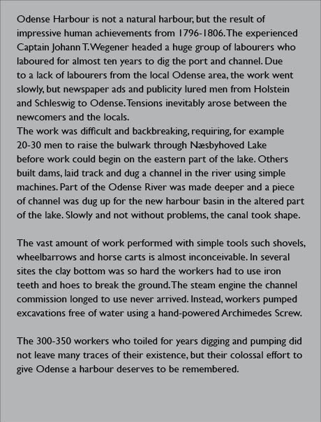
Ill. 2.2: The text that introduces the exhibition Harbour
– Odense Docklands and Canal over 200 Years is the initial teaser to the narrative.
Can the invisible become visible?
The teaser at the beginning of the exhibition embodies the crucial values at stake and which later appear in the exhibition. The teaser also introduces the theme of the invisible [Ill. 2.2].
Work to dig the channel and Odense harbour began in approximately 1800 and took 10 years to complete. The work was mainly carried out by foreign workers comprising more than 300 men brought in from Holstein and Schleswig in Germany. The exhibition’s introductory text states that the, “... large work crew that dug and pumped for years did not leave many traces”.
A pair of large old work boots, an old shovel, a worn out wheelbarrow and some old floorboards are displayed below the text. In contrast to all the other objects in the exhibition, there is no specific indication of e.g. what these items are or where they come from. Probably because they are simply a visualisation of the hard work that took place and of what is invisible. This display is appropriate in a cultural historical museum that emphasises material culture and in this case it is the workers and the non-material property for which no trace has been left behind. With 300 or more men present in an area for over ten years, one obvious conclusion is that they might have left something highly tangible behind – children, grandchildren and subsequent generations.
The texts in the exhibition highly praise the enormous job carried out by anonymous workers: “… they and the colossal amount of digging they did deserves to be remembered”. The visible part also belongs to the dockers, whose only remaining artefacts are the many children they left behind.
The tone of the texts marks the distinction between the others and us. Between ordinary middle-class citizens and the others; between a stable, controlled life and chaos. The part of the exhibition describing dockworkers explains, “Today goings-on at Restaurant Sprogø awaken memories of the lively and, for some, scary environment that existed here up until the 1960s”.
The exhibition also indicates that large wagon trains of travellers and people “… who did not live a normal bourgeois life” called the port home. The various colourful environments represent a challenge for the exhibition that it certainly does not take up, but that it nevertheless makes an attempt to address.
People’s objects are preserved and exhibited as well. For example there is an optimistic story about the fraternal fish society and its amusing ballot box, not to mention a description of their annual drunken fishing trip. This story reflects an atmosphere that is far from the lively, scary environment found at Restaurant Sprogø. The respectable, bourgeois elements of life are visible not only in the preserved objects, but also shine through the overall design of the exhibition, which is beautifully designed aesthetically and uses a colour scale ranging from dark gray to silver, sharply accented with a glaringly bright greenish yellow.
The exhibition is nice, orderly and proper. Visitors enter the exhibition on a gangway painted gray and green with greenish yellow warning stripes, but it all looks so new. There are no oil stains, no soil and dirt, no scratches or cracks in the wood, no wear and tear etc. There is nothing that marks the “invisible” anonymous workers who walked and worked tirelessly and pulled and lifted and lost. There is no uncertainty. There is no trace of their existence. Thus ‘we’ represents the bourgeois or those in possession of civic virtues and ‘they’ represents the invisible but also what is colourful and dangerous. By talking to visitors, the exhibition - the Harbour - brings us into a safe harbour.
Does Odense have a harbour?
Believing that the town lies too far inland, unenlightened tourists are surprised to find that Odense has a harbour, especially because there is a steel shipyard by the sea in nearby Lindø, which does not influence Odense. Tourists wonder where exactly the harbour is in Odense. This is the first riddle the exhibition puts forward - and its answers.
From the pragmatic reception theoretical framework one seeks as a visitor and user based on the themes, traces and signs in an exhibition, the visitor/user has the opportunity to link them together to create a coherent interpretation universe. At the same time the exhibition constructs a number of narratives through objects, texts, photographs, maps, designs and paths through the various rooms. It is this complex material universe I must interact with and explore. I have the role of a highly interested observer who would like to understand what I am being met with and what the museum wants me to experience.
From the beginning I am sympathetically disposed to the entire museum, which has dared to remove what numerous other local historical museums tend to exhibit, e.g. traces of local history from antiquity until the Second World War or up to the present. Always in chronological order. The topic here is narrower: Harbour! And covers a time span limited to two hundred years. This is also a temporary one-year exhibition, leading me to suppose that this museum has an active, modern exhibition policy based on the premise that a museum is not somewhere you visit just once in a lifetime, but a place that regularly presents new and different exhibitions. What an exciting prospect.
1806-1904-1965
The exhibition has no fewer than three teasers that cover ‘the invisible’, the code 1806-1904-1965 and ‘the future’. Approaching the exhibition from a narrative theoretical starting point means that the main characters introduced, the conflict and the progression of the narrative are of interest.
One significant drawback with the first teaser involving the invisible is that the main characters initially appear almost exclusively in the exhibition’s introduction and basically do not reappear later. The user attempts to create cohesion by looking for conflicts or emotions that can underpin the invisible as the main characters. For example the dockworkers’ own stories of uncertainty and degeneration could have been told. At least there is a red flag from the trade-union movement. Teasers can be viewed as specific details that provide a summary of key themes. Teasers can be a carefully selected object or a single text addressing the core of the story. One familiar approach to films is applying commonsense understanding by decoding or attempting to decode the unknown through known codes. If this fails, the visitors/viewers will begin hunting for new codes, a step that can create a bridge or open a small hatch or push a giant gate ajar to what is new.
The code 1806-1904-1965 presents a highly interesting puzzle. On the most banal level, they probably represent years, but why precisely these years? What is the user being asked to recall in relation to the history of Denmark? Was Copenhagen bombarded and humiliatingly defeated in 1806 by the British? What about 1904, which covers neither the World War I nor the reunification of South Jutland? Does 1965 have something to do with the Cuban Missile Crisis and the Cold War? Certainly they are not referring to 1968 and everything it produced? Finally, the question can be asked as to why 2003, which would mark a 200th anniversary, is not included on the list [2].
The previously mention boys and the old man perhaps never noticed this puzzle or were not interested in it. A riddle must also be interesting and relevant. Eco believes the readers or viewers have a philosophical duty to understand a text as it was conceived or at least as they are able to meet it. This is the approach that I plan to employ to break the code.

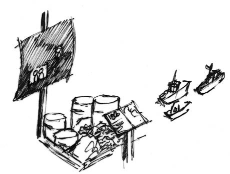
Ill. 2.3: The three years are presented using four types of codes. The first one is a sail upon which drawings, photographs and paintings from the period are projected. The next one is a pallet loaded with selected commodities and goods typically transported by ship. The third code comprises three model ships that illustrate the size, type and name of the ships used. The fourth one is a display showing a map of the channel and harbour accompanied by an explanation.
The code is revealed in four different ways in one assembled installation. There is a green card with something blue on it showing how the canal was dug from the small town of Stige to Odense. The first map shows how the area looked in 1806 and the second one shows how the channel changed and was expanded in 1904, while the third map indicates the changes in 1965. The second part of the code is presented by each year in the form of three miniature ship models illustrating the types of ships used to navigate the channel and harbour at the time.
Information is consequently added about the depth and the width of the channel and the port, which naturally were expanded over time to allow larger ships to enter the harbour. The third part of the code is presented using a pallet carrying goods typically transported by ship for one of the three years, for instance the metal square of compressed beer and soft drink cans the boys were so fascinated by. The fourth part of the code is presented on a stylised sail upon which drawings and photographs are projected showing work at the canal and the port. The big room where the three installations are located is filled with port sounds from the different time periods.
The well-made model ships and prototypical goods are fascinating, but they are not reflected in the code, which is apparently made up of a random selection of years. The theme of the invisible has already receded and knowing anything about the three years appears to be irrelevant, leaving the user to assume that the years are probably not especially significant.
The third teaser comes late at the close of the exhibition. The hidden year or time, namely the present and the near future, are suddenly apparent. In the last big room of the exhibition, the design and contact have undergone changes. The gray and silver tones accented with a glaring greenish yellow are gone. In this room, where everything suddenly becomes white and architecturally styled, users enter a new visual and linguistic code, namely the planning and architectural displays and models. Users enter an unfamiliar room filled with designs for architectural competitions and where future ideas are presented and discussed. Plans for the future of Odense Harbour are on view. Users are addressed as political citizens and told about dreams and visions.
As a visitor, I am convinced that this teaser makes the exhibition highly topical and relevant. I do not live in Odense, but the exhibition clearly increasingly targets the city’s inhabitants, who are friendly but rather frightened by what is new and unfamiliar. The political future angle updates the exhibition. What if the exhibition were reversed and started with a completely different question such as, “What should happen to Odense Harbour?” – then many things would fall into place. The exhibition would have a clear, pronounced utility value that would go beyond the traditional history of the development of the port. The exhibition would look at the existing buildings in the port from more than the traditional angle, which generally focuses on beauty and aesthetics. As the exhibition catalogue states, “The large concrete silos are perhaps not beautiful in the classical sense, but the geometric shapes and large building masses offer their own beauty.” Unfortunately, the current exhibition does not make this approach possible.
When objects are gathered by design
Even though exhibition design is a mixture of aesthetics, function and technique, this is not how we experience it. Users generally tend to respond emotionally, their reactions ranging from irritation and confusion to happiness and feelings of comfort. They sense what is happening and react without necessarily being able to articulate what the source of their emotional reactions is. How the design is experienced shapes the users’ overall experience of an exhibition. For example, it rapidly becomes clear whether something is cool and modern or old-fashioned and out-of-date. Taste, however, is not innate, but rather a learned part of one’s cultural repertoire.
An anecdotal story about a weekly magazine in Denmark illustrates what good design is. In the 1970s when Danish author Paul Hammerich completely redesigned a magazine and gave it an elegant new design, the circulation numbers plummeted. Circulation rebounded however when the design was again messy and chaotic, similar to that of supermarket leaflets with a plethora of colours, images and text at odd angles. The new editor explained that the impetus behind the magazine’s new identity was that it must resemble the homes it appeared in.
If considered from a Bourdieuian perspective, what does the harbour exhibition look like? Certainly not the low style of popular weekly magazines. It looks like highly stylised advertising. Taste is about more than just aesthetics; it’s about inclusion and exclusion. While at an exhibition, unless there are familiar aspects and the user feels embraced, then the feeling of being expelled and excluded can arise. Feeling included makes users a part of what Stanley Fish (1980) calls the interpretive community and allows them to appreciate e.g. the simple, elegant and raw design.
Regardless of the inclusionary and exclusionary signs an exhibition design presents, a clear and thorough design approach can unify, and on a surface level, make a 'poorly structured exhibition appear comprehensive and targeted. This is the strength and weakness of design. Visitors however cannot be fooled. Even if they experience clarity, the exhibition will seem irrelevant if it does not go deeper than the aesthetics, which is the lowest level of experience when trying to create meaning.
Users who spend an extended amount of time at an exhibition will discover many astute and thoughtful details. For example, at the harbour exhibition, I discover that the three years also function as a design tool in that each topic always had three drawings or photographs selected according to the three years, thus providing a contrastive history.
The material culture
Plain and simply, exhibitors can display what they have, but they cannot display what they do not have. When this is the case, cultural history museums face a fundamental challenge if they look at objects as the only crucial element of an exhibition. Eva Persson (1994), an extremely experienced Swedish exhibition producer, thinks that objects can either stand alone, stand in contrast to another object or being linked by similarity to another object. Museum manager John Hennigar Shuh believes that, “One of the major advantages is that most people are capable of being fascinated by ‘things’.” (1999:81). Reasonably, Shuh sees believes in the potential of this fascination because he knows that people are not wildly enthusiastic about seeing the endless number of objects they encounter in daily life. He believes that museums have a unique ability to focus viewer attention on an object and that the object has a story to tell if people are able to listen.
Simply appearing in a museum showcase is apparently not enough; someone also needs to ask the right questions to help the spectator and the objects create a story together. But is this what happens at Odense exhibition?

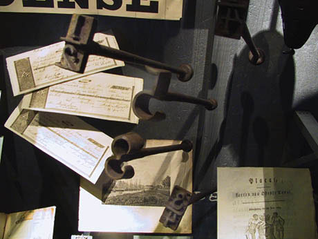
Ill. 2.4: Branding irons with the numbers ½, 5, 3 and ¼ hang decoratively in front of the documents and engravings.
The heading in one showcase reads, “Port and channel management”, causing viewers to rightly guess that the showcase contains a variety of papers, forms and books about the port and channel. There are also 30 cm-long iron objects with an inverted 4, 8, ¼, ½, 5 and 3 written on the ends. They are beautifully and decoratively hung on an imaginary axis. A brief text explains that they are branding irons used by customs officials.
When Shuh believes that museums can focus visitor attention on an object I become attentive, but I also get disappointed. Shuh, who would have been a great companion during my visit, has written an article in which he uses a Big Mac Styrofoam box to wonderfully show how questions can prompt viewers to look at one object in fifty different ways (1999).
In an attempt to decipher the numbers 4, 8, ¼, ½, 5 and 3, I try to link them to 1806, 1904 and 1965, but some numbers are missing. I wonder why exactly these numbers were chosen. Were 1, 2, 6, 7, 9 and especially 0 not needed? Are the numbers selected aesthetically beautiful in some way? Finally, why are the numbers placed in this particular order? I wonder what the branding irons were used for and whether the numbers represent a date or an invoice number or anything imaginable.
My point is that the objects in the Odense exhibition do not create the kind of attention described by Shuh in that no surprising story is told through them. Yes, I can read that smuggling was widespread, but no specific story emerges containing exciting details such as how the items were smuggled, who smuggled them or what customs officials did to counteract the problem. The branding iron would have been an ideal artefact to use as a starting point for explaining customs clearance procedures. Writing this analysis requires me to reflect on my experience to gain an understanding of my initial feelings of disappointment toward objects whose stories remained silent.
While I was at the Odense exhibition a Spanish couple came walking by with their two 10-12-year-old children. They could not understand the signs, which were in Danish only, so they just went around the rooms slowly. Then they stopped because they had caught sight of my advanced digital camera sitting on a windowsill. The couple’s son began carefully looking at it and they all talked eagerly together. Finally, an object they could relate to and allocate possible stories.
Learning and fun
Catching the right punch line in terms of experience and meaning construction at a museum is easy, especially within the framework of constructivist learning theory. People form their own individual opinions and carry their knowledge and feelings with them, drawing whatever they can out of the objects and texts in an exhibition.
Is this the way it should be or is this a sign of laziness? The director of a major museum once said that if visitors recognise an object at a museum because it looks like something their grandmother had, then they have benefitted from the museum’s exhibition. This approach is rather un-ambitious and also represents a misguided understanding of constructivist learning theory. If a narrator, sender or museum has no goals about what they do then they might as well find something else to do.
Falk and Dierking have two fundamental notions about why people go to museums and what they get out of doing so. First, visitors expect museums to be an informal learning space that is, and this is key, also fun (2000:72). Second, people go because the learning is contextualised. According to the second notion, learning takes place through more than just the objects, images and texts appearing in the context of the exhibition. There is also the context the viewer brings or adds and the context possibly created from viewer knowledge and experiences outside the museum environment (Falk & Dierking 2000:32). Viewed as a dialectical game – the overall design of the exhibition creates a series of cues, which easily allow drawing connections to the world outside the museum - and which motivate the visitor to establish the possible relations to the world outside the museum (Gjedde & Ingemann 2008: 49-74 & 75-98).
The Odense exhibition mainly only makes it possible to create connections that are topographical and factual with the available pictures and models, which are anchored through the text as objects and recognisable locations. The connections are rather weak because the richest relationships are those which Falk and Dierking call, “... an emotional, cognitive, and psychomotor learning experience, a learning experience that was rich enough to be transferable to a new situation” (2000:23). They emphatically conclude that, “Contrary to popular belief, there is no evidence that visitors come to museums either to learn or to have fun; ... visitors come both to learn and to have fun. The individuals who choose to go to the museum seek a learning-oriented entertainment experience” (2000:87). Falk and Dierking’s examples of a good combination of learning/play involve children’s museums, where learners have more autonomy and control over their own learning (2000:187) and where psychomotor tasks allow them to become involved emotionally by testing things.
The question at the harbour exhibit is whether visitors have both autonomy and control. On an abstract level, every exhibition naturally leaves the selection and control to the visitor. On the practical level it does not happen because the producer of the exhibition has excluded something and included something else which I as the visitor cannot relate to. On a practical level objects, texts, themes and structures are used and presented that provide many or only a few opportunities to create a cognitive, emotional and physical relationship to the exhibition to share with the world outside the museum and the visitor’s knowledge and memory. The harbour exhibition fails to embrace the emotional and physical aspects, leaving almost only pure cognitive relationships. Knowledge can be gained, but it is a knowledge that resembles what can be gleaned from a traditional textbook instead of a genre-specific museum with an educational/playful approach. Knowledge is acquired, but no questions are posed; there are answers but no tantalising puzzles. There are objects, but no stories behind the objects.
New categories
I ask myself the question as to why this otherwise so apparently nicely designed exhibition falls apart for the visitor. There is a lack of relevance for me as a visitor and a lack of narrative drive that elevates the experience beyond that of dusty artefacts. There is not anything wrong with the objects themselves, but rather the exhibition structure and the way the individual components are categorised. The headings are sedate, lack imagination and have no power, e.g. Port and channel management; Port and city; Shipbuilding in Odense - Lind Hansen’s shipyard; N.F. Hansen’s shipyard; Odense Steel shipyard; Work and life on the harbour; From middle-class excursion spot to working-class neighbourhood; Dreams for the port.
In an attempt to further pinpoint what is lacking in the harbour exhibition, I apply six questions involving a variety of categories and structures that were used by a different museum in a completely different location. The only change is that I have replaced the word ‘art’ in the list below with the word ‘harbour’.
How does harbour conceal and reveal secret knowledge?
How does harbour mark physical and social boundaries?
How does harbour express the secrets held by each gender?
How does harbour identify the owners of secret knowledge?
How does harbour transmit secret knowledge?
Can we ever really understand another culture’s secrets?
(Kirshenblatt-Gimblett 2004:576)
Replacing the word ‘art’ with ‘harbour’ allows one to imagine a completely different and much more investigative exhibition that demands something form the viewer. There are many aspects of what is hidden and secret that could be explored, for example harbour wild life, the colourful people and the invisible. In the Odense exhibition these topics failed to become real like people of flesh and blood or to have clearly defined values and attitudes. The exhibition does not live up to the old adage “Don’t explain it, show it!” Although the harbour exhibition is appealing, there are too many objects that are not part of a meaningful narrative.
Seeing an exhibition
Using a phenomenological approach and following Husserl’s challenge to “go to the case itself”, my starting point is the practical experience and letting the experience determine the choice of theories [3].This method means that not all exhibitions can be analysed in a similar way because they raise different questions when looked at closely. Consequently I chose to introduce some fundamental issues using at least three different methodological approaches. In employing a pragmatic reception theoretical approach I applied Umberto Eco’s theory of the Model User to extract the semiotic traces that directly and indirectly talk about and to the visitor and to examine how the exhibition and its objects, pictures, texts and design construct the user [4].
The second pragmatic approach, based on Bruner’s theory of narrative understanding, involved examining the exhibition’s narrative structure in relation to the ability of visitors to create meaning by generating their own narrative. This meant using a simple structure - a beginning, a middle and an end - that has been around since the time of Aristotle. This makes it essential to look at the teaser of the story as the input and the framework created for us to find meaning in the “... murk of chaotic experience” (Bruner 1990:56).
The third approach is the learning theory based on Falk and Dierking’s theory of informal learning spaces, with emphasis on a good combination between learning and play and thus opportunities for emotional and physical experiences.
The consistent feature of the analysis lies in the beholder. It is the visitors, viewers, readers and users who construct their own exhibition and the museum and the exhibition offer a number of aids to make this possible.
Notes
[1] Harbour – Odense Docklands and Canal over 200 years.
[2] I visited the exhibition in Odense in 2003.
[3] ”It is not necessary with a claim to see with your own eyes, however, it is important not to interpret what is seen away because of biased thought coercion” (Husserl 1987:61).
[4] The pragmatic reception analysis starts with the ‘text’ and not the real user of the exhibition or the intention the museum or its curators had. It is “the thing itself” that is examined.
|

