Chapter 17:
The Journey
– Design between creativity and organisation
The general practice of cultural history museums is to treat original objects as sacred and not alter them in any way when they are exhibited. It is acceptable to construct or insert a context to help understand the meaning and value of the object e.g. by adding a linguistic message to anchor the meaning and interpretation. But how can this precondition be overruled or transformed so the use of the original objects can be displaced and accepted?
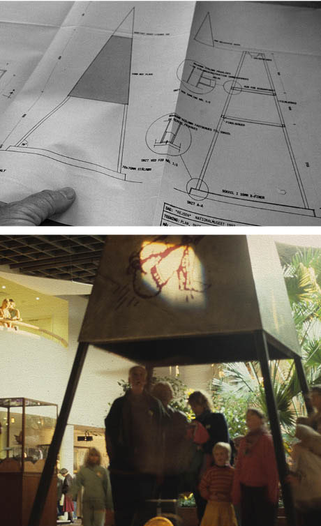
The designer meets with a young architect at the architect practice to hear more about his second task, which is to create the content and the form of a part of the exhibition called the Journey of the soul. The designer was fascinated. The young architect, enthusiastic, engaged and highly persuasive, brought to life a drawing he had made of a shaman tower, a more than 6 meter tall, tent-like structure with a 2.5 m2 base. It has an illuminated triangular top and the space at the bottom is big enough for visitors to stand and look up to watch the slide show the designer is to create [Ill. 17.1].


 Ill. 17.1: Architectural drawing of the Shaman Tower shown to the designer. The photo shows the surrounding context of the Shaman Tower at the Danish National Museum 1992 opening exhibit. Ill. 17.1: Architectural drawing of the Shaman Tower shown to the designer. The photo shows the surrounding context of the Shaman Tower at the Danish National Museum 1992 opening exhibit.
Full of infectious enthusiasm, the young architect did his best to breathe life into the tower and the designer. What is shamanism? The architect explained that shamans can enter into a state of altered consciousness at will. While in this state, they make a conscious choice to journey to another reality outside of time and space. This other reality is composed of three layers: the lower, middle and upper world, which are inhabited by helping spirits. The shaman is able to establish relationships with these spirits and bring back information and healing for the community or for individuals. Most importantly, shamans make a practical difference in the real world. Their work brings about a change. The journeys are undertaken with a specific purpose in mind.
A basic principle of shamanism, which is a practice not easily defined, is the belief that everything has a spirit and is alive. A tree, a rock, a drum, and yes, even a computer, has a spirit. If everything has a spirit and is alive, then humans are in a position of equality rather than dominance. Following this logic, shamanism is a radical practice. Shamans do not follow the laws of man; they follow the laws of the spirits. They do not dominate the earth and its creatures; they strive to live in harmony and balance [1].
The architect showed the designer pictures with tents and drums in a book with the Evenki people of Siberia. He stressed that the meaning of the word shaman is ‘one who knows’. As it later turned out, his layman enthusiasm for the Evenki and their shamanism would be transferred to another place due to the material objects that would serve as the foundation for the content of the Shaman Tower. A freelance ethnographer whose expertise is Greenland and who has in-depth knowledge of Inuit myths and their shamanism wrote the synopsis for the slideshow the designer was going to do. The ethnographer chose the well-known Inuit legend about the journey to the Mother of the Sea. Briefly, the story is that the Mother of the Sea was upset by the Inuit’s evil deeds at their settlement so as a punishment she gathered all the animals hunted by the Inuit into her fiery hair at the bottom of the sea. When the Blind One came down to remedy the situation, he combed her hair, gathered the dirt in a heap and threw it away. At that exact moment everything came alive: a bear, a fox, a hooded seal, a bearded seal, a ringed seal, a harp seal, a common seal, a walrus, a narwhal and all manner of birds.
The ethnographer used to be a curator at the National Museum and was familiar with the famous pencil drawings illustrating this legend made in the early 1910s by the Inuit sealer Karale Andreassen.
Still in the initial creative phase of gathering information and experiences, the designer went to see and photograph the original drawings in the museum. Wearing white cotton gloves, the curators opened the huge boxes containing the drawings mounted on large white passepartout. Ever so small, the drawings were gentle and soft. Drawn with an ordinary pencil, the lines were light gray and lacked the drama and amount of expression that the designer’s preconceptions had caused him to expect. The job would not be as simple as photographing these drawings, turning them into 20 slides, creating a narrative of the legend and then adding a sound track of authentic shaman activities comprising heavy drums and loud songs in Inuit. The designer was finished collecting material and impressions and could now begin the creative process of making a slideshow with a whole different approach than the one he had anticipated using.
The constraints and the development
The original material had important constraints. First it was limited to the legend of the journey to the Mother of the Sea, Andreassen’s five pencil drawings and an original sound recording from the 1950s. In addition to these constraints, there were also the ones set by the designer: 20 slides shown from two Kodak carrousel projectors that melded into one another, a two-minute narrative and exclusive use of the sound track (i.e. no commentary whatsoever). The entire slideshow would also repeat on a continuous basis. Another constraint was the fact that the final slideshow had to be shown inside the Shaman Tower in an exhibition room where people would be milling about and talking.
In a handbook about the creative production of slideshows the designer wrote a short contribution in the same year as the slideshow on how the journey to the Mother of the Sea was created. In the text, he introduced a rather new digital process for turning pictures into slides on film. This text from August 1992 takes a detailed look at the creative production that took place based on five original drawings. The designer examines not only how his choices are rooted in his own biases, but also the challenges he creates for himself. For example he writes about how he had to deal with how gentle, soft and small the pencil drawings were:
… I did not feel they were an adequate expression of the Journey of the Shaman. The sensitivity of the pencil drawings contrasts sharply with how dramatic the shaman’s story is about going into a trance, contacting the spirits, who fly away after assisting him, meeting the Mother of the Sea and using spiritual power to increase the riches of the sea. The drama and the supernatural aspects gave me the idea of using two colours, black and blue. The black background was chosen to create the highest contrast and blue was chosen because it invokes e.g. not only the cold Greenland climate but also the chakra concept of blue and white as expressing spirituality (Ingemann 1992:91).
The designer’s preconceived notions about colour and how they create a contrast are used to remedy the issue of the subtleness of the pencil drawings. Initially disappointed by the material, he found a way to recreate it.

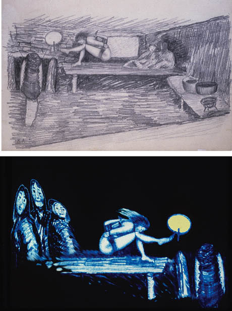
Ill. 17.2: The first of Karale Andreassen’s original pencil drawings and the newly designed, digitally reversed picture manipulated to show the three observers on the left.
The designer wrote that the central image shows the shaman with his arms tied behind his back and his head tied to his knees [Ill. 17.2], one of his feet touches the handle of the drum and the drumstick moves spontaneously on its own without anyone touching it. There are two observers on the right side of the picture. Descriptive, calm and without drama, the picture communicates what the scene looks like when the shaman is doing what he does, its down-to-earth approach implying that it is nothing special, just an ordinary part of daily life.
First, the designer changed the colour of the image to blue/white, after which he altered the fine shading by increasing the contrast and making the picture lighter. The result was a coarser, more dramatic expression that was further enhanced by using a background black. The majority of the details in the original were removed to focus the visual expression as much as possible. The designer experimented with the colour of the drum, a central object, because it was not especially visible in the original drawing. He chose to make the drum skin a shade of yellow that did not seize all of the attention.
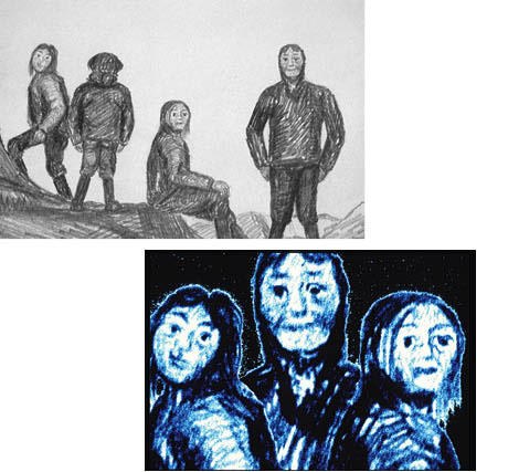
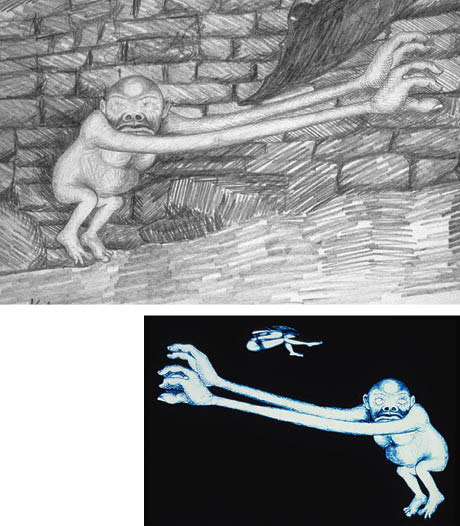
The aim of the central image is to introduce the situation with the shaman and the observers. Seeing the original drawing of the observers as insufficiently clear and impassive, the designer searched Andreassen’s drawings until coming across three giants who could be used as observers. Expressive and powerful, they look directly at the viewer [Ill. 17.3].

Ill.: 17.3: The original drawing of the three giants and the manipulated drawing in which they are cut out and placed close to each other to represent a unit of attention and hope.
The solution was to borrow them by cutting out two of the characters, moving them close to the central figure and adding the blue/black shading. Next, they were put in the central image to replace the original people sitting in the corner. By turning them and changing the scale, the designer fitted them into the picture but without adhering to the norms of a realistic room or the laws of perspective. Only the shaman and the drum remain from the original drawing; the rest is rather heavily manipulated, including the shaman when seen in contrast to the original picture.
When choosing what he defined as the central image, the designer’s aim was to establish not only the scenery but also to link to the events the central image was part of. The drum, floating, was used in some close-ups and the shaman was used alone without the drum, several of the images were made diffuse and blurred with filters to create the illusion of disappearing into space. The central image was used as raw material for a half a dozen slides.
A good and helpful spirit called Amo by the shaman is pictured in a room in a hut in Andreassen’s original drawing, but the designer removes Amo from this setting, adds the blue/black tone and a black background, enhances the contrast and then subtly alters the etchings on Amo’s body and face to bring out the good spirit’s strange and powerful pupilless eyes [Ill.: 17.4]. A sequence of four slides with Amo showing what happened also includes the flying shaman.

Ill.: 17.4: Original drawing of the helpful spirit, Amo, with his fascinating pupilless eyes on his way to assist the shaman on his important mission.
The manipulated image in which the etching on Amo’s body and face have been altered.
In another drawing of the flying shaman, the designer etched in red/orange lines to emphasise that he is flying [Ill. 17.5]. Ingemann writes:
To create the transition between the shaman’s hut and the manipulated slide, I used a drawing of the polar sky over the sea. I gave the exceedingly dark black/white drawing a blue tinge and enhanced the darkness by painting more blue/black on top of the picture. I also put a light blue shaft in the northern light to emphasise it even more clearly. The small image of the blurred flying shaman appears in the upper left corner but migrates to a different position on the next slide to indicate that his journey is moving him closer to the Mother of the Sea (1992:94).

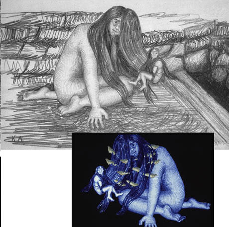
Ill.: 17.6: The original Mother of the Sea drawing and the manipulated image, where seals are interwoven in her hair.
The shaman is sitting on the knee of the Mother of the Sea [Ill. 17.6.], who the designer has chosen to make look softer than the shaman figure, where there is more contrast. Taken from an oil painting of Karale Andreassen, the seal’s colour was enhanced and the image copied many times, rotated and scattered in the Mother of the Sea’s hair. Some of the seals are starting to swim out of her hair. The designer added more hair to partially cover some of the seals. When the seals are released the shaman’s mission into the other world is over and he can return to the world of human kind. The slide show runs repeatedly, which means the beginning of the story, where the shaman and the three observers are pictured, is also its end and vice versa.
The creative speed – from the idea to the realisation
From a semiotic perspective the form and the content are inseparably woven together. The creative production of the slide show for the Shaman Tower intertwines a variety of contexts and signs into a complex form that includes Karale Andreassen’s 1910 drawings, a sound recording from the 1950s and the slide show created in 1992 for the Shaman Tower.
Several questions arise concerning the creative production process, e.g. How does the newly created digital design influence the creative process? How does the final solution relate to the ethical issues concerning authenticity and the designer’s principles? How does the museum handle its organisational understanding of objects as the foundation for the exhibition? The answer to these kinds of questions is actually another, quite simple, question: Does it work? From the creator’s point of view everything is permissible, e.g. borrowing images and manipulating various objects into a new coherent work. But does this happen in and with the Shaman Tower? Is it an exposition of cultural objects? Is it orchestrated communication? Is it new artwork?
The designer is not clear about his role or the character of his work – or more precisely, he has not articulated his role or the nature of his work explicitly. He is eager to understand and exploit the semiotic field of form and content within the realm of new digital production tools. The creative process speeded up fascinates him as well as the options available for making something totally new and surprising within minutes, like changing colours, removing parts of an original picture, adding parts from other pictures, reversing pictures, changing the contrast and light, repeating pictures, altering the scale and level of definition etc.
After the process he realises that he is able to create completely new semiotic signs never before possible. The designer has in fact become an artist, a media artist. Over the years the media artist has made a multitude of drawings and posters using ‘old’ material from photographs, but it required a time-consuming process to achieve coherent, powerful new signs. Before the advent of digital technology the creative process involved in making changes by hand was long and laborious.
The creative process has been speeded up, but this does not necessarily mean that time spent on the production process is shorter! The designer has come to acknowledge that the time saved is now spent on making more variations and on greater experimentation. This has also meant gaining a feeling of greater control over the process and a greater openness to change.
The East Greenland sealer Karale Andreassen’s (1890-1934) drawings illustrate the myths gathered by the Danish polar explorer Knud Rasmussen, who requested that he do the drawings. Author and artist Ib Gertsen’s book describes Andreassen as having, “… a European approach in his line and style” (1990).
Interpreting the work of another artist by transforming it into something else is a well-known strategy called paraphrasing, where the idea, in addition to creating something new, is to preserve much of the original. Andreassen produced pencil drawings on small sheets of paper, but the most important aspect of these drawings is the fact that, as part of the Inuit culture, he has experienced the shaman’s rituals first-hand; he has heard the sound of the drum and shouted along with the other participants. He knows what it means to face starvation because the animals of the sea have disappeared and he is intimately familiar with how the shaman’s journey is a means for contacting other worlds. All of his knowledge has found its way to the tip of his pencil and is expressed through the lines, signs and symbols in his drawings.
The lines in Andreassen’s drawings bear all of these cultural references, their authenticity enhanced by the fact this sealer and artist was born over one hundred years ago. Paraphrasing semiotician Roland Barthes when he talks about photography, Andreassen “has been there”. Rasmussen gracefully succeeded in getting close to the Inuit culture, their way of living and especially their oral tradition for telling stories, which he made a written record of in Danish. The work of these men is part of the Shaman Tower, the original drawings and the story of their creation lending it authenticity.
Where is the object?
Fortunately, the practice of museums is no longer to exhibit ‘the others’. But the challenge remains of how to exhibit spirituality and spiritual practices, for example when the only material objects are from where the shaman’s journey starts and ends: the hut, stones, earth, coats, furs and, last but not least, the drum.
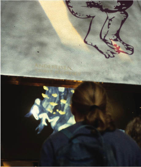
Other problematic and difficult themes that were part of the museum’s opening exhibition, e.g. the final journey and myths about life and death, were solved by displaying numerous material objects to promote the common sense understanding of visitors. The material objects were the wearers of the more spiritual content. At the Shaman Tower the material object is, precisely that, a tower. From a cultural history museum perspective it would be categorised based on its materials, such as black painted steel, zinc with silk printed drawings and illuminated white plexiglass. A banner at the bottom of the Shaman Tower reads:
This slide show was created by Bruno Ingemann based on drawings by Karale Andreassen from East Greenland made to illustrate Knud Rasmussen’s journey. The following five drawings were used here: [drawings shown as enlarged, silk prints and not in their original format].
The designer’s approach of borrowing images was well-received by the museum, which recognised that the role of the designer was not simply to display objects but to design communication. The museum’s acceptance of the concept behind the installation also meant the slide show was acknowledged as a newly created work of art.
Notes
[1]
See http://www.alidabirch.com/What_Is_Shamanism.html and http://en.wikipedia.org/wiki/Shamanism |

